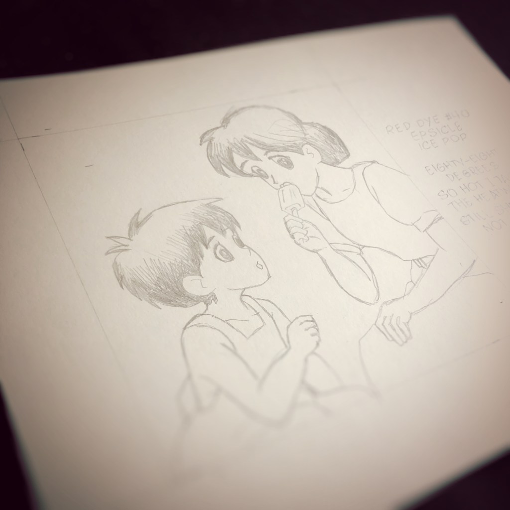
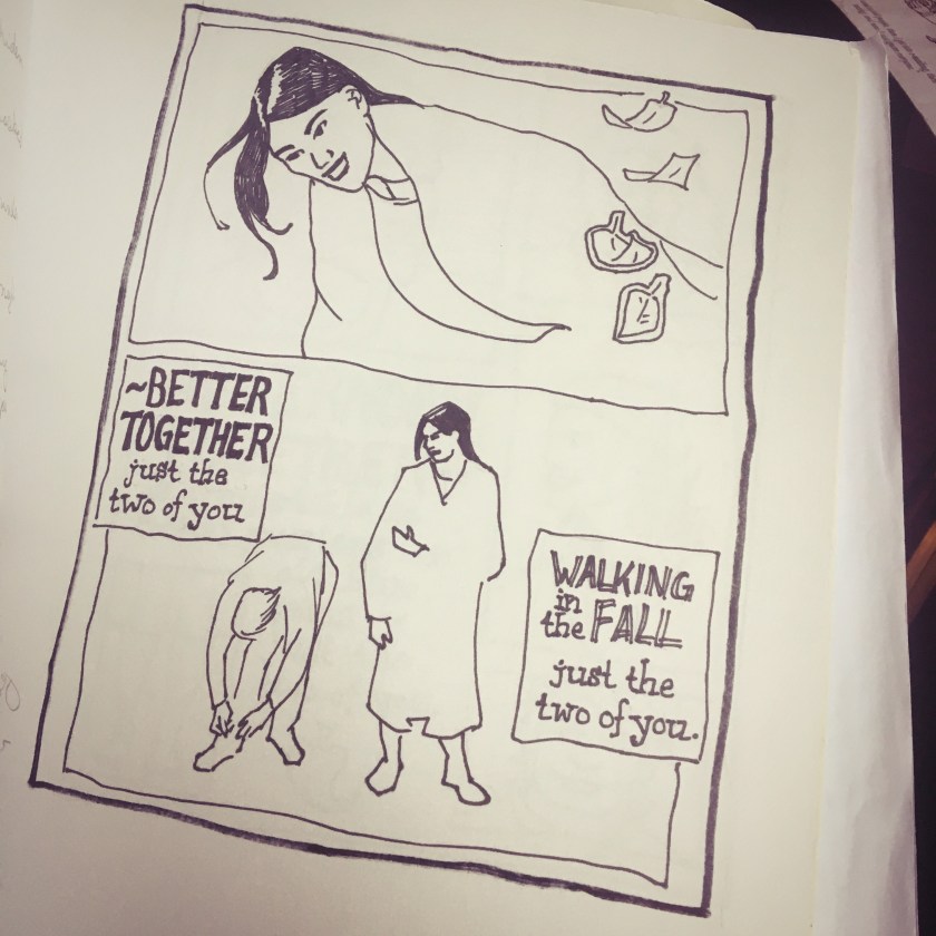
To commemorate a poem published 20 years ago, I composed a little drawing to mark the occasion. The epsicle episode1 provides a modest response to a small poem inspired by the inventor of a summertime snack, the popsicle, is Frank Epperson.
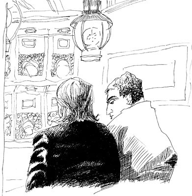
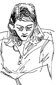
The kagenashi art style is unfamiliar to me. Inspired by Studio Ghibli films and a newly discovered manga graphic novel, Hirayasumi, I thought I would give it a try.
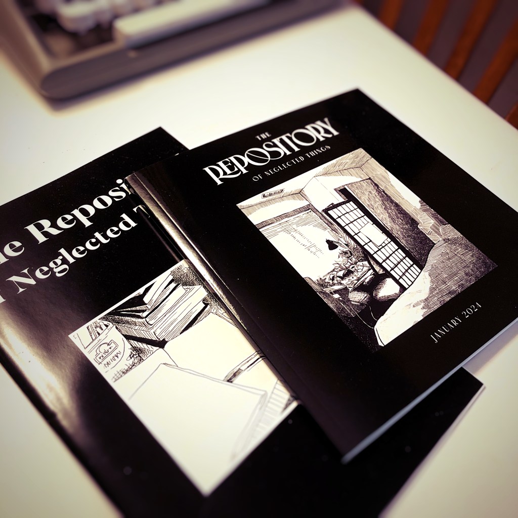
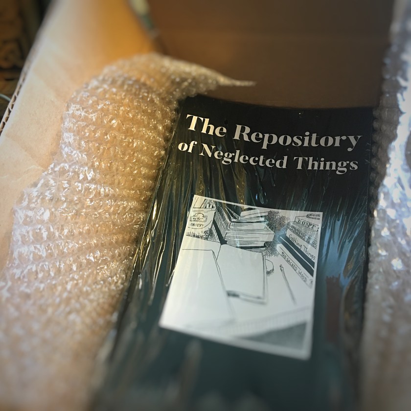
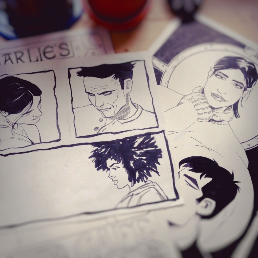
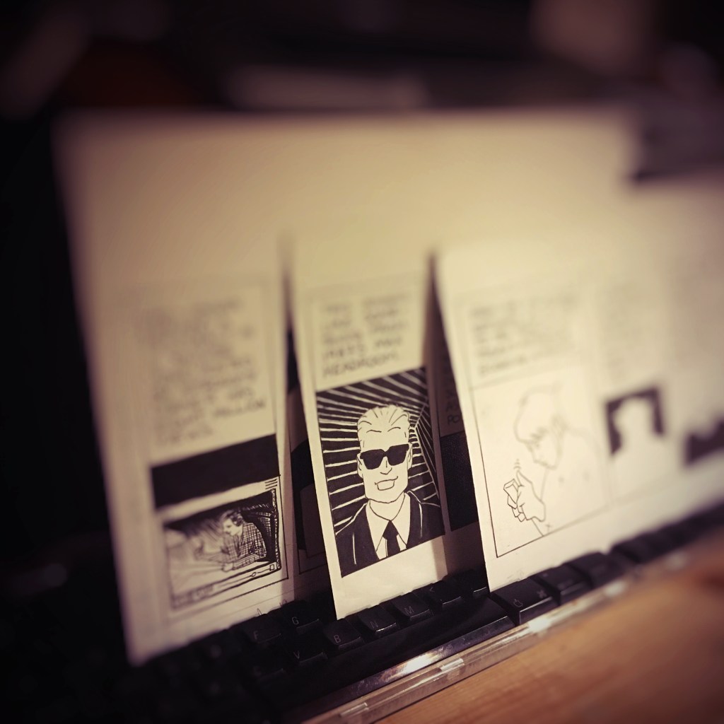
A couple of the drawings and illustrations featured on this web site during the last month or two appear in The Repository of Neglected Things. This private project originally started as way to collect unpublished drawings, illustrations, and stories into a physical package for friends and family. An anthology, if you will. Or maybe a portfolio. Plans are in process for a third and fourth volume. It has a limited print run. And distributed privately by invitation only.
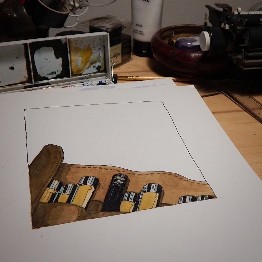
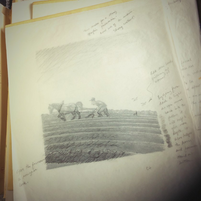
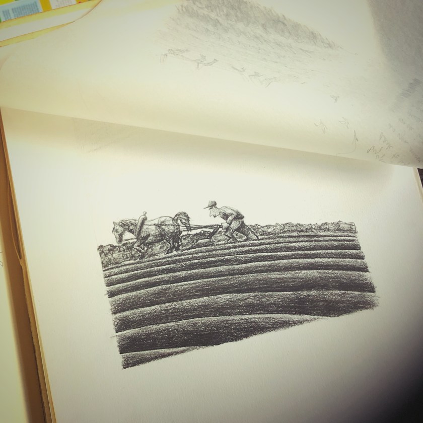
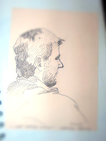
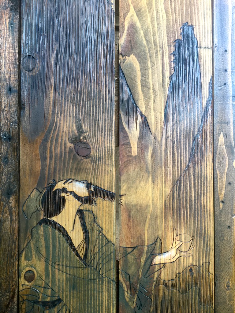
Photo of an illustration in progress taken five years ago.
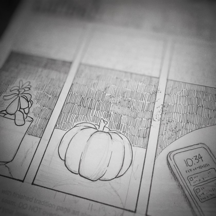
Most nights I look at this series of drawings and try to remember where I left off. Do I have time to finish a one-page drawing? Or one part of a drawing on a page?
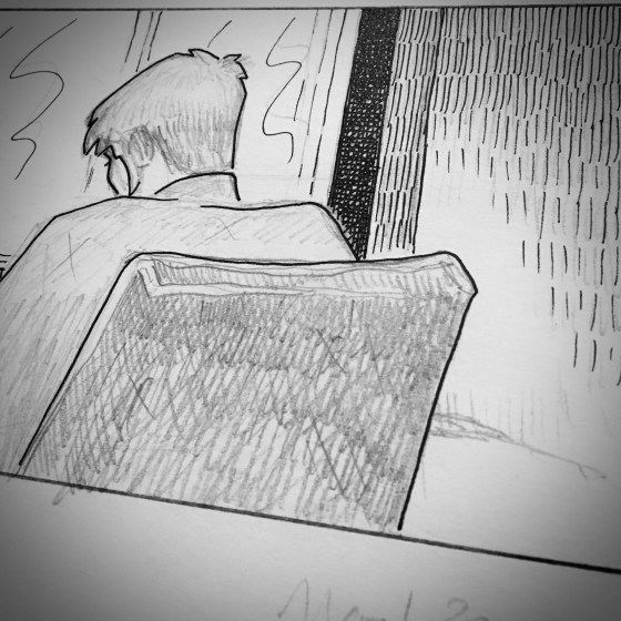
The project began years ago. The script is incomplete. The character model sheet shifted. A fellow graphic designer called the original drawings “cartoony”. So, I shifted the drawings to something more realistic and representational. But the grammar of it seems confusing.
He sketches. He draws.
He sketches a page a night. He draws cartoony pictures.
Intransitive verbs. Transitive verbs. Is there such thing as transitive art? Intransitive art? Does the artwork transfer action to someone of something? Does artwork use a direct object? Is the artwork a direct object and the action the artist?
He drew. Last night, he drew.
Last night, he drew a cartoon picture. Last night, he drew a cartoon picture for a story he wrote, but did not finish.
This is confusing. English grammar. Transitive verbs. Intransitive verbs.
Tonight, he changed.
Tonight, he changed creative direction. Tonight, he drew a representational picture for a story he wrote .
What is grammar? Grammar is the skill of expanding core principles of any topic. Grammar provides the base for dialectic. Dialectic furnishes the foundation for rhetoric.
Pen transfers ink to paper. Ink forms points and lines. Points and lines for compositions…
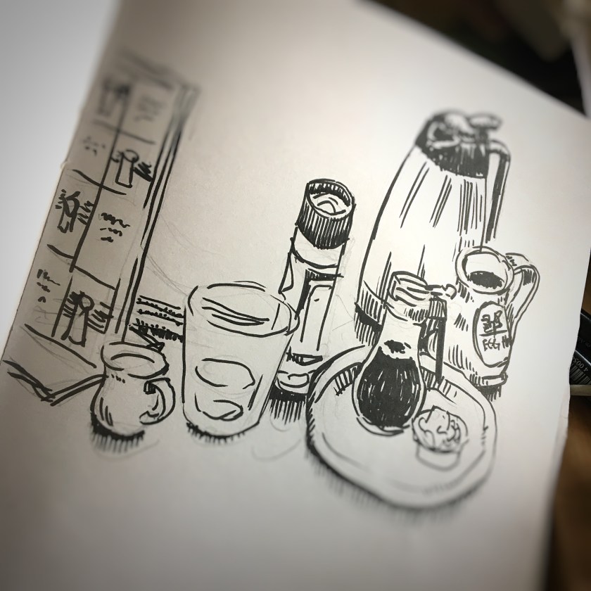
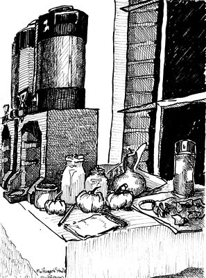
As a drawing exercise, I reclaim old illustration paper that has been damaged in some form or fashion. Maybe it was ink or paint that bleed from a top page to the paper underneath. Maybe it is page that I erased pencil lines so many times the paper fibers feather the ink when it is applied. Whatever the case, a couple drawings and the use of my Sakura Pigma Micron pens provide an art exercise.
The challenge of creating analog art in a digital world is the only people to see and experience it are those who receive it–who physically hold the Bristol paper with ink illustrations in their hands. It is a great temptation to showcase the art on social media for the ephemeral likes of affirmation and validation. But the experience of sharing art in-person is intimate and memorable.
Is this sentimental? Or wistful desire toward a time and place where people were present and engaged? The value of creating something tangible and shared among family and friends avoids parasocial relationships. The glare of digital praise is alluring, but lonely.
Before mobile devices with cameras — and software applications that capture images and store and share them — there was the sketchbook. A hard case, cloth-cover book featuring at least a hundred blank archival pages was always within reach. As a young art student it was my practice to draw advertisement layouts, images, typographic arrangements, or other sources of inspiration that I might use in future creative projects. Occasionally a sketch was a hand-drawn duplication of a photo, print ad, or poster. More often it was an interpretation, re-imagining, or riff on an original source of inspiration. It was, and is, how I learn — how I study. It is tactile.
The practice of drawing develops the interaction of muscle and neural growth. Drawing is a skill that will not improve by machine learning or multimodal image creation software applications. It is a dance between the muscles of the hands and fingers in coordination with the eyes and the cerebral cortex. Outsourcing these skills only lead to atrophy of intellect and muscle. Looking at my hands as they hover over the keyboard, I wonder why I am not drawing instead of typing. This too is a dance. The delicate steps navigating life’s dance among digital and analog tasks.