Before mobile devices with cameras — and software applications that capture images and store and share them — there was the sketchbook. A hard case, cloth-cover book featuring at least a hundred blank archival pages was always within reach. As a young art student it was my practice to draw advertisement layouts, images, typographic arrangements, or other sources of inspiration that I might use in future creative projects. Occasionally a sketch was a hand-drawn duplication of a photo, print ad, or poster. More often it was an interpretation, re-imagining, or riff on an original source of inspiration. It was, and is, how I learn — how I study. It is tactile.
The practice of drawing develops the interaction of muscle and neural growth. Drawing is a skill that will not improve by machine learning or multimodal image creation software applications. It is a dance between the muscles of the hands and fingers in coordination with the eyes and the cerebral cortex. Outsourcing these skills only lead to atrophy of intellect and muscle. Looking at my hands as they hover over the keyboard, I wonder why I am not drawing instead of typing. This too is a dance. The delicate steps navigating life’s dance among digital and analog tasks.
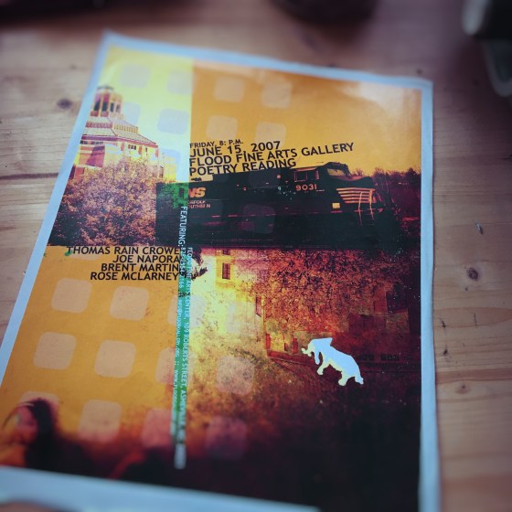
Back in February, I came across an event poster I designed. Shot all the photos. Including the white elephant. It was a child’s toy. Laid out the type and and composed the image for the event.
The poster was almost almost tossed into the trash. Early spring cleaning. But that morning I heard Garrison Keillor read “Admiring Audubon’s Carolina Parakeets” by Rose McLarney on the February 6th podcast of The Writer’s Almanac. She was a featured poet at that Asheville event.
Memories of Asheville poetry readings returned to me. The night I heard Thomas Rain Crowe and Coleman Barks reading Hafiz and Rumi poems. Rose McLarney was a rising poet. The Flood Fine Arts Gallery provided the space and community for poets young and old to share and grow.
That summer grew me as well. June 16th, there were two poetry readings I did in Durham. Later that summer I enrolled in a 5-week writing course. And received a scholarship to attend a writers residency in Queen City.
Those were different times. All good memories. But what to do with this poetry event poster I designed?
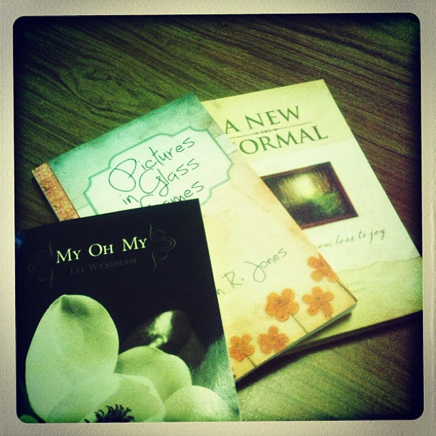
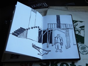
Relocating to Wisconsin was done with such haste that I am still discovering unopened boxes of items. Some items I have not seen in years. One such discovery was a series of old sketchbooks.
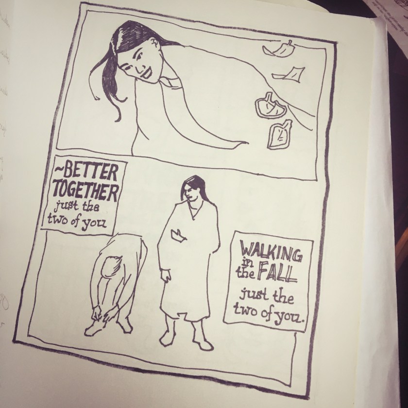
A five-minute sketch of a landscape painting on display at an art museum. The composition captured, but not the details.
A loose sketch of a production of Shakespeare in the Park.
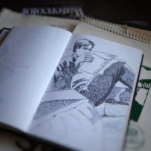
A 30-minute sketch of a roommate reading a magazine. That was back in the days before mobile phones, tablets and laptop computers.
When I flipped through the pages of these sketchbooks there was a mixture of despair and some other unnamed emotion. Is it possible to name every emotion? Is it necessary to catalog everything in the cosmos in hopes of gaining understanding? Or knowledge? Or wisdom? But I digress.
Each sketch had a story. The night at a downtown pub when I learned I was no good at billiards. After the first game, I enjoyed the rest of the evening by doing sketches. I remember the show at the art museum and the artist represented. The friends who invited me to see Shakespeare in the Park. And the rare moment a very charismatic roommate sat on the couch before jetting off to a concert or movie or date or some other activity.
A sketch is an exercise that precedes a painting. But these sketches never received the intended painting. Reportedly, Thomas More’s poems for Epigrammata began as a Latin translation exercise. If I view these sketches as lost paintings, I despair. But if I view these sketches as exercises, I am gratified.
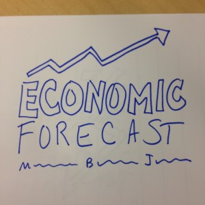
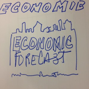
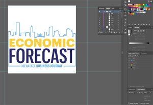
The practice of sketching is an exercise and preliminary draft of an art object. Even today, I still sketch ideas and images. For example, I was asked to create a logo design for a business event.
After some discussion the request included the city skyline of Milwaukee.
Once a plan was in place, I quickly moved to a digital rendering of the logo design and colors. Securing a piece of stock illustration, I customized the vector image and crafted a logotype used to promote and represent the business event.
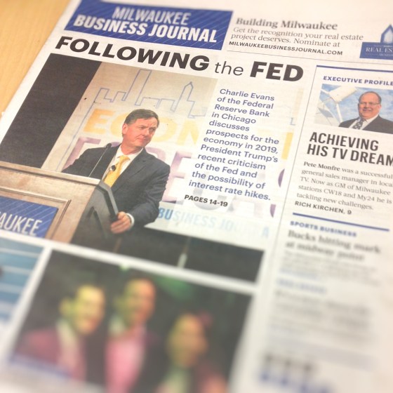
The pace of work is so fast, months go by without me realizing the value of the brand created. What took hours over the span of a few days, was on display on the front page of the newspaper and behind a representative from the Federal Reserve Bank in Chicago.
A few small three-inch square pen sketches became a huge display banner at a business event in Milwaukee. The practice of sketching is twofold: exercise and exhibit. The path to the 2019 Economic Forecast event logo and banner was a thousand unseen sketches. Page after page. Year after year. A lot of practice pieces that remain lost from view. But without them the objects that are visible would not have been created.
Wrangling pages of copy all day. Setting letters and words into rows and columns. Aligning headline copy and main body copy. Kerning. Leading. Placing an image — photo headshot of a person featured in the article. Assigning pagination to each folio.
Often I am too busy hammering out page layout designs and meeting a deadline for a press date that the elegance and beauty of each letter is missed. The leg of the letter K, the arm of the letter V, the shoulder of a lowercase N, the spine of the S become a swath of gray in a field of white space. The stoke of an A, the swash of a fancy uppercase B, the bowl of the letter D, or the counter — the closed space — of the letter O become a tangled forest of 6000 characters.
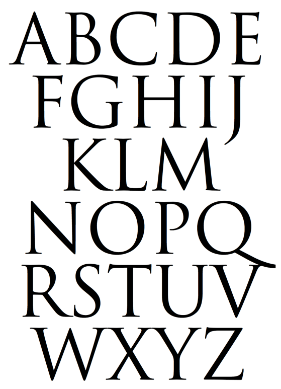
In a culture where everything seems instant and ephemeral, it is a delight to enjoy a timeless typeface inspired from a two thousand year old Roman edifice. If only for a few moments.
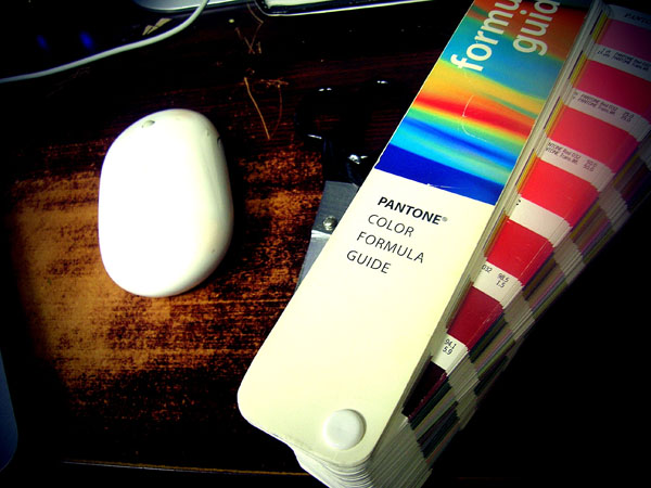
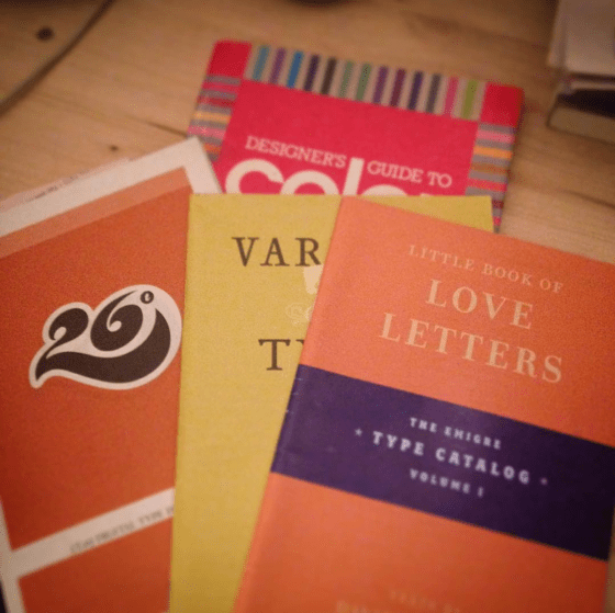
Type catalogs and color guide book circa 1991 and 2004. These artifacts of graphic design history turned up in the garage while I was searching for something else. These catalogs reminded me of a certain passion for the stories behind the creation of specific typefaces. As a young designer, I looked forward to receiving type catalogs from T26 and Émigré.
Émigré often featured text about what inspired the type designer to craft the typeface. For example, Frank Heine wrote in the catalog Various Types:
“I’ve always had a desire to design a typeface based on a Renaissance Antiqua. There are two reasons. First, the Renaissance Antiqua can be considered the prototype for most of today’s typefaces… Second, I am particularly attracted to its archaic feel,…”
I read those catalog pages the way, I imagine, a chef may read a sommelier’s writings on viticulture, enology, and food pairing.
A quiet love developed for the work of type designer Zuzana Licko. She created the typefaces Mrs. Eaves and Matrix II. Both typefaces were and still are my favorite typefaces to use in editorial projects.
If my digital tool box were restricted to only five typefaces, Helvetica, Baskerville, Mrs. Eaves, Matrix II and Gotham would be there. I thought briefly about Butler. But I know that is a passing phase. Ten years from now designed material that features Butler will look dated to this time period in the same manner that Copperplate of FF Trixie will always remind me of the late 1990s.
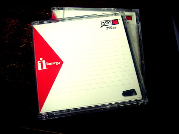
Ah, ye ole Zip disk[1][2] circa 1990s. Once the preferred removable storage device for young graphic designers — now, well, . . . these days you will have to scavenge Amazon[3] or eBay to locate a Zip disk. Then you will need to find a Zip drive that will connect with a USB port in order to salvage any data.
Somewhere between the days of floppy disks, magnetic tape and CD storage,[4] the Zip disk was a practical way to transfer files from art department to pre-press department.
There were deadline nights in the art department — back when Friends and Party of Five were on network television. I would scramble with the rest of the design team to print out press proofs for a project. Then we folded all the proofs and color separations into a FedEx Envelope or Box. Next was to save all related files onto a Zip disk —the QuarkXpress document file, native Illustrator and Photoshop files, and fonts — and pack that into the FedEx package. One of the design team was tasked with driving the package to the FedEx dropbox by 7 p.m. pick up.
When I shared this story with an intern several months ago she displayed a perplexed facial expression. I took for granted the evolution of systems and technology experienced during my career in graphic design. It is something she may never fully appreciate. She will experience an entirely different progress of technological applications as she begins her career in advertising and marketing.
I told her that on those press nights a few of us at the office would use it as an opportunity to grab supper together at a favorite Mexican restaurant. Or maybe catch a movie. Some nights we would go play bowling as a team or hang out at the Village Cafe downtown. We were a twenty-something tribe of professionals working in an industry that was rapidly changing.
Kind of a reward for putting in long hours, she commented.
Yeah, I replied.
I wanted to continue sharing details of those days during the digital revolution in design, but stopped. She will have her own stories to share about those days when everyone used flash drives to transfer data. And how easier it was to upload PDF files from a laptop or mobile device to the cloud.
I cannot help but wonder what will graphic design look like in twenty years?
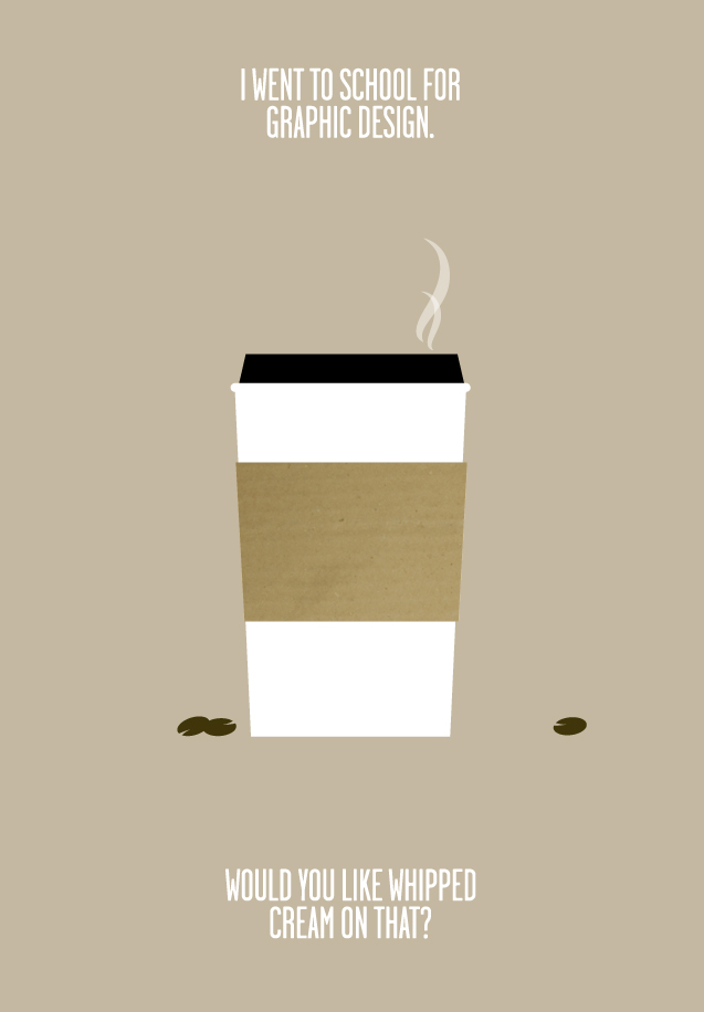
Sharing this post[1] with you from nikography — plus my own story afterwards. Because graphic design is hard work.
i went to school for graphic design, and did not spend my nights getting drunk. instead, i worked my ass off, spent most of my outside-class time learning/trying/doing as much as possible, and then got an awesome job after graduating.
protip: if you’re lucky enough . . . to be in college, you should be spending all available time learning, trying, making things, messing things up, experimenting and READING. . . .
i didn’t waste a single day. and neither should you. build your momentum and go with it.
for the but-i’m-an-artist’s: you want money? learn a technical skill related to your field and get good at it. then get better at it. . . . just sayin’.
final note: i had a BLAST in college, and miss it like crazy. working hard does not mean no-fun-allowed, it means relax harder 🙂 [2][3]
—nikography
I had the unique opportunity to enter a graphic design career during the transitional years of the digital revolution in design (somewhere between the Upper Peasealithic and Macolithic periods). The university offered computer graphics classes during the final year of the academic program called commercial arts. The degree was catalogued as a bachelors in science (as opposed to a bachelors in arts).
All other graphic design classes were hands-on, analog, technical application of composition, typography, illustration, photography, color theory, and so on. And for that fact, I am grateful.
One afternoon, during critique of students’ work a professor called two of my classmates out of the room. Most of the students knew why. One of the two owned a personal computer (yes, this is back in the paleolithic days before wifi, laptops, and mobile phones). They did their copy layout (design jargon for arranging blocks of advertising text — usually Lorem Ipsum — on a page) using a personal computer and printer. Then they inked over the print outs and submitted their work. Or so the rumors went.
No one else in the class owned a personal computer and had to lay out the text for a three-panel brochure by hand using rulers, graphite and non-photo blue pencils and rubylith film for color overlays.
The professor had caught them cheating. They denied using a computer to do the text layout. Hushed conversation relayed that they were nearly suspended for the act.
The recollection of that afternoon seems so arcane and archaic. The level of craftsmanship and skill required to accomplish print layout work was demanding. Each design student spent hours a day in the studio working on each project.
It used to take weeks of hand-lettering and composing mock-up pages before submitting the design samples for ad director and client reviews. Now it takes me a morning to generate three design layout drafts of a two- to four-page project.
The digital revolution allowed for faster turnaround of design projects, but graphic design is still hard work. It is something I try to impart to interns and young designers.
If graphic design is not good, hard, rewarding work, than you’re doing it wrong.
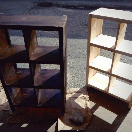
OR. This is not Minecraft, but there are a lot of cubes.
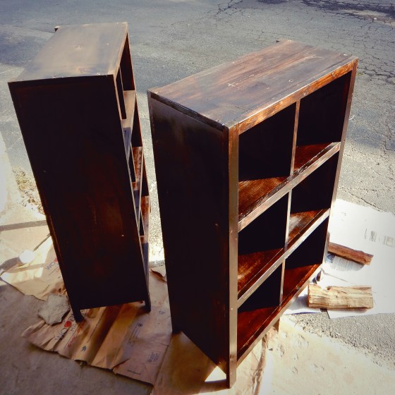
Can you have too many bookshelves? Well, byrequest, I built two more cube bookshelves from 1″x12″ and 1″x2″ pine boards. It was a fairly simple matter to draw out the blueprint for these shelves based on the previously built cube shelves.
Managed to stain both shelves this past weekend. But as the outdoor temperatures cool, the drying time is longer. And I ran out of coffee. Plan to finish the cube shelves with a coat or two of poly.
Very excited about a mentoring opportunity with the Boys & Girls Club of Greater Milwaukee this afternoon. Last October I volunteered and really enjoyed sharing my knowledge and experience of graphic design with the students.
Here are my notes on the five basic elements of a print advertisement.
Headline
Subhead
Body copy
Visuals
Layout
A print ad includes other components (like, color, shape, logo, etc.), but these five elements are foundational to print advertising.
Nearly done with the back cover illustration. A brush is often forgotten in the process of keeping a clean drawing surface.
Detail of the back cover illustration — a catfish. I have to admit — besides the firewheel flower blossom on the front cover — drawing the catfish was a pleasure.
Front and back cover pen and ink collage drawing completed. Ready for the next phase — watercolor.
The foundation of a great painting is a solid drawing. At least that was my goal when I worked on this book cover illustration for Orison Books. The collage features a firewheel — sometimes called Indian blanket — blossom, shotgun shell and expansive Texas landscape.
The purpose of thumbnail sketches is to advance the concept of artist, art director and editor to a final product. It seems like a lot of busy work, but three elements are essential: brainstorming, mind-mapping and closing the gap. The following images illustrate the process of thumbnail sketches as it relates to a book cover illustration. Three thumbnail cover comps presented to the publisher a couple months back. Full-size book cover sketch to gauge color temperature and composition of elements.
The window is open on a warm late May day and a cool mountain breeze moves the curtains like papery fingers. Occasionally, I glance at the Japanese maple outside or the grape vine wildly clinging to a handmade, crude trellis of found pine limbs….
[read more]
UPDATE: This blog post is available as part of an audio podcast.
When describing what you want in a design, make sure to use terms that don’t really mean anything. Terms like “jazz it up a bit” or “can you make it more webbish?”. “I would like the design to be beautiful” or “I prefer nice graphics, graphics that, you know, when you look at them you go: Those are nice graphics.” are other options. Don’t feel bad about it,you’ve got the right. In fact, it’s your duty because we all know thaton fullmoons, graphic designers shapeshift into werewolves.
![DSCN6003[DSCN6002[sqr-basic-lomo-dusk-tilt]]](https://coffeehousejunkie.net/wp-content/uploads/2016/07/dscn6003dscn6002sqr-basic-lomo-dusk-tilt.jpg?w=560)
![DSCN3386[sqr-tilt-dallas]](https://coffeehousejunkie.net/wp-content/uploads/2015/06/dscn3386sqr-tilt-dallas.jpg?w=560)
![DSCN3396[sqr-tilt-dallas]](https://coffeehousejunkie.net/wp-content/uploads/2015/06/dscn3396sqr-tilt-dallas.jpg?w=560)
![DSCN3400[sqr--dallas]](https://coffeehousejunkie.net/wp-content/uploads/2015/06/dscn3400sqr-dallas.jpg?w=560)
![DSCN3395[sqr-tilt-dallas]](https://coffeehousejunkie.net/wp-content/uploads/2015/06/dscn3395sqr-tilt-dallas.jpg?w=560)
![DSCN3390[sqr--dallas]](https://coffeehousejunkie.net/wp-content/uploads/2015/06/dscn3390sqr-dallas.jpg?w=560)
![DSCN3558[sqr-tilt]](https://coffeehousejunkie.net/wp-content/uploads/2015/07/dscn3558sqr-tilt.jpg?w=560) Three thumbnail cover comps presented to the publisher a couple months back.
Three thumbnail cover comps presented to the publisher a couple months back. ![DSCN3560[sqr-tilt]](https://coffeehousejunkie.net/wp-content/uploads/2015/07/dscn3560sqr-tilt.jpg?w=560) Full-size book cover sketch to gauge color temperature and composition of elements.
Full-size book cover sketch to gauge color temperature and composition of elements.