Scanning document with Adobe Photoshop 6.0
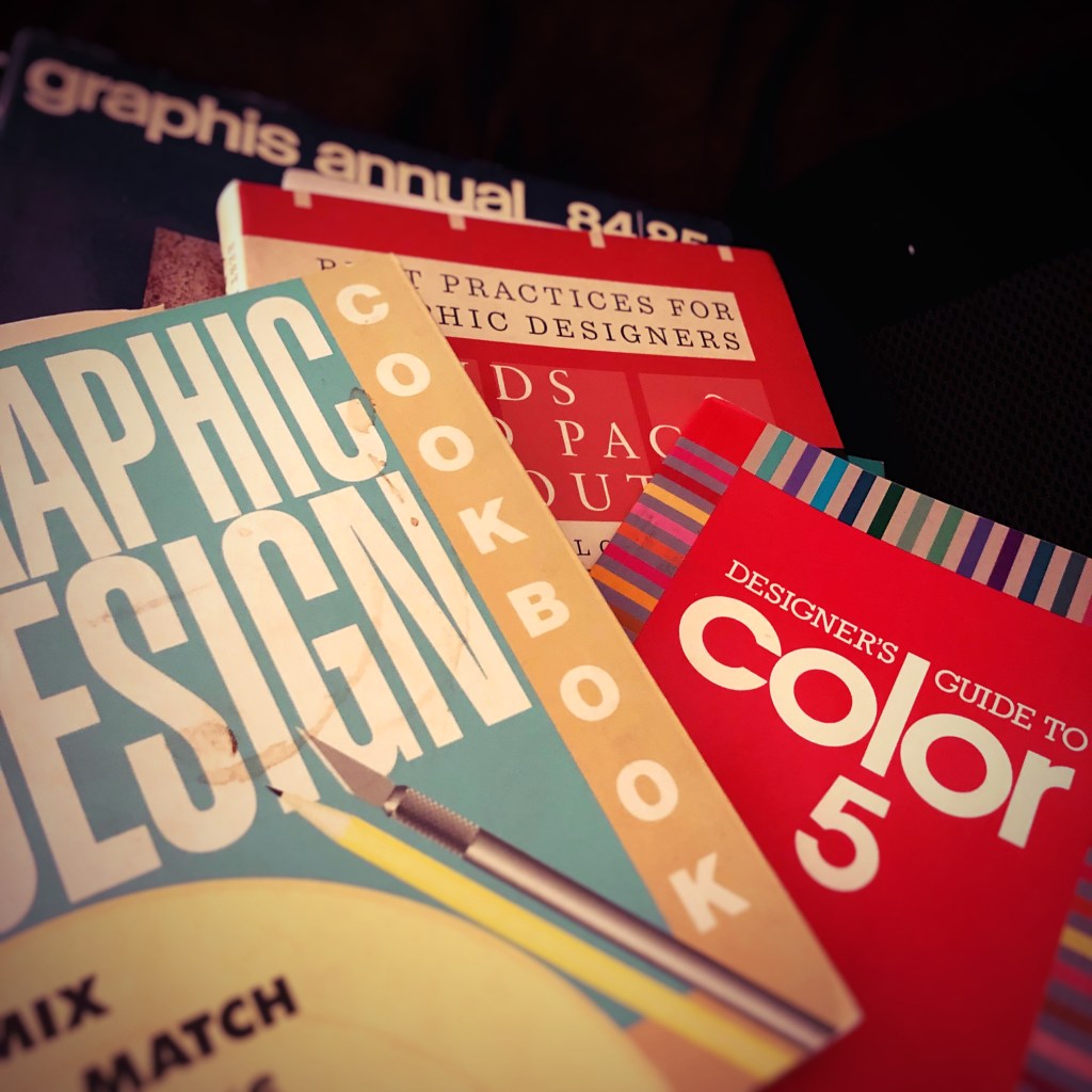
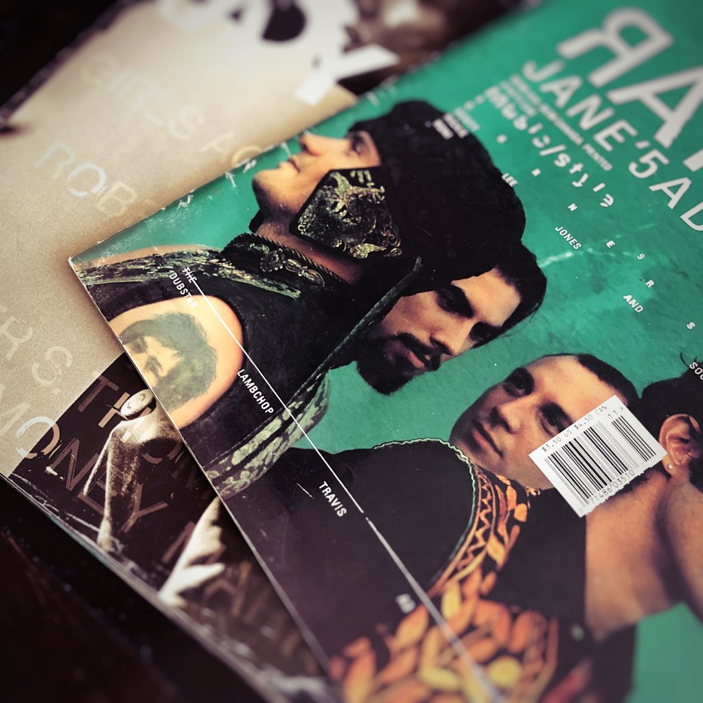
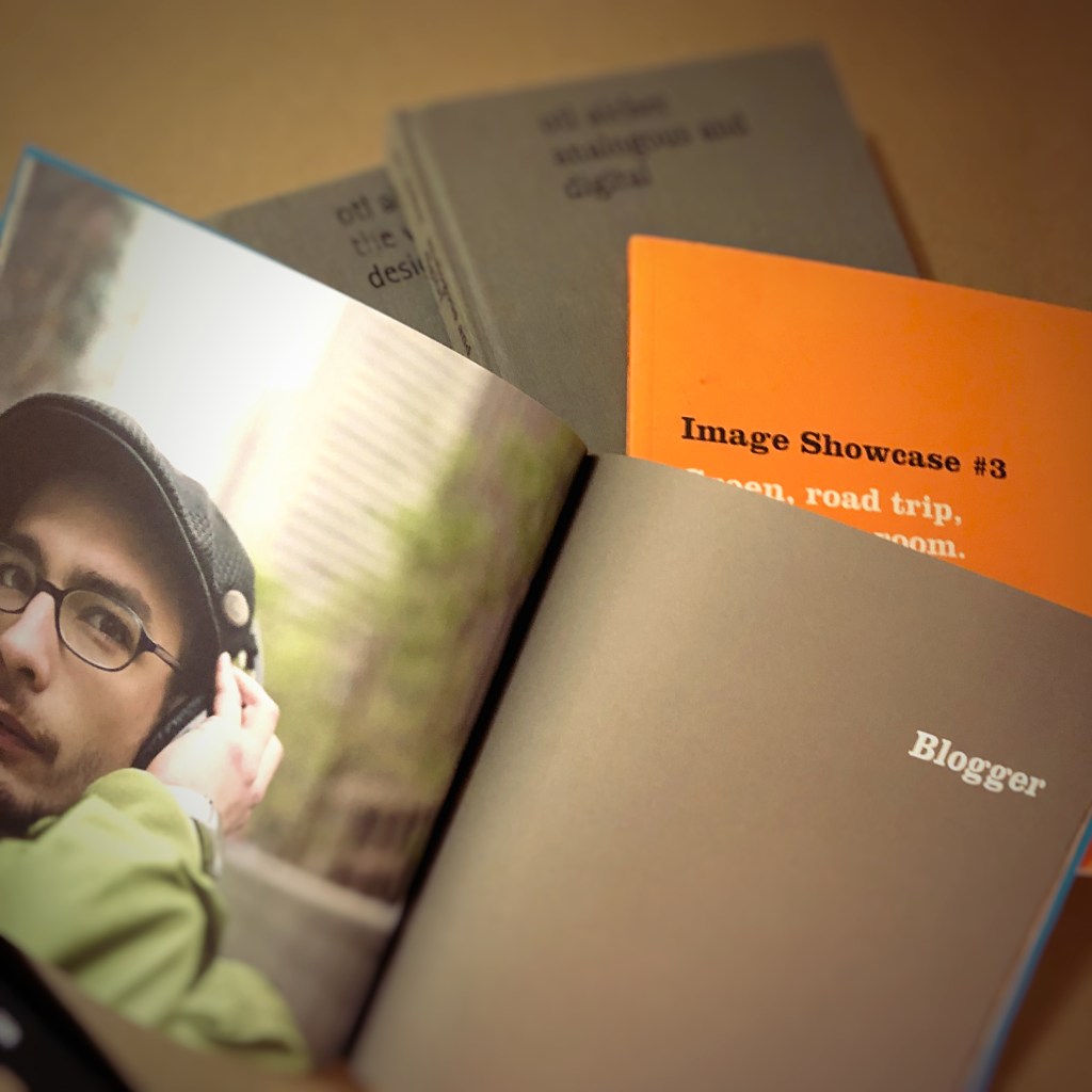
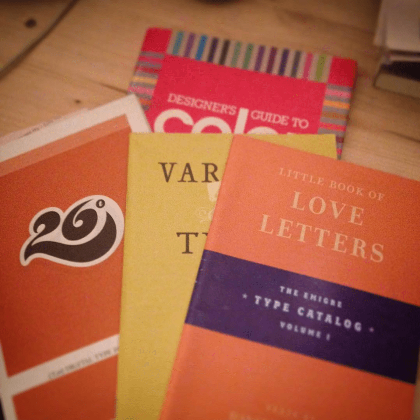
Always learning. Always growing. A glimpse at a graphic designer’s library. Graphis Annual 84/85 The International Annual of Advertising and Editorial Graphics, Graphic Design Cookbook, Designer’s Guide to Color 5, and Best Practices for Graphic Designers, Grids and Page Layouts.
Graphic designers solve problems. They educate clients as much as they create products for clients.
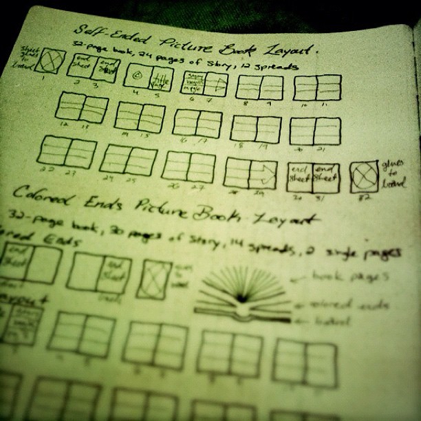
In an old Action Book journal, I sketched the details and differences between two options for a picture book. Most people see picture books all the time, but may not be aware of how they are put together. This sketch helped illustrate for the client and author how best to plan for their project.
That client meeting was years and years ago. Now I have stacks and boxes of these design journals. From time to time, I open these journals to reference an idea or sketch. But maybe it is time to start recycling them.
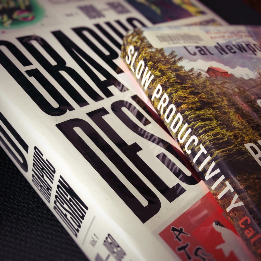
The interlibrary loan system provides access to books. Books that are not available at the local rural public library. Books requested using the library system’s web site arrive as they are available. Sometimes the combinations of titles display a curious serendipity. Slow Productivity. And History of Graphic Design Volume 1 1890 – 1959.
The principles featured in Slow Productivity appear to contrast with the other book. At least at first glance.
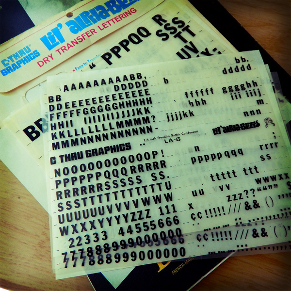
Graphic design projects and tasks were once defined by art and drafting skills. Tactile skills of cutting an oval with an X-Acto knife for a Rubylith overlay sheet. Or drafting skills of using a T-square ruler and triangle to layout the ad copy for an advertisement. Or the skill of painting a headline with gouache paints or pigment inks. Or the photographic skills of loading, shooting, processing, and printing 35mm film. Graphic design work prior to the 1990s required more physical activity. Often, a design shop featured multiple creative talents. A photographer. An illustrator. A copywriter. A director and assistant. A typographer and designer. A videographer and film and audio editors. That is a team of ten creatives. Now graphic design projects and tasks encompass project management and problem solving. And a single designer needs to do the work of ten creatives.
Can graphic designers do their projects and tasks without burnout? That is the question. And, maybe, that is where the interlibrary loan library books compliment each other. Can the past inform the present? And future? And, more uregently, can I read these books before they are due back to the library?
It is a challenge for me. When I am introduced as an artist and/or poet. Still not comfortable with either of those nouns. The next question is inevitable. It usually goes something like this:
My wife turns and introduces me to her friend and adds, “He’s also an artist and poet, too.”
“Wow, can I see your art work on Facebook?”
“No. I am not on Facebook.”
“Oh. Instagram?”
“No. Not on Instagram, either.”
“Well. Um. What do you do? Oil paintings? Do you have a gallery somewhere?”
“He posts some of his work on his blog,” my wife offers.
About that time the bread crumb trail ends and the conversation shifts to something else.
The trouble is that some of the work I create I cannot contractually share. Technically, I do not own the copyrights to the final art. And so, I cannot distribute or display it on this or other online platforms. Frustrating. Yes. Bad. No. It is the cost of commercial arts.
For example, a couple weeks ago I drew a portrait. A line art drawing. The portrait will be featured as an etching in either crystal or acrylic as part of a lifetime award. Sometime in March. You may have seen such awards in business offices. A crystal award on black base sitting on someone’s desk or shelf or trophy case.
I am reminded of one of Milton Glaser’s mottos: “Art is work.”
Milton Glaser, celebrated graphic designer, may not be a household name. Not even in my home. But most Americans will recognize the I [heart] NY logo. It is highly unlikely that school children will study designers as part of their art curriculum. (My children are presently studying the American painter Andrew Wyeth.)
Too often I lament, or rather, complain that I spend too much time creating work in front of a screen. It was so nice to ditch the screen and work in ink on vellum and illustration paper. Took nearly four hours to draw the portrait. And that is with the interruptions of replying to emails and designing elements for a multi-page editorial piece. It would take four weeks if I tried to craft the portrait as an oil painting.
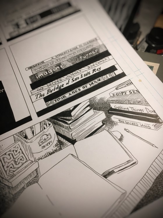
In order to answer a request (Where may I find your art work?), I drew the above page last weekend. Inspired by Jane Mount’s Ideal Bookshelf, I managed to draw the stacks of books on my desk by the bedroom window. At least fifty books. So many books. So little time. I enjoyed the exercise. It felt good to pencil a sketch, flesh out the details, and ink the page.
“Wait. You write poetry, too?”
“Um…” I start.
“Have you been published?”
“Yes,” I say.
And this time the bread crumb trail ends quickly. Because most people do not know where to begin to look for published poetry.
“He posts some of his published poems on his blog,” my wife adds.
Jigsaw puzzles appeal to many people because the scrambled mess has a decisive solution. Usually, because the path to success is printed on the outside of the puzzle’s cardboard box. Build the edges first and then fill in the center. The strategy is fairly simple. The execution presents the delightful journey.
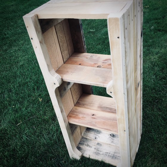
Building a bookshelf without plans is like dumping several jigsaw puzzles on to a table top, throwing away their cardboard boxes, and trying to create one solution from the many parts.
After selecting boards for the shelves, sides, supports, and legs, I started cutting the pieces to fit.
One of the therapeutic aspects of working with your hands is the tactile creation of the project. So much of what I do for a living is done by proxy. I design images for print and web. But I never touch the art. A pointer displayed on a screen by way of a handheld device that tracks two-dimensional motion allows me to design a variety of material. But it also presents a barrier. Glass, metal, and plastic separates me from the art I created. Should the art maker and the art object be divided in such a manner?
The physicality of this salvaged-wood, no-plan bookshelf presented joy. The smell of the sawdust. The feel of the drill boring into hardwood. The motion of sanding off the rough edges.
Sure, there were some mistakes. A board was too warped to use. Another board split when screwed in place. Four legs that do not match. But that is part of the riddle. Part of the delight.
When the assembled jigsaw pieces from several puzzles were set on the grass one weekend, it resembled a bookshelf.
To be asked to design a logo is part of the job. It is what I do. Among other daily and weekly design projects and tasks.
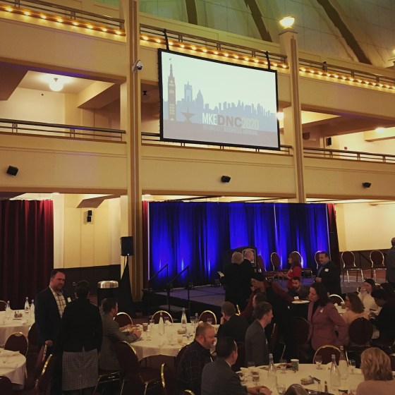
To design a logo that will be attached to the coverage of local and national news about the 2020 Democratic National Convention coming to Milwaukee, Wisconsin, . . . well, that is still part of the job. And to get it done in time to make the weekly print edition. That is also what I do.
So, I worked fast. Logo needed to be ready for print and digital in two days. I threw some digital sketches together in Adobe Illustrator. Drank more coffee.

I used multiple artboards for easy of digital workspace. Played with ideas including an outline of the state of Wisconsin and then settled on the skyline of Milwaukee. Inspired by Robert Lenz’s The People’s Flag of Milwaukee design, I built the color palette in that direction. Chose a typeface. Presented the logo design.
Once the logo design was approved, I applied the logo to various formats and platforms including mobile, print, web and animated video.
![]()
I had big expectations that this logo would receive a lot of local and national attention. People would see this logo in print, online and at events. And then something happened between February and March.
Things began to slide sideways. By April, all events that featured this logo were cancelled. Print and digital ads were pulled. And those 50,00 visitors expected to materialize in Milwaukee this week. Well friends, let’s just say things didn’t go as planned.
The animated logo I designed was part of a presentation to an intimate crowd of business leaders at Miller High Life Theatre in February. And that is the last time it really sparkled and shined.
Disappointed? Yes. A little. But there are plenty of other design projects to work on.
Graphic design is funny that way. It is the most visible and the most invisible of trades.
Something in front of you right now was designed by some unseen modern peasant who worked long hours with short deadlines to launch a web site, create mobile app interface or digital user experience, design a slideshow presentation, pull together a single slate screen or lower thirds graphic for video and so on. Graphic design has multiple disciplines. Maybe even interdisciplinary.
Well-crafted graphic design may only get a glance. But that is all it needs to complete its function.
What do you do when you find a 15-year old sketchbook with at least two dozen blank pages at the end of it? This sketchbook was something used many years ago to compose page layouts ideas.
It may be that as a young graphic designer I required the use of pen, ink, and paper to organize thoughts and ideas before turning to the digital tool of computer and software to complete a magazine page layout. Or a book layout. Or whatever design project it was that I was working on at the time.
Even back then, a lot of creatives were skipping the hand-drawn phase of graphic design and moving to digital sketches. I was one of those designers too. It did not take long to adapt to digital sketches using Quark Xpress or PageMaker. External and internal clients did not understand these hand-drawn sketches. I quickly understood that these initial sketches were best served between fellow creatives. A form of pictorial shorthand.
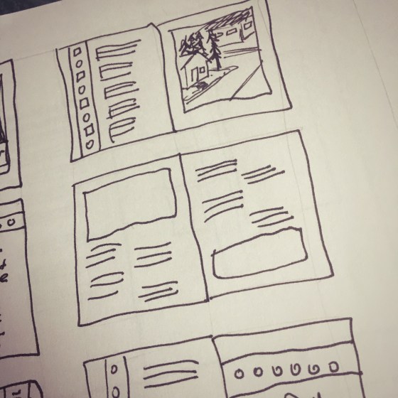
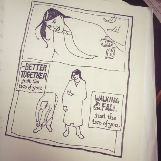
Sketches using human figures engaged clients. A point of connection. Composing advertisements and editorial layouts was enjoyable. Even when it was poorly drawn it was pleasurable. It was exciting to explore and play out ideas on pages. To balance text and image. To push the elements toward asymmetrical tension.
Sometimes referred to as “mock ups” or “work ups,” these comps (jargon for compositions) often featured ad copy or editorial headlines that I wrote. I preferred writing my own copy rather than using dummy copy, greeking, or some other form of gibberish used to represent where text was to be placed in design compositions.
These sketches bring back a lot of memories. Projects completed. Projects that never were approved. Abandoned. Like the craft of sketching designs and ideas.
I needed something to prop up the office laptop computer in order to avoid a kink in my neck as I work on print and web design tasks. MacBook Pros are not ergonomically designed. An old keyboard was located. And then a Kensington trackball mouse. And an old, unbound sketchbook. That did the trick.
This work-from-home solution is not ideal. There are days when my children see that I spend most of the time reading and replying to emails, joining video conferences, and moving file icons across the desktop to various folders synched to cloud-based servers. Graphic design looks so different from the point at which I joined the trade. It is less tactile.
The national safe-at-home quarantine allowed me to build a wood desktop and a wood stand-up-desk solution for the laptop, keyboard, trackball workplace arrangement. And the 15-year old sketchbook? Well, paging through the collection of ideas and designs. . . after a long hiatus, I began sketching and drawing on the empty pages at the end of the book.
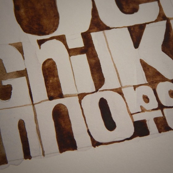
Tested a couple old brushes using a dozen watercolor half pans on illustration paper. Purchased the art supplies for a book cover illustration project a few years ago. Have not had the occasion to use them since then. Apart from recreational sketches and practice.
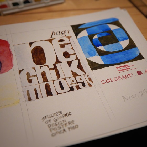
Painted some studies of graphic design advertisement posters from the 1960s. Muscle memory atrophied more than expected. How does the aphorism go? Either control the watercolors or they will control the painting. Some clumsy mistakes. A good test of skills. Not ready to paint a book cover illustration. But the exercise warmed up the muscles and mind to consider more opportunities.
Relocating to Wisconsin was done with such haste that I am still discovering unopened boxes of items. Some items I have not seen in years. One such discovery was a series of old sketchbooks.
A five-minute sketch of a landscape painting on display at an art museum. The composition captured, but not the details.
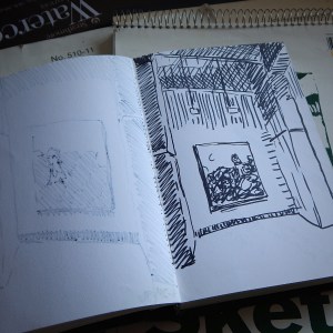
A loose sketch of a production of Shakespeare in the Park.
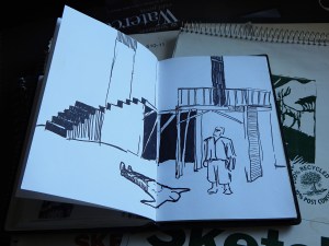
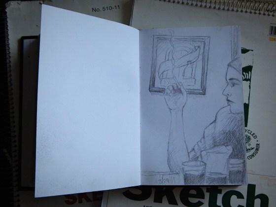
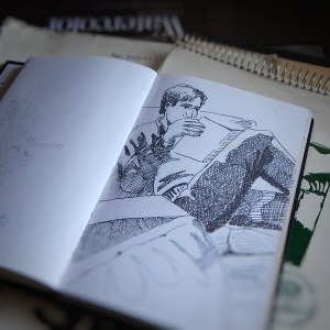
A 30-minute sketch of a roommate reading a magazine. That was back in the days before mobile phones, tablets and laptop computers.
When I flipped through the pages of these sketchbooks there was a mixture of despair and some other unnamed emotion. Is it possible to name every emotion? Is it necessary to catalog everything in the cosmos in hopes of gaining understanding? Or knowledge? Or wisdom? But I digress.
Each sketch had a story. The night at a downtown pub when I learned I was no good at billiards. After the first game, I enjoyed the rest of the evening by doing sketches. I remember the show at the art museum and the artist represented. The friends who invited me to see Shakespeare in the Park. And the rare moment a very charismatic roommate sat on the couch before jetting off to a concert or movie or date or some other activity.
A sketch is an exercise that precedes a painting. But these sketches never received the intended painting. Reportedly, Thomas More’s poems for Epigrammata began as a Latin translation exercise. If I view these sketches as lost paintings, I despair. But if I view these sketches as exercises, I am gratified.
The practice of sketching is an exercise and preliminary draft of an art object. Even today, I still sketch ideas and images. For example, I was asked to create a logo design for a business event.
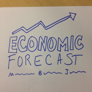
After some discussion the request included the city skyline of Milwaukee.
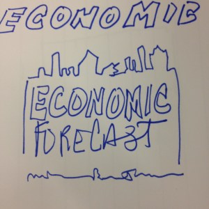
Once a plan was in place, I quickly moved to a digital rendering of the logo design and colors. Securing a piece of stock illustration, I customized the vector image and crafted a logotype used to promote and represent the business event.
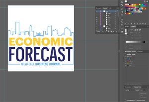
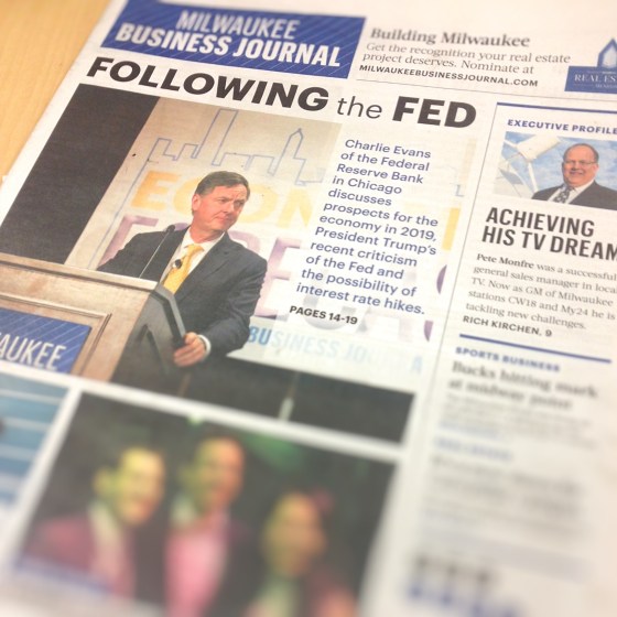
The pace of work is so fast, months go by without me realizing the value of the brand created. What took hours over the span of a few days, was on display on the front page of the newspaper and behind a representative from the Federal Reserve Bank in Chicago.
A few small three-inch square pen sketches became a huge display banner at a business event in Milwaukee. The practice of sketching is twofold: exercise and exhibit. The path to the 2019 Economic Forecast event logo and banner was a thousand unseen sketches. Page after page. Year after year. A lot of practice pieces that remain lost from view. But without them the objects that are visible would not have been created.