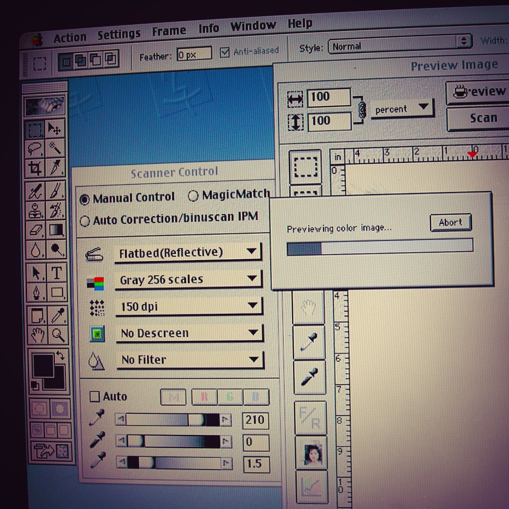
Scanning document with Adobe Photoshop 6.0
Based on the publication date of this old book on how to build a log cabin, the typesetting of these pages was likely a Linotype machine.1
Typeface test.
1) Is the subtitle, Floor Joists, the typeface Future Bold?
2) Is the main body text Bodoni? Or Caslon?
NOTES:
1) For those interested in additional information on the history of printing and the Linotype machine…
Frank Romano, “Help Save the Linotype”, Museum of Printing (Haverhill, Massachusetts), accessed May 11, 2026, https://www.museumofprinting.org/news-and-events/help-save-the-linotype/
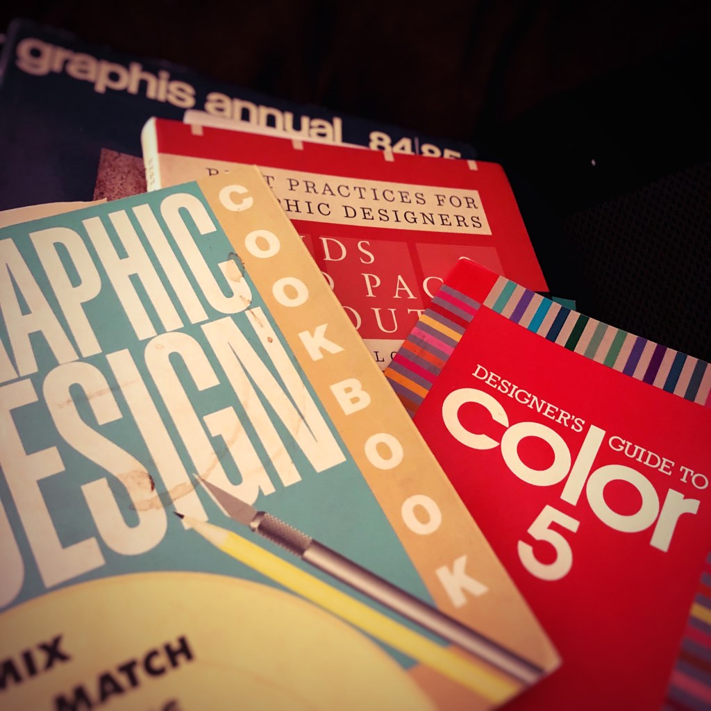
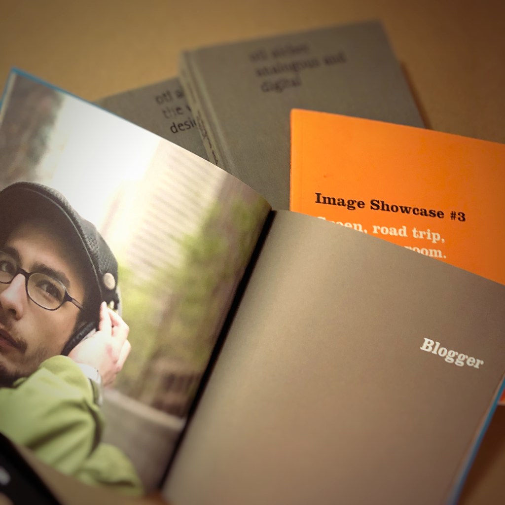
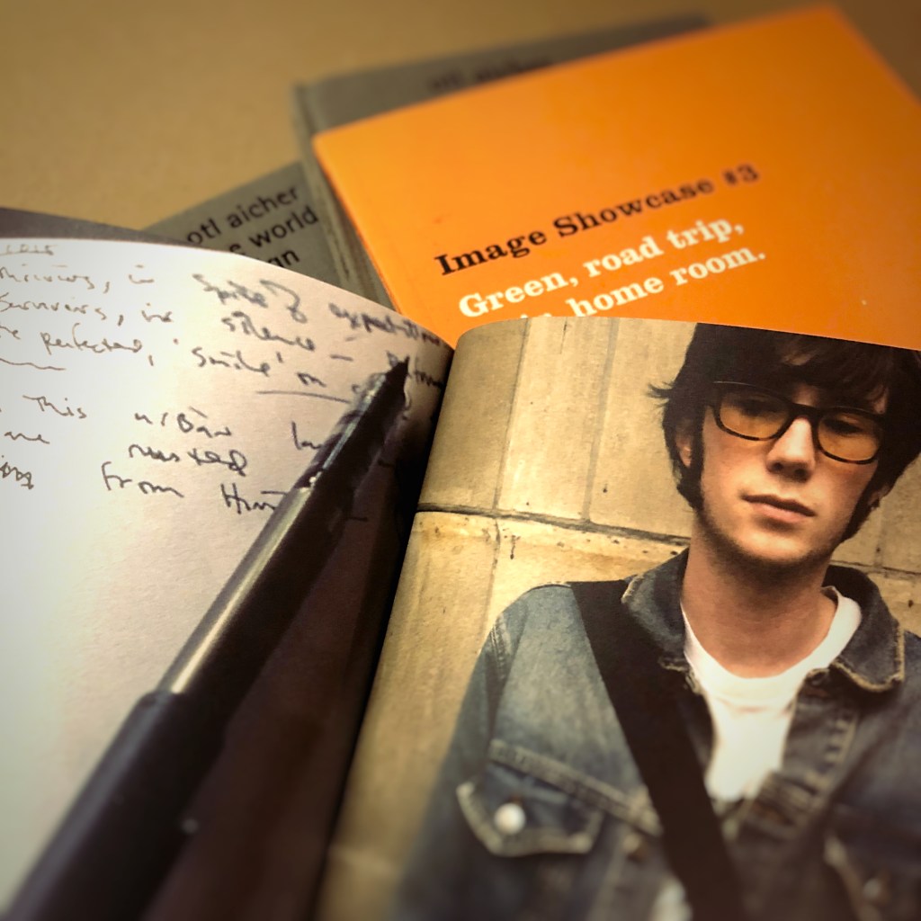
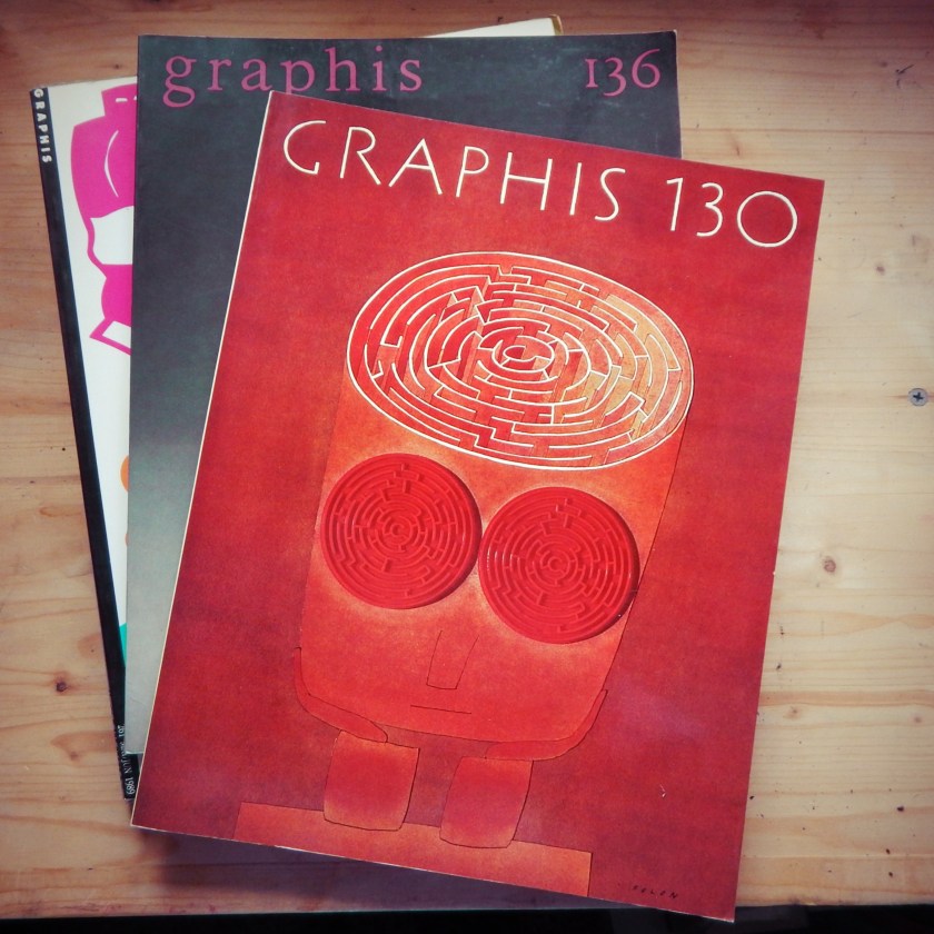
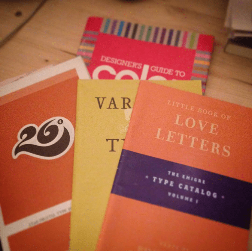
Always learning. Always growing. A glimpse at a graphic designer’s library. Graphis Annual 84/85 The International Annual of Advertising and Editorial Graphics, Graphic Design Cookbook, Designer’s Guide to Color 5, and Best Practices for Graphic Designers, Grids and Page Layouts.
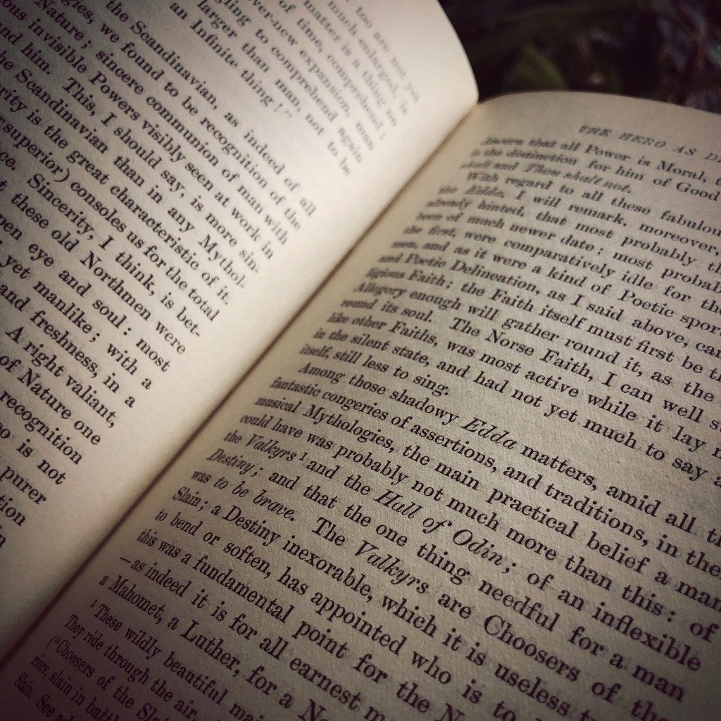
It was not the thunder or lightening that distracted me. It was the typeface. Was it the letter “s” or the letter “g” that offered a clue as to the typeface? Most likely Baskerville. But it could also be Caslon.
The wind and rain battered the window. The game’s afoot. The evidence was in a line across the page. Something about the letter “e” made me think I was wrong. The anatomy of the letter “e” features the eye on the top half of the oval. The finial is the tail and the open space between the top half of the letter and finial is the aperture.
The thunder faded as the rain slowed to a steady drizzle. It was the space of the aperture that made me consider that it was neither Baskerville or Caslon. For Baskerville, the eye should be higher and finial lower with a greater space in the aperture. But since this book was printed before the 1970s, maybe the original Baskerville typeface for Linotype looked different when printed. Computer typesetting replaced photo typesetting. And photo typesetting replaced Linotype. Maybe the form of the letters changed from Linotype Baskerville to digital Baskerville. The lights flickered but remained on.
The storm moved east. The downspout outside the window burbled from the rain. And I forgot what I had been reading. A mystery? Something about heroes.
Graphic designers solve problems. They educate clients as much as they create products for clients.
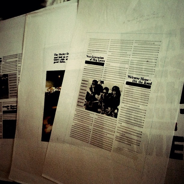
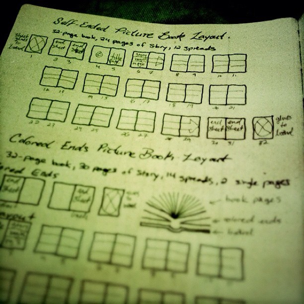
In an old Action Book journal, I sketched the details and differences between two options for a picture book. Most people see picture books all the time, but may not be aware of how they are put together. This sketch helped illustrate for the client and author how best to plan for their project.
That client meeting was years and years ago. Now I have stacks and boxes of these design journals. From time to time, I open these journals to reference an idea or sketch. But maybe it is time to start recycling them.
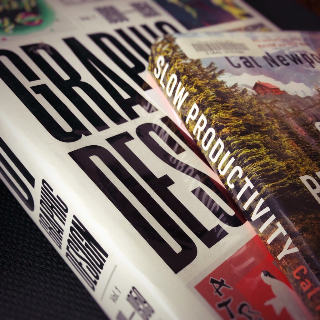
The interlibrary loan system provides access to books. Books that are not available at the local rural public library. Books requested using the library system’s web site arrive as they are available. Sometimes the combinations of titles display a curious serendipity. Slow Productivity. And History of Graphic Design Volume 1 1890 – 1959.
The principles featured in Slow Productivity appear to contrast with the other book. At least at first glance.
Graphic design projects and tasks were once defined by art and drafting skills. Tactile skills of cutting an oval with an X-Acto knife for a Rubylith overlay sheet. Or drafting skills of using a T-square ruler and triangle to layout the ad copy for an advertisement. Or the skill of painting a headline with gouache paints or pigment inks. Or the photographic skills of loading, shooting, processing, and printing 35mm film. Graphic design work prior to the 1990s required more physical activity. Often, a design shop featured multiple creative talents. A photographer. An illustrator. A copywriter. A director and assistant. A typographer and designer. A videographer and film and audio editors. That is a team of ten creatives. Now graphic design projects and tasks encompass project management and problem solving. And a single designer needs to do the work of ten creatives.
Can graphic designers do their projects and tasks without burnout? That is the question. And, maybe, that is where the interlibrary loan library books compliment each other. Can the past inform the present? And future? And, more uregently, can I read these books before they are due back to the library?
To be asked to design a logo is part of the job. It is what I do. Among other daily and weekly design projects and tasks.
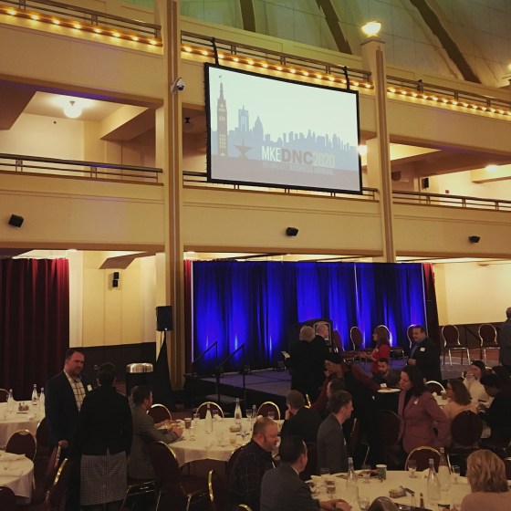
To design a logo that will be attached to the coverage of local and national news about the 2020 Democratic National Convention coming to Milwaukee, Wisconsin, . . . well, that is still part of the job. And to get it done in time to make the weekly print edition. That is also what I do.
So, I worked fast. Logo needed to be ready for print and digital in two days. I threw some digital sketches together in Adobe Illustrator. Drank more coffee.

I used multiple artboards for easy of digital workspace. Played with ideas including an outline of the state of Wisconsin and then settled on the skyline of Milwaukee. Inspired by Robert Lenz’s The People’s Flag of Milwaukee design, I built the color palette in that direction. Chose a typeface. Presented the logo design.
Once the logo design was approved, I applied the logo to various formats and platforms including mobile, print, web and animated video.
![]()
I had big expectations that this logo would receive a lot of local and national attention. People would see this logo in print, online and at events. And then something happened between February and March.
Things began to slide sideways. By April, all events that featured this logo were cancelled. Print and digital ads were pulled. And those 50,00 visitors expected to materialize in Milwaukee this week. Well friends, let’s just say things didn’t go as planned.
The animated logo I designed was part of a presentation to an intimate crowd of business leaders at Miller High Life Theatre in February. And that is the last time it really sparkled and shined.
Disappointed? Yes. A little. But there are plenty of other design projects to work on.
Graphic design is funny that way. It is the most visible and the most invisible of trades.
Something in front of you right now was designed by some unseen modern peasant who worked long hours with short deadlines to launch a web site, create mobile app interface or digital user experience, design a slideshow presentation, pull together a single slate screen or lower thirds graphic for video and so on. Graphic design has multiple disciplines. Maybe even interdisciplinary.
Well-crafted graphic design may only get a glance. But that is all it needs to complete its function.