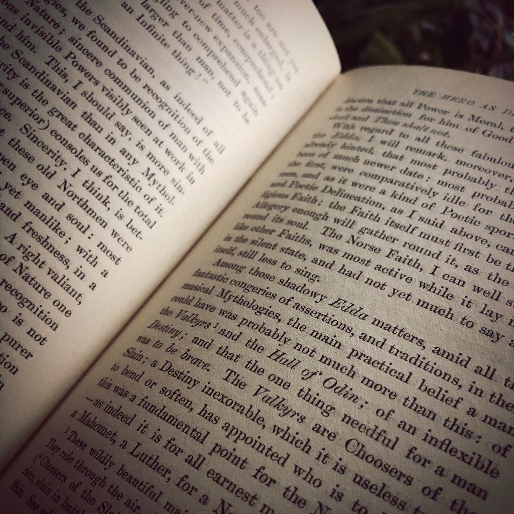
It was not the thunder or lightening that distracted me. It was the typeface. Was it the letter “s” or the letter “g” that offered a clue as to the typeface? Most likely Baskerville. But it could also be Caslon.
The wind and rain battered the window. The game’s afoot. The evidence was in a line across the page. Something about the letter “e” made me think I was wrong. The anatomy of the letter “e” features the eye on the top half of the oval. The finial is the tail and the open space between the top half of the letter and finial is the aperture.
The thunder faded as the rain slowed to a steady drizzle. It was the space of the aperture that made me consider that it was neither Baskerville or Caslon. For Baskerville, the eye should be higher and finial lower with a greater space in the aperture. But since this book was printed before the 1970s, maybe the original Baskerville typeface for Linotype looked different when printed. Computer typesetting replaced photo typesetting. And photo typesetting replaced Linotype. Maybe the form of the letters changed from Linotype Baskerville to digital Baskerville. The lights flickered but remained on.
The storm moved east. The downspout outside the window burbled from the rain. And I forgot what I had been reading. A mystery? Something about heroes.
Wrangling pages of copy all day. Setting letters and words into rows and columns. Aligning headline copy and main body copy. Kerning. Leading. Placing an image — photo headshot of a person featured in the article. Assigning pagination to each folio.
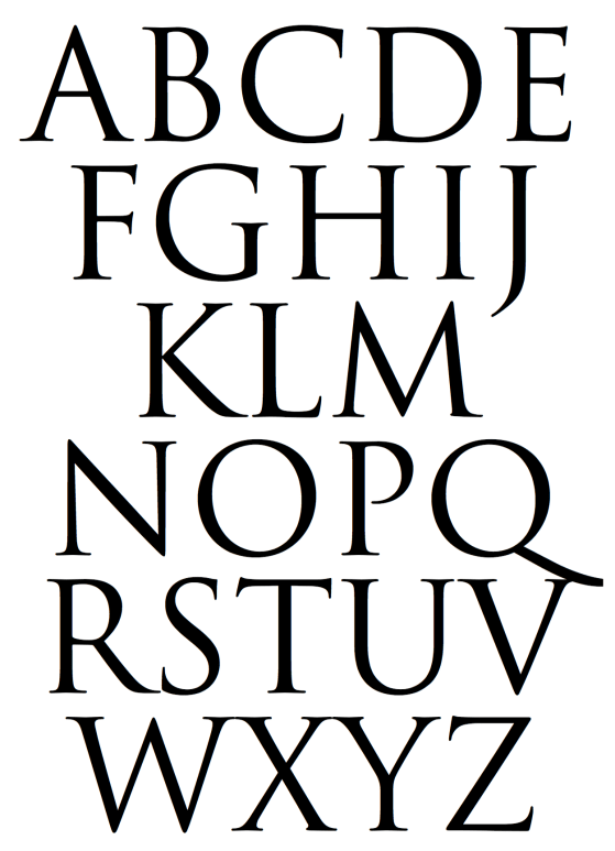
Often I am too busy hammering out page layout designs and meeting a deadline for a press date that the elegance and beauty of each letter is missed. The leg of the letter K, the arm of the letter V, the shoulder of a lowercase N, the spine of the S become a swath of gray in a field of white space. The stoke of an A, the swash of a fancy uppercase B, the bowl of the letter D, or the counter — the closed space — of the letter O become a tangled forest of 6000 characters.
In a culture where everything seems instant and ephemeral, it is a delight to enjoy a timeless typeface inspired from a two thousand year old Roman edifice. If only for a few moments.
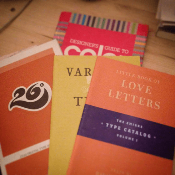
Type catalogs and color guide book circa 1991 and 2004. These artifacts of graphic design history turned up in the garage while I was searching for something else. These catalogs reminded me of a certain passion for the stories behind the creation of specific typefaces. As a young designer, I looked forward to receiving type catalogs from T26 and Émigré.
Émigré often featured text about what inspired the type designer to craft the typeface. For example, Frank Heine wrote in the catalog Various Types:
“I’ve always had a desire to design a typeface based on a Renaissance Antiqua. There are two reasons. First, the Renaissance Antiqua can be considered the prototype for most of today’s typefaces… Second, I am particularly attracted to its archaic feel,…”
I read those catalog pages the way, I imagine, a chef may read a sommelier’s writings on viticulture, enology, and food pairing.
A quiet love developed for the work of type designer Zuzana Licko. She created the typefaces Mrs. Eaves and Matrix II. Both typefaces were and still are my favorite typefaces to use in editorial projects.
If my digital tool box were restricted to only five typefaces, Helvetica, Baskerville, Mrs. Eaves, Matrix II and Gotham would be there. I thought briefly about Butler. But I know that is a passing phase. Ten years from now designed material that features Butler will look dated to this time period in the same manner that Copperplate of FF Trixie will always remind me of the late 1990s.
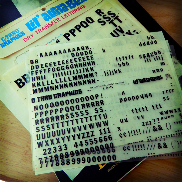
From the graphic design history archive… Anyone remember doing advertising or editorial mockups using dry transfer lettering? Or the fact that mockups were expected to take several days. Not hours.
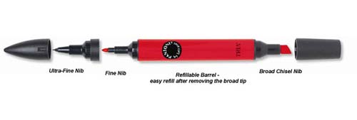
At the university where I received education in the art of design, I spent a lot of money purchasing packets of dry transfer lettering and Pantone triple nib markers. And I spent a lot of hours in the design studio developing the skill of paste ups and thumbnail layouts.
As I designed a multi-page layout project recently I could not escape the fact at how fast I was able to pull it together. The hand drawn layout thumbnails and non-repo blue line paste ups were not part of the process. Nor were there long days of sketches, dummied text, paste ups, Photostat machine, rubber cement, T-squares, proportional scale wheels and other essential pre-digital design tools.
Fortunately for me, I entered the world of advertising and marketing during the digital revolution in design. The design process for the multi-page layout project was exclusively digital — from concept to completion.
Instead of paging through thick, expensive design journals and other trade publications for color palette and typography and font inspiration, I visited a couple websites like Design Seeds[3] or Font Squirrel.[4] The color palette choice and font and photo selections were quick. That is the nature of the fast-paced environment of production work for a graphic designer.
Yet, last Thursday when the printed product arrived and I reviewed the freshly-inked pages, I was disappointed. The final printed product lacked the essence of human touch. At no point did my hand every touch the page. Everything was created by digital proxy. I can see the difference. Most designers see the difference. A careful observer may also see the difference.
Sharing this post[1] with you from nikography — plus my own story afterwards. Because graphic design is hard work.
i went to school for graphic design, and did not spend my nights getting drunk. instead, i worked my ass off, spent most of my outside-class time learning/trying/doing as much as possible, and then got an awesome job after graduating.
protip: if you’re lucky enough . . . to be in college, you should be spending all available time learning, trying, making things, messing things up, experimenting and READING. . . .
i didn’t waste a single day. and neither should you. build your momentum and go with it.
for the but-i’m-an-artist’s: you want money? learn a technical skill related to your field and get good at it. then get better at it. . . . just sayin’.
final note: i had a BLAST in college, and miss it like crazy. working hard does not mean no-fun-allowed, it means relax harder 🙂 [2][3]
—nikography
I had the unique opportunity to enter a graphic design career during the transitional years of the digital revolution in design (somewhere between the Upper Peasealithic and Macolithic periods). The university offered computer graphics classes during the final year of the academic program called commercial arts. The degree was catalogued as a bachelors in science (as opposed to a bachelors in arts).
All other graphic design classes were hands-on, analog, technical application of composition, typography, illustration, photography, color theory, and so on. And for that fact, I am grateful.
One afternoon, during critique of students’ work a professor called two of my classmates out of the room. Most of the students knew why. One of the two owned a personal computer (yes, this is back in the paleolithic days before wifi, laptops, and mobile phones). They did their copy layout (design jargon for arranging blocks of advertising text — usually Lorem Ipsum — on a page) using a personal computer and printer. Then they inked over the print outs and submitted their work. Or so the rumors went.
No one else in the class owned a personal computer and had to lay out the text for a three-panel brochure by hand using rulers, graphite and non-photo blue pencils and rubylith film for color overlays.
The professor had caught them cheating. They denied using a computer to do the text layout. Hushed conversation relayed that they were nearly suspended for the act.
The recollection of that afternoon seems so arcane and archaic. The level of craftsmanship and skill required to accomplish print layout work was demanding. Each design student spent hours a day in the studio working on each project.
It used to take weeks of hand-lettering and composing mock-up pages before submitting the design samples for ad director and client reviews. Now it takes me a morning to generate three design layout drafts of a two- to four-page project.
The digital revolution allowed for faster turnaround of design projects, but graphic design is still hard work. It is something I try to impart to interns and young designers.
If graphic design is not good, hard, rewarding work, than you’re doing it wrong.