Discovered an old portfolio during spring cleaning. The book predates the iPod. Or, for those readers under the age of 20, the iPhone or Twitter. The design samples were probably created using an old Macintosh Quadra series. Or maybe a Macintosh LC II with an integrated Sony Trinitron display screen. Aldus PageMaker 5.0 was the software used for digital design page layout. Or maybe Adobe PageMaker 6.0 or QuarkXPress 3. Either way, the software had to be installed using removable media — 3.5″ floppy disks. No internet connection on the machines — unless you were an art director or lead graphic designer. Projects and tasks did not flood your email inbox. They were assigned by paper envelope work orders or creative briefs or landline telephone.

Each portfolio sample was mounted on black core matboard with spray adhesive. It was not that I did not own a classic black leather portfolio case with two handles and black filler pages and acetate covers. I did — and still do. But I remember being advised by someone in an ad agency to present work on boards. That way a client may spread the design samples out on a conference room table for a better examination.
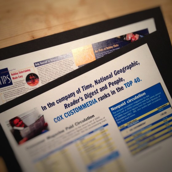
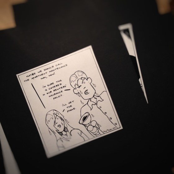
Back in the early days of the digital revolution in design, a commercial artist needed to include a spectrum of work: page layout, photography, product design, illustration, package design, logo, branding, infographics and so on. As design technology advanced, the pervading question asked was, can you draw? A senior graphic designer at the ad agency where I interned had boxes and boxes of drawings for advertising campaigns. The paste-up boards featured his illustrations on the bottom layer with an acetate overlay for text and a top layer had written mechanical instructions for the printer. One of my goals as a young graphic designer — improve my illustrations skills.
The hardware and software during that period were rather primitive by today’s standards. Much of graphic design tasks veered toward desktop publishing. That consisted of typesetting blocks of text around images in a page layout. The cathode ray tube display screen became more of a designer’s interface than a drafting or light table. Within in years, the tactile connection between commercial artist and the art object were severed indefinitely.
Whether spoken or internalize, the mantra of young graphic designers in those days was adapt or die. The desire to rapidly assimilate to the new tech outweighed the intellect to consider the consequences. In the mid to late 90s I recall young designers often took full-time jobs in construction or sales to pay off student loans. The pay was better than design jobs. But when they tried to return to a career in graphic design a few years latter the advances in hardware and software were too much. For those of us desiring to be an art director in five years, creative director in ten and partner in 15 to 20 years, we took the low wages with the long term goal in mind.
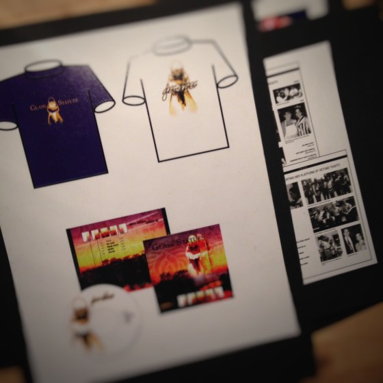
There were no web sites in the mid 1990s where designers could download a free vector-based template of a t-shirt or book cover in order to showcase custom designs. I created all my own templates. Often on a rented Mac computer at Kinko’s that charged by the hour. Now the question remains. Do I recycle these samples? or store them in a museum — in the early period of digital revolution in design wing of the museum?