“Art is work”

A drawing of my desk with books read, unread, or partially read.

It is a challenge for me. When I am introduced as an artist and/or poet. Still not comfortable with either of those nouns. The next question is inevitable. It usually goes something like this:

My wife turns and introduces me to her friend and adds, “He’s also an artist and poet, too.”

“Wow, can I see your art work on Facebook?”

“No. I am not on Facebook.”

“Oh. Instagram?”

“No. Not on Instagram, either.”

“Well. Um. What do you do? Oil paintings? Do you have a gallery somewhere?”

“He posts some of his work on his blog,” my wife offers.

About that time the bread crumb trail ends and the conversation shifts to something else.

The trouble is that some of the work I create I cannot contractually share. Technically, I do not own the copyrights to the final art. And so, I cannot distribute or display it on this or other online platforms. Frustrating. Yes. Bad. No. It is the cost of commercial arts.

For example, a couple weeks ago I drew a portrait. A line art drawing. The portrait will be featured as an etching in either crystal or acrylic as part of a lifetime award. Sometime in March. You may have seen such awards in business offices. A crystal award on black base sitting on someone’s desk or shelf or trophy case.

I am reminded of one of Milton Glaser’s mottos: “Art is work.”

Milton Glaser, celebrated graphic designer, may not be a household name. Not even in my home. But most Americans will recognize the I [heart] NY logo. It is highly unlikely that school children will study designers as part of their art curriculum. (My children are presently studying the American painter Andrew Wyeth.)

Too often I lament, or rather, complain that I spend too much time creating work in front of a screen. It was so nice to ditch the screen and work in ink on vellum and illustration paper. Took nearly four hours to draw the portrait. And that is with the interruptions of replying to emails and designing elements for a multi-page editorial piece. It would take four weeks if I tried to craft the portrait as an oil painting.

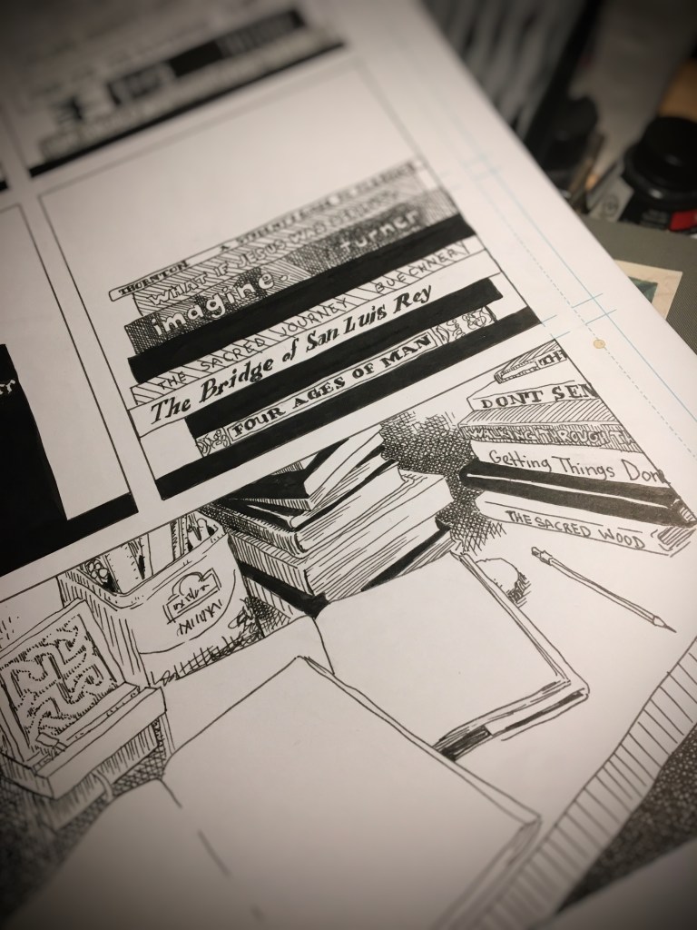
In order to answer a request (Where may I find your art work?), I drew the above page last weekend. Inspired by Jane Mount’s Ideal Bookshelf, I managed to draw the stacks of books on my desk by the bedroom window. At least fifty books. So many books. So little time. I enjoyed the exercise. It felt good to pencil a sketch, flesh out the details, and ink the page.

“Wait. You write poetry, too?”

“Um…” I start.

“Have you been published?”

“Yes,” I say.

And this time the bread crumb trail ends quickly. Because most people do not know where to begin to look for published poetry.

“He posts some of his published poems on his blog,” my wife adds.

Unbound sketchbook

What do you do when you find a 15-year old sketchbook with at least two dozen blank pages at the end of it? This sketchbook was something used many years ago to compose page layouts ideas.

It may be that as a young graphic designer I required the use of pen, ink, and paper to organize thoughts and ideas before turning to the digital tool of computer and software to complete a magazine page layout. Or a book layout. Or whatever design project it was that I was working on at the time.

Even back then, a lot of creatives were skipping the hand-drawn phase of graphic design and moving to digital sketches. I was one of those designers too. It did not take long to adapt to digital sketches using Quark Xpress or PageMaker. External and internal clients did not understand these hand-drawn sketches. I quickly understood that these initial sketches were best served between fellow creatives. A form of pictorial shorthand.

Sketches using human figures engaged clients. A point of connection. Composing advertisements and editorial layouts was enjoyable. Even when it was poorly drawn it was pleasurable. It was exciting to explore and play out ideas on pages. To balance text and image. To push the elements toward asymmetrical tension.

Sometimes referred to as “mock ups” or “work ups,” these comps (jargon for compositions) often featured ad copy or editorial headlines that I wrote. I preferred writing my own copy rather than using dummy copy, greeking, or some other form of gibberish used to represent where text was to be placed in design compositions.

These sketches bring back a lot of memories. Projects completed. Projects that never were approved. Abandoned. Like the craft of sketching designs and ideas.

I needed something to prop up the office laptop computer in order to avoid a kink in my neck as I work on print and web design tasks. MacBook Pros are not ergonomically designed. An old keyboard was located. And then a Kensington trackball mouse. And an old, unbound sketchbook. That did the trick.

This work-from-home solution is not ideal. There are days when my children see that I spend most of the time reading and replying to emails, joining video conferences, and moving file icons across the desktop to various folders synched to cloud-based servers. Graphic design looks so different from the point at which I joined the trade. It is less tactile.

The national safe-at-home quarantine allowed me to build a wood desktop and a wood stand-up-desk solution for the laptop, keyboard, trackball workplace arrangement. And the 15-year old sketchbook? Well, paging through the collection of ideas and designs. . . after a long hiatus, I began sketching and drawing on the empty pages at the end of the book.

Rented Mac computers and other joys of graphic design in the 1990s


Discovered an old portfolio during spring cleaning. The book predates the iPod. Or, for those readers under the age of 20, the iPhone or Twitter. The design samples were probably created using an old Macintosh Quadra series. Or maybe a Macintosh LC II with an integrated Sony Trinitron display screen. Aldus PageMaker 5.0 was the software used for digital design page layout. Or maybe Adobe PageMaker 6.0 or QuarkXPress 3. Either way, the software had to be installed using removable media — 3.5″ floppy disks. No internet connection on the machines — unless you were an art director or lead graphic designer. Projects and tasks did not flood your email inbox. They were assigned by paper envelope work orders or creative briefs or landline telephone.


Each portfolio sample was mounted on black core matboard with spray adhesive. It was not that I did not own a classic black leather portfolio case with two handles and black filler pages and acetate covers. I did — and still do. But I remember being advised by someone in an ad agency to present work on boards. That way a client may spread the design samples out on a conference room table for a better examination.

Back in the early days of the digital revolution in design, a commercial artist needed to include a spectrum of work: page layout, photography, product design, illustration, package design, logo, branding, infographics and so on. As design technology advanced, the pervading question asked was, can you draw? A senior graphic designer at the ad agency where I interned had boxes and boxes of drawings for advertising campaigns. The paste-up boards featured his illustrations on the bottom layer with an acetate overlay for text and a top layer had written mechanical instructions for the printer. One of my goals as a young graphic designer — improve my illustrations skills.


The hardware and software during that period were rather primitive by today’s standards. Much of graphic design tasks veered toward desktop publishing. That consisted of typesetting blocks of text around images in a page layout. The cathode ray tube display screen became more of a designer’s interface than a drafting or light table. Within in years, the tactile connection between commercial artist and the art object were severed indefinitely.

Whether spoken or internalize, the mantra of young graphic designers in those days was adapt or die. The desire to rapidly assimilate to the new tech outweighed the intellect to consider the consequences. In the mid to late 90s I recall young designers often took full-time jobs in construction or sales to pay off student loans. The pay was better than design jobs. But when they tried to return to a career in graphic design a few years latter the advances in hardware and software were too much. For those of us desiring to be an art director in five years, creative director in ten and partner in 15 to 20 years, we took the low wages with the long term goal in mind.


There were no web sites in the mid 1990s where designers could download a free vector-based template of a t-shirt or book cover in order to showcase custom designs. I created all my own templates. Often on a rented Mac computer at Kinko’s that charged by the hour. Now the question remains. Do I recycle these samples? or store them in a museum — in the early period of digital revolution in design wing of the museum?

Love letters and various type catalogs

Type catalogs and color guide book circa 1991 and 2004. These artifacts of graphic design history turned up in the garage while I was searching for something else. These catalogs reminded me of a certain passion for the stories behind the creation of specific typefaces. As a young designer, I looked forward to receiving type catalogs from T26 and Émigré.

Émigré often featured text about what inspired the type designer to craft the typeface. For example, Frank Heine wrote in the catalog Various Types:

“I’ve always had a desire to design a typeface based on a Renaissance Antiqua. There are two reasons. First, the Renaissance Antiqua can be considered the prototype for most of today’s typefaces. . . . Second, I am particularly attracted to its archaic feel, . . . “

I read those catalog pages the way, I imagine, a chef may read a sommelier’s writings on viticulture, enology, and food pairing.

A quiet love developed for the work of type designer Zuzana Licko. She created the typefaces Mrs. Eaves and Matrix II. Both typefaces were and still are my favorite typefaces to use in editorial projects.

If my digital tool box were restricted to only five typefaces, Helvetica, Baskerville, Mrs. Eaves, Matrix II and Gotham would be there. I thought briefly about Butler. But I know that is a passing phase. Ten years from now designed material that features Butler will look dated to this time period in the same manner that Copperplate of FF Trixie will always remind me of the late 1990s.


Good design is more than this


(image via Jonathan Trier Brikner)

There’s more to being a design genius than this. Truly.

Just because you have a computer, laptop or tablet allowing you to download free fonts and free images and use some free app you discovered on Twitter does not make you a design genius.

Just because you “designed” a cool graphic image the way many misled souls believe they labored and “built” an IKEA bookshelf does not make you a design genius. [1]

Celebrated graphic designer, Milton Glaser, put it best:

Computers are to design as microwaves are to cooking.

Good design solves problems and presents stories. As a creative director for an international publishing house, my chief goal is to attract potential readers to new books by capturing a story in a single cover image. To illustrate the point further, an author (for whom I had just completed a book design) emailed me recently: “I’m getting some great feedback on my Facebook page about the cover. Thank you very much…” Good design is about communication: problem solved, story told.

NOTE: [1] For what it is worth, IKEA is not good design. It is nothing more than cheaper-than-Wal-mart veneer furniture, second-rate fabric products and wax-paper lamps. And don’t call IKEA “modern design” because modern design is so 1948. Seriously, the modernist movement began almost a century ago. But I digress.