Stormy night reading

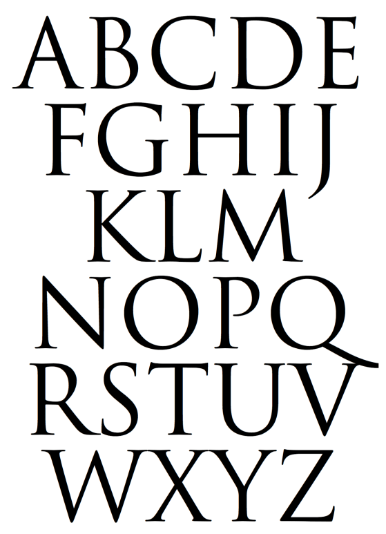
It was not the thunder or lightening that distracted me. It was the typeface. Was it the letter “s” or the letter “g” that offered a clue as to the typeface? Most likely Baskerville. But it could also be Caslon.

The wind and rain battered the window. The game’s afoot. The evidence was in a line across the page. Something about the letter “e” made me think I was wrong. The anatomy of the letter “e” features the eye on the top half of the oval. The finial is the tail and the open space between the top half of the letter and finial is the aperture.

The thunder faded as the rain slowed to a steady drizzle. It was the space of the aperture that made me consider that it was neither Baskerville or Caslon. For Baskerville, the eye should be higher and finial lower with a greater space in the aperture. But since this book was printed before the 1970s, maybe the original Baskerville typeface for Linotype looked different when printed. Computer typesetting replaced photo typesetting. And photo typesetting replaced Linotype. Maybe the form of the letters changed from Linotype Baskerville to digital Baskerville. The lights flickered but remained on.

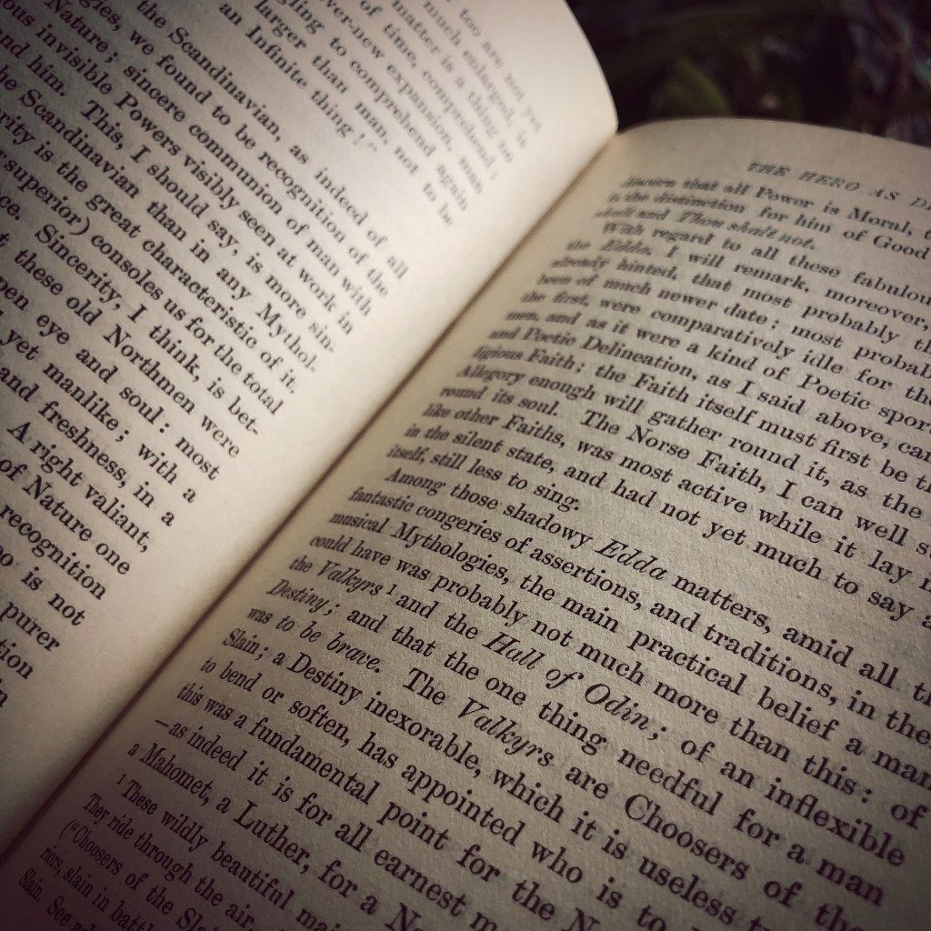
The storm moved east. The downspout outside the window burbled from the rain. And I forgot what I had been reading. A mystery? Something about heroes.

A tangled forest of 1000 letters

Wrangling pages of copy all day. Setting letters and words into rows and columns. Aligning headline copy and main body copy. Kerning. Leading. Placing an image — photo headshot of a person featured in the article. Assigning pagination to each folio.

Often I am too busy hammering out page layout designs and meeting a deadline for a press date that the elegance and beauty of each letter is missed. The leg of the letter K, the arm of the letter V, the shoulder of a lowercase N, the spine of the S become a swath of gray in a field of white space. The stoke of an A, the swash of a fancy uppercase B, the bowl of the letter D, or the counter — the closed space — of the letter O become a tangled forest of 6000 characters.

In a culture where everything seems instant and ephemeral, it is a delight to enjoy a timeless typeface inspired from a two thousand year old Roman edifice. If only for a few moments.

Love letters and various type catalogs

Type catalogs and color guide book circa 1991 and 2004. These artifacts of graphic design history turned up in the garage while I was searching for something else. These catalogs reminded me of a certain passion for the stories behind the creation of specific typefaces. As a young designer, I looked forward to receiving type catalogs from T26 and Émigré.

Émigré often featured text about what inspired the type designer to craft the typeface. For example, Frank Heine wrote in the catalog Various Types:

“I’ve always had a desire to design a typeface based on a Renaissance Antiqua. There are two reasons. First, the Renaissance Antiqua can be considered the prototype for most of today’s typefaces… Second, I am particularly attracted to its archaic feel,…”

I read those catalog pages the way, I imagine, a chef may read a sommelier’s writings on viticulture, enology, and food pairing.

A quiet love developed for the work of type designer Zuzana Licko. She created the typefaces Mrs. Eaves and Matrix II. Both typefaces were and still are my favorite typefaces to use in editorial projects.

If my digital tool box were restricted to only five typefaces, Helvetica, Baskerville, Mrs. Eaves, Matrix II and Gotham would be there. I thought briefly about Butler. But I know that is a passing phase. Ten years from now designed material that features Butler will look dated to this time period in the same manner that Copperplate of FF Trixie will always remind me of the late 1990s.

Presidential Campaign Typeface

Optima vs. Gotham

The Obama camp chose Gotham. Conceptually this chose could be a bad move (i.e. think of a future dystopian America or simply think of the south side of Chicago). Gotham is a fairly new typeface designed my Tobias Frere-Jones who was inspired by mid 20th-century architectural signage. This could swing two ways; 1) Obama could be considered as too trendy, new, inexperienced and 2) Obama could be considered as recycled material from the 1950s rather than a truly progressive. Gotham is classified as a geometric due to its lineal monoline circles and rectangles providing a modern feel. This could be a challenge for Obama if he’s trying to secure the parties base which started voting in the 1950’s.

The McCain camp chose Optima. Conceptually this chose could be a good move (i.e. think optimistic or Optimus Prime). Interestingly, Optima was designed by Hermann Zapf as one of the first digital typefaces for desktop publishing in the 1950s. This could date McCain as a dinosaur or cast him as a futurist. Further, Optima is classified as a humanist typeface due to its calligraphic elements. This could be a bad thing for McCain if he’s trying to secure the Christian vote.

(Other font thoughts from Steven Heller here).