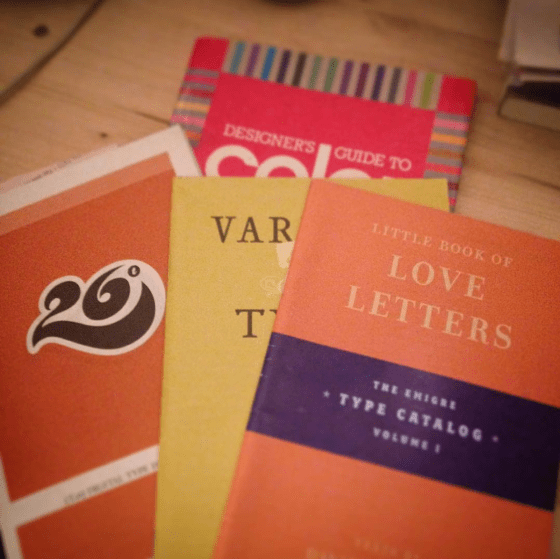
Type catalogs and color guide book circa 1991 and 2004. These artifacts of graphic design history turned up in the garage while I was searching for something else. These catalogs reminded me of a certain passion for the stories behind the creation of specific typefaces. As a young designer, I looked forward to receiving type catalogs from T26 and Émigré.
Émigré often featured text about what inspired the type designer to craft the typeface. For example, Frank Heine wrote in the catalog Various Types:
“I’ve always had a desire to design a typeface based on a Renaissance Antiqua. There are two reasons. First, the Renaissance Antiqua can be considered the prototype for most of today’s typefaces… Second, I am particularly attracted to its archaic feel,…”
I read those catalog pages the way, I imagine, a chef may read a sommelier’s writings on viticulture, enology, and food pairing.
A quiet love developed for the work of type designer Zuzana Licko. She created the typefaces Mrs. Eaves and Matrix II. Both typefaces were and still are my favorite typefaces to use in editorial projects.
If my digital tool box were restricted to only five typefaces, Helvetica, Baskerville, Mrs. Eaves, Matrix II and Gotham would be there. I thought briefly about Butler. But I know that is a passing phase. Ten years from now designed material that features Butler will look dated to this time period in the same manner that Copperplate of FF Trixie will always remind me of the late 1990s.
