The Repository of Neglected Things, published

Why was The Repository of Neglected Things written, illustrated and published?

The idea of this published project began grudgingly.

First, some background. Old sketchbooks, from decades ago, resurfaced when I cleaned the garage a year or so ago. 

“What am I going to do with these?” I asked my wife. 

“Save them,” she answered. 

The cleaning plan was to throw away or sell garage items. Throwing away these large sketchbooks was not an option. And neither was selling them. The black cloth cover hardback sketchbooks varied in sizes. Most of them were nine inches wide by 12 inches high with 96 to 110 pages. Some were smaller. The smallest was four inches wide by six inches high. The largest was 11 inches wide by 14 inches high. 

A navy blue cloth cover hardback sketchbook made its way from the garage to my desk. It measured six inches wide by nine inches high. The little blue book was half full of sketches. Or half empty. As many as 40 blank pages. My wife encouraged me to fill the blue cloth sketchbook with drawings. My children asked me to make more drawings. One of the children requested I storyboard a comic book. Or picture book. Reluctant, I began a few pencil drawings. My wife bought me some brush markers. I added more sketches. Once the blue sketchbook was filled with drawings, I reviewed it. Should I return it to the garage with the other black sketchbooks?

Summer faded to Autumn. A plan formed around the recently filled blue sketchbook. A mission to show my children that they can write and illustrate their own stories, their own books. The goal. Showcase their work in a print publication. A comic book. With creativity and energy they pulled their stories together. They learned about the process of creating a story, illustrating, organizing pages and layout, and basic pre-press tasks. The stories from the children featured one about cats baking muffins and another of a mouse warrior. My contribution to the anthology was selected drawings from the blue sketchbook. The art inside spanned twenty years. A single narrative titled “The Little Blue Sketchbook” tied the drawings together.

Finally, the publication The Repository of Neglected Things arrived. The children celebrated by flipping through the pages. They paused to examine their contributions. They read selections to each other. And then collected copies to send to friends and family. One child asked, “So, when do we publish the next edition?”

Thursday reminder to keep going


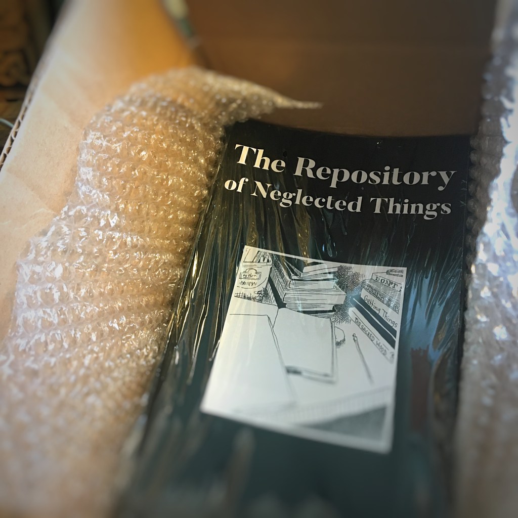
What does one do with old, unpublished artwork? Dozens upon dozens of illustrations remain hidden. Housed in art portfolio cases and cardboard boxes. These sketches, drawings and illustrations remain artifacts of decades of work.

They resurfaced this summer. Drawings and illustrations created with the purpose of advancing a career as a children’s book writer/illustrator, comic book artist and/or cartoonist. Several four-page comic book stories present an exercise toward a full-length comic book. Inspired by the 1990s indie comic scene, a lot of the stories are slice-of-life scenes and dramas. One collection of illustrations is a story written by a friend. Another set of drawings features character drawings for a writer seeking to pitch a proposal to Image Comics.

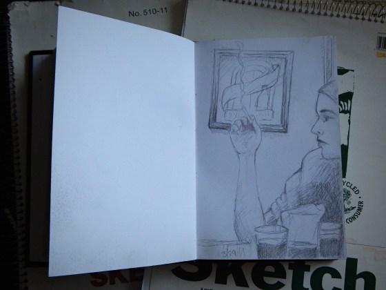
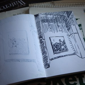
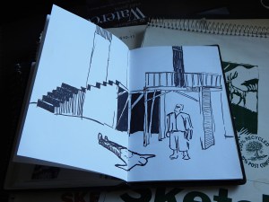
There is a portfolio case filled with pages of a first issue and half a second issue of an indie comic. It was created for a writer who contacted me to collaborate on the project. The pages display pen and brush illustrations. Think of the early work of David Collier. If he drew every page with his right hand. (He is left-handed. If I recall correctly.) On second thought, maybe it doesn’t look anything like David Collier’s work. The struggle with this indie project was that I learned that I do not illustrate fast and well at the same time. Back in those pre-iPhone/pre-Twitter days, I worked as a graphic designer during the day and an artist by night. A 30-day deadline to complete 22 pages plus cover art was a difficult task. If I had worked eight hours a day on the project instead of two hours a day, maybe the results would have been better. The indie comic was never published.

Another sketch book has pages of comps for a cartoon strip. The idea was that if I cannot draw detailed panels and pages fast, maybe I can draw cartoons faster. So, I created a cartoon character and comic strip and discovered that drawing a cartoon is just as time intensive as illustrating detailed comic pages. I pivoted toward a cartoon style similar to Jim Davis. In short, a comic strip with near static panels and subtle changes in art between one panel and the next. Sort of a pre-Adam Ellis templated four-panel strip. The comic strip was published regularly in a North Carolina alternative newspaper until the paper took an extended sabbatical.

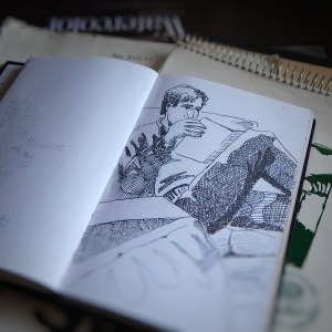
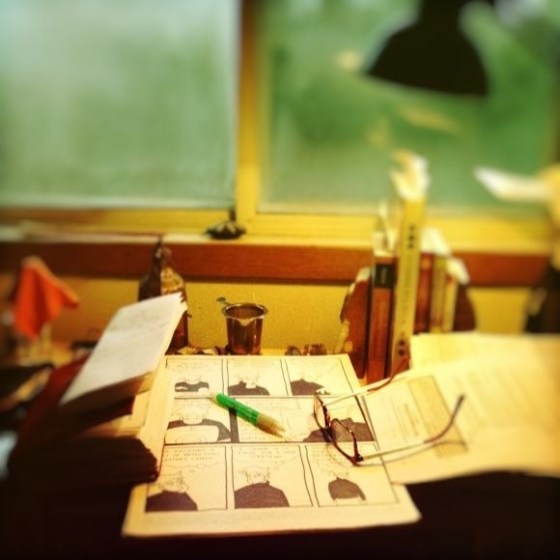
“I like that one,” my bride commented. Dozens of cartoon pages rest on a desk in our bedroom.

“Maybe I should collect these pages into a book,” I offered.

“What do mean?”

“You know, like an artist’s sketchbook or portfolio book. I’ve got several of those type of books.” I think of books like Michael Wm. Kaluta Sketchbook or C. Vess Sketchbook.

“Yeah, but aren’t those more like retrospectives of an artist’s celebrated career?”

“Hm. Yeah. I guess you’re right,” I answered. But why can’t it be used to promote a career, I think to myself.

“Maybe after you’ve published your magnum opus.”

“Yeah. I guess so.”

The illustration boards still rest on the desk I built from salvaged wood. A reminder to keep going.

Dry transfer lettering and the human touch

Dry transfer type

From the graphic design history archive… Anyone remember doing advertising or editorial mockups using dry transfer lettering? Or the fact that mockups were expected to take several days. Not hours.

At the university where I received education in the art of design, I spent a lot of money purchasing packets of dry transfer lettering and Pantone triple nib markers. And I spent a lot of hours in the design studio developing the skill of paste ups and thumbnail layouts.

As I designed a multi-page layout project recently I could not escape the fact at how fast I was able to pull it together. The hand drawn layout thumbnails and non-repo blue line paste ups were not part of the process. Nor were there long days of sketches, dummied text, paste ups, Photostat machine, rubber cement, T-squares, proportional scale wheels and other essential pre-digital design tools.

Fortunately for me, I entered the world of advertising and marketing during the digital revolution in design. The design process for the multi-page layout project was exclusively digital — from concept to completion.

Instead of paging through thick, expensive design journals and other trade publications for color palette and typography and font inspiration, I visited a couple websites like Design Seeds[3] or Font Squirrel.[4] The color palette choice and font and photo selections were quick. That is the nature of the fast-paced environment of production work for a graphic designer.

Yet, last Thursday when the printed product arrived and I reviewed the freshly-inked pages, I was disappointed. The final printed product lacked the essence of human touch. At no point did my hand every touch the page. Everything was created by digital proxy. I can see the difference. Most designers see the difference. A careful observer may also see the difference.

NOTES:


[1] Image originally posted: August 8, 2014. https://coffeehousejunkie.net/2014/08/08/dry-transfer-lettering/
[2] It is a challenge to purchase the old style triple nib markers. Here is one source: AOE Artworld.

[3] Design Seeds: https://www.design-seeds.com/

[4] Font Squirrel: https://www.fontsquirrel.com/