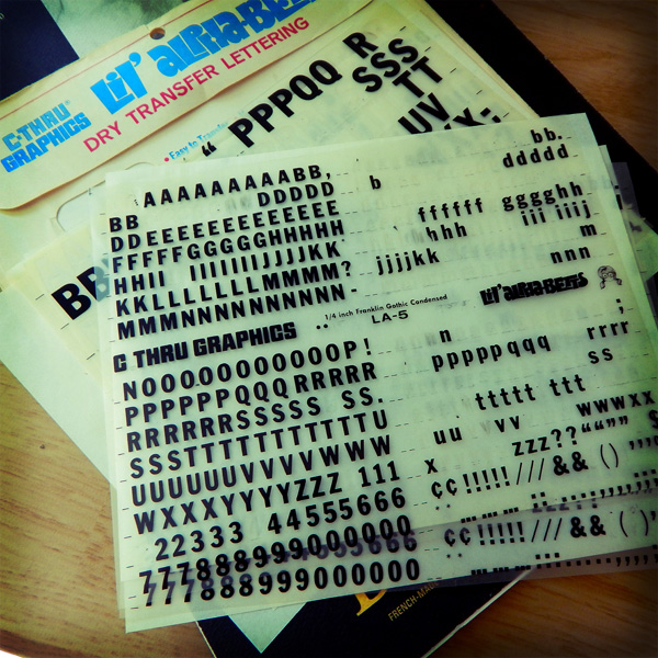
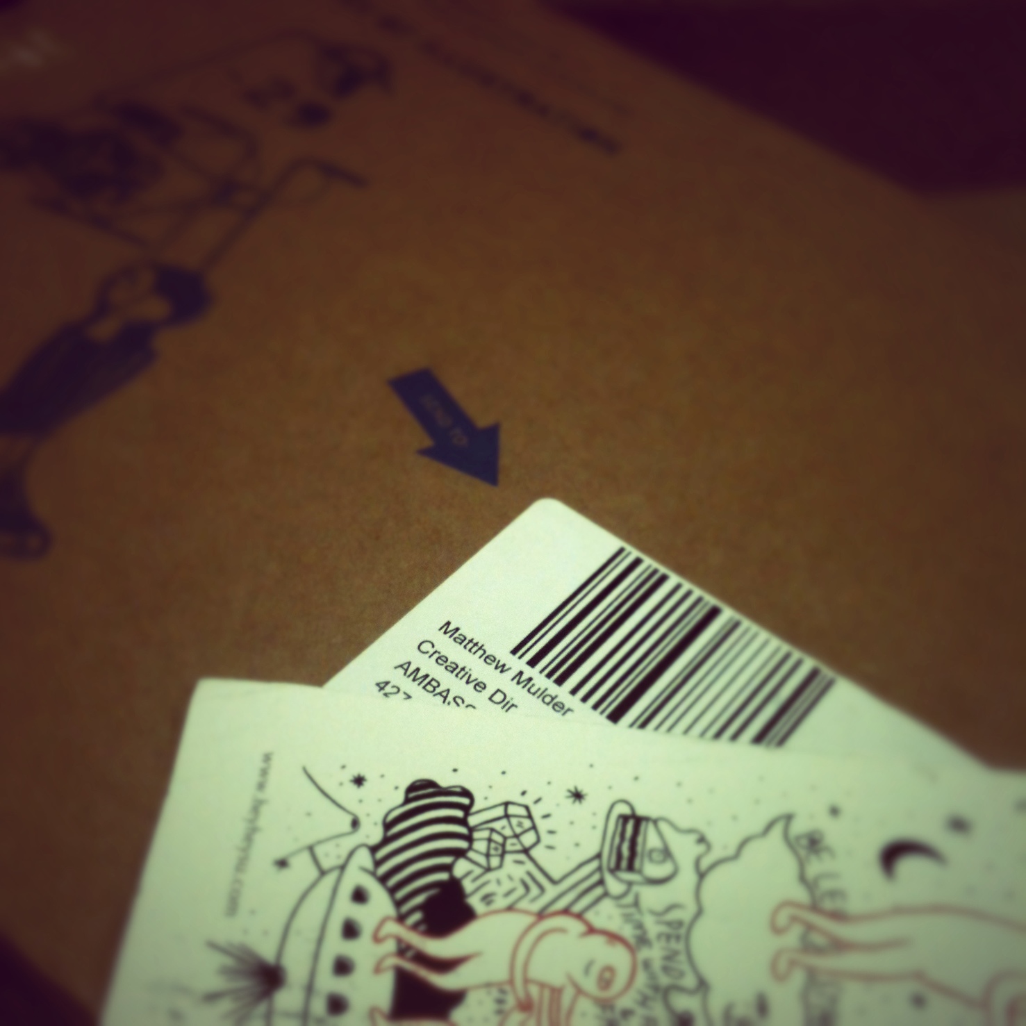
Discovered an old portfolio during spring cleaning. The book predates the iPod. Or, for those readers under the age of 20, the iPhone or Twitter. The design samples were probably created using an old Macintosh Quadra series. Or maybe a Macintosh LC II with an integrated Sony Trinitron display screen. Aldus PageMaker 5.0 was the software used for digital design page layout. Or maybe Adobe PageMaker 6.0 or QuarkXPress 3. Either way, the software had to be installed using removable media — 3.5″ floppy disks. No internet connection on the machines — unless you were an art director or lead graphic designer. Projects and tasks did not flood your email inbox. They were assigned by paper envelope work orders or creative briefs or landline telephone.

Each portfolio sample was mounted on black core matboard with spray adhesive. It was not that I did not own a classic black leather portfolio case with two handles and black filler pages and acetate covers. I did — and still do. But I remember being advised by someone in an ad agency to present work on boards. That way a client may spread the design samples out on a conference room table for a better examination.
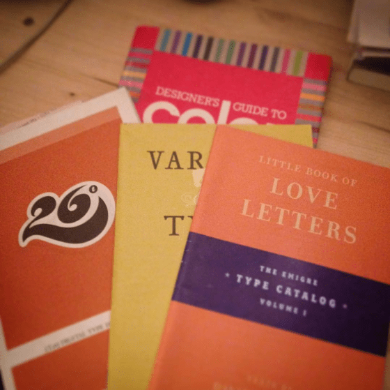
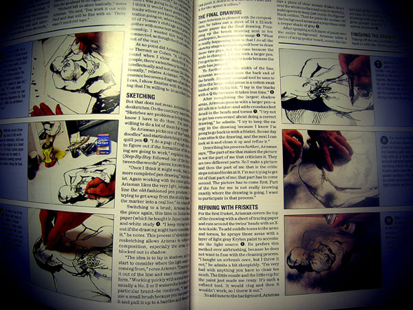
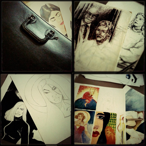
Back in the early days of the digital revolution in design, a commercial artist needed to include a spectrum of work: page layout, photography, product design, illustration, package design, logo, branding, infographics and so on. As design technology advanced, the pervading question asked was, can you draw? A senior graphic designer at the ad agency where I interned had boxes and boxes of drawings for advertising campaigns. The paste-up boards featured his illustrations on the bottom layer with an acetate overlay for text and a top layer had written mechanical instructions for the printer. One of my goals as a young graphic designer — improve my illustrations skills.

The hardware and software during that period were rather primitive by today’s standards. Much of graphic design tasks veered toward desktop publishing. That consisted of typesetting blocks of text around images in a page layout. The cathode ray tube display screen became more of a designer’s interface than a drafting or light table. Within in years, the tactile connection between commercial artist and the art object were severed indefinitely.
Whether spoken or internalize, the mantra of young graphic designers in those days was adapt or die. The desire to rapidly assimilate to the new tech outweighed the intellect to consider the consequences. In the mid to late 90s I recall young designers often took full-time jobs in construction or sales to pay off student loans. The pay was better than design jobs. But when they tried to return to a career in graphic design a few years latter the advances in hardware and software were too much. For those of us desiring to be an art director in five years, creative director in ten and partner in 15 to 20 years, we took the low wages with the long term goal in mind.

There were no web sites in the mid 1990s where designers could download a free vector-based template of a t-shirt or book cover in order to showcase custom designs. I created all my own templates. Often on a rented Mac computer at Kinko’s that charged by the hour. Now the question remains. Do I recycle these samples? or store them in a museum — in the early period of digital revolution in design wing of the museum?

![DSCN6003[DSCN6002[sqr-basic-lomo-dusk-tilt]]](https://coffeehousejunkie.net/wp-content/uploads/2016/07/dscn6003dscn6002sqr-basic-lomo-dusk-tilt.jpg?w=560)


 If you have a couple minutes, enjoy this video titled “Don’t tell designers how to do their own job. . .”:


 For me, every book cover I design begins with pencil sketches that eventually lead to ink drawings. Actually, I suppose it begins prior to that. The author receives a pre-publication questionnaire from me prior to the design process. The questionnaire asks the author what is his/her elevator pitch, what are the pillars of the book (i.e. what are three main concepts/ideas in the book?), and what is the book’s key audience? There are more questions that help me prepare for the design process, but reading through that document helps me form an idea of who the author is, what the book is about and how best to represent the book’s content with an attractive cover.
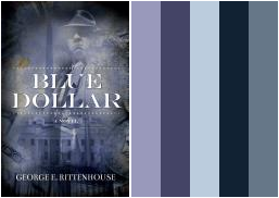
 The full-color design is often photographic, as in the case of this sample, but can also feature illustrated work or typographic designs. An illustrated cover is sent to a freelance artist who spends a week or so producing the cover art. The final cover design pulls together all the elements (art, photo, type and copy) to present a cover that, in theory, sells a 1000 to 3000 copies on face value. I know what you’re thinking, but books really are judged by their covers. Just watch people at a bookstore. They’re scanning covers before they even pick up a book to read the back copy blurb or open a book to read the first few chapters. If a book has amateurish art or less than professional photography, the audience will move to the next book cover that has great photography or stunning artwork. Further, if a book has poor quality cover art, it will be represented in poor book sales. Let me say it again: if a book has crappy cover art, the book will have crappy sales. No reader wants a crappy book on their bookshelf or e-reader. Half the battle for a reader’s attention is getting him/her to pick the book from the shelf. The same applies to e-book stores. Readers are scanning covers from the Kindle or Nook e-stores and deciding, based on cover design and book blurb, what title to purchase.