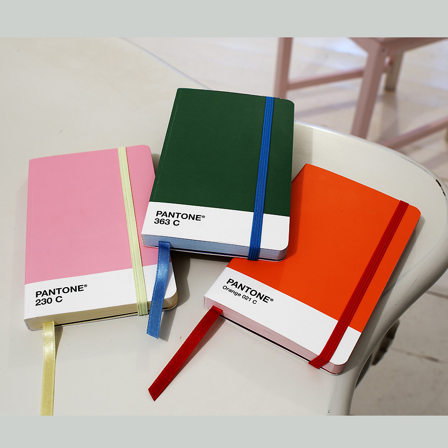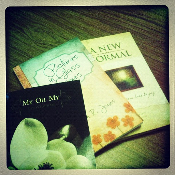
Just a few of the books I designed during the last few weeks.
Just a few of the books I designed during the last few weeks.
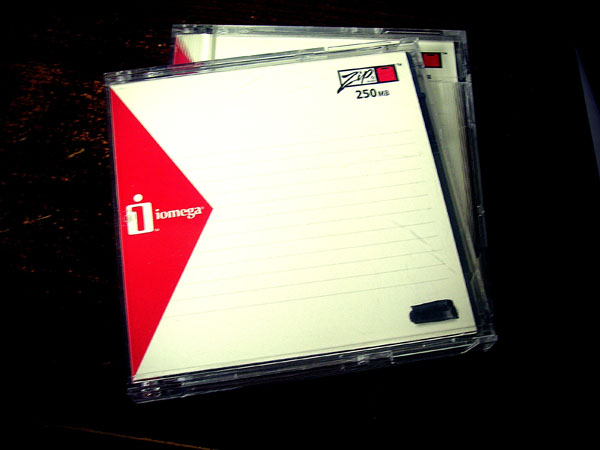
Better yet, does anyone have a Zip drive?
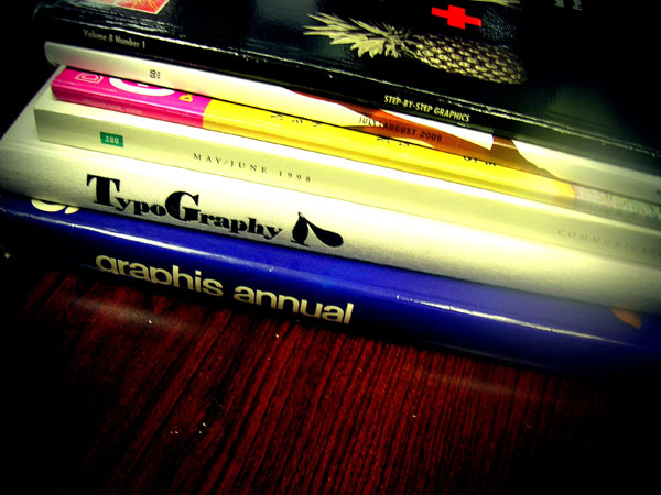
Cleaning out an old desk and discovered these books.
NOTES:
1) szymon, accessed April 21, 2011, http://inspire.2ia.pl/post/3216409498 (page no longer available, web site deactivated)
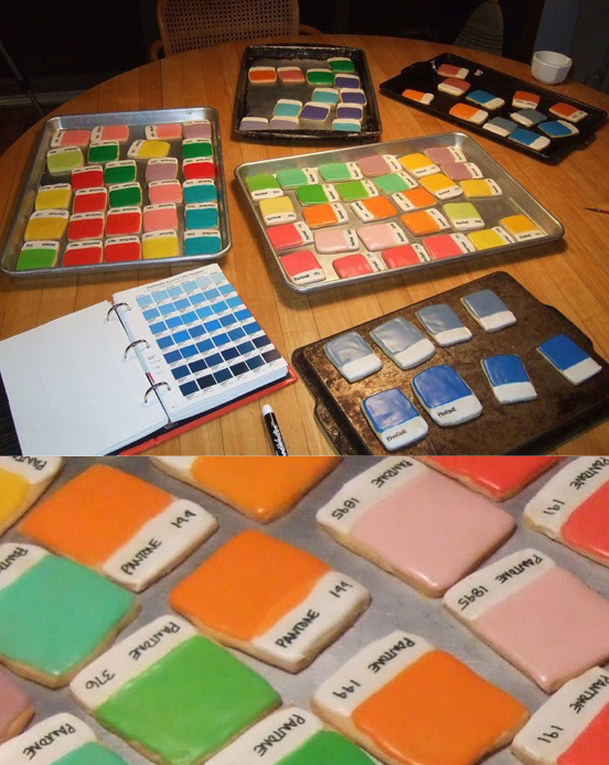
2) Laura Sweet, “Pantone Color Chip Cookies! Kim Neill Bakes Up Deliciously Divine Design.,” February 2011, If it’s Hip, It’s Here, accessed April 21, 2011, https://ifitshipitshere.blogspot.com/2011/02/pantone-color-chip-cookies-kim-neill.html?zx=9222f2c9e0dcd152
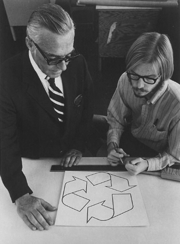
Gary Anderson (right), creator of the recycling symbol, 1970.
Anderson was a 23-year-old USC Architecture graduate when he entered the Container Corporation of America’s design contest to create what would become the universal symbol for recycling.
(via waxandmilk) 1
( via noonebelongsheremorethanyou) 2
(via brocatus) 3
NOTE:
1) Mark Malazarte, waxinandmilkin, accessed September 17, 2010, https://waxinandmilkin.com/post/963308730/gary-anderson-right-creator-of-the-recycling Tumblr account deactivated.
2) noonebelongsheremorethanyou, September 17, 2010, https://noonebelongsheremorethanyou.tumblr.com/post/964604837/anneyhall-gary-anderson-right-creator-of-the Tumblr account deactivated.
3) André Brocatus, André Brocatus was here…, September 17, 2010, https://brocatus.tumblr.com/post/964633674/noonebelongsheremorethanyou-gary-anderson
Earlier this week we did a post on a printed piece created by British design firm Spin that details the top 10 books from 50 major figures in graphic design.We sorted through the 500 listed books and found that there were 14 books that appeared in almost every list.
Here’s the list in no particular order:
01. A Designer’s Art Paul Rand
02. Typographie Emil Ruder
03. Mode en Module Wim Crouwel
04. A History of Graphic Design Phillip Meggs
05. Jan Tschichold: Typographer Ruari McLean
06. Design as Art Bruno Mari
07. 8vo: On the Outside Mark Holt
08. Tibor Kalman: Perverse Optimist Peter Hall
09. Weingart: My Way to Typography Wolfgang Weingart
10. Designed Peter Saville
11. How to be a graphic designer with…Adrian Shaughnessy
12. The Tipping Point Malcolm Gladwell
13. Modern Typography: An Essay in Critical… Robin Kinross
14. Envisioning Information Edward Tufte
NOTES:
1) Liz, “Follow up: Spin asks: What are the top ten books you believe designers should read?” accessed January 27, 2010, https://liz.tumblr.com/post/352754770/follow-up-spin-asks-what-are-the-top-ten-books
2) Plaid-Creative, accessed January 27, 2010, http://blog.plaid-creative.com/post/346685665/follow-up-spin-asks-what-are-the-top-ten-books-you (page no longer available, Tumblr account deactivated)
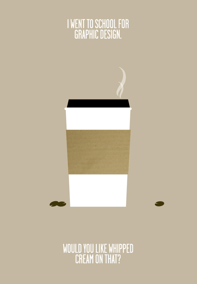
i went to school for graphic design, and did not spend my nights getting drunk. instead, i worked my ass off, spent most of my outside-class time learning/trying/doing as much as possible, and then got an awesome job after graduating.
protip: if you’re lucky enough (and i mean it when i say lucky) to be in college, you should be spending all available time learning, trying, making things, messing things up, experimenting and READING. (seriously. they make sketchbooks with words in them already. they are just called books.)
i didn’t waste a single day. and neither should you. build your momentum and go with it.
for the but-i’m-an-artist’s: you want money? learn a technical skill related to your field and get good at it. then get better at it. jonathan harris built wefeelfine on the weekends while working a full time job. just sayin’.
final note: i had a BLAST in college, and miss it like crazy. working hard does not mean no-fun-allowed, it means relax harder 🙂
orginal image via synecdoche
(via vanseodesign)
so, i work at a company that makes videos. that means lots of props. since it’s much easier to just make something like a giant fake ticket with custom text than edit/composite it in later, there’s lots of fun stuff to be made.
in the world of digital art/graphic-making, this is totally dying. why make something to photograph when you can just composite the image from assets on the screen?
because it never. looks. as. good. (seriously!)
examples that will always fail: why hand draw type when you can just pick a handwriting font? why write on a box when i can just draw on the box with my tablet? why take a certain photograph when i can just digitally change his/her hair color and possibly move that arm over somewhere else…
answers: because the handwritten effect is lost when every duplicate letter looks exactly the same. because it will always look like you just drew on a box with your tablet and skewed it (and no layer blending property can achieve the correct texture). because the photo will always be just slightly off.
so, if you want to make some text out of yarn or whatever. don’t go looking for a photoshop brush, just friggin’ do it. on your desk, on a big white piece of paper. your results will thank you.
Theoretically, a great number of ideas assures a great number of choices, but such choices are essentially quantitative. This practice is as bewildering as it is wasteful. It discourages spontaneity, encourages indifference, and more often than not produces results which are neither distinguished, interesting, nor effective. In short, good ideas rarely come in bunches.
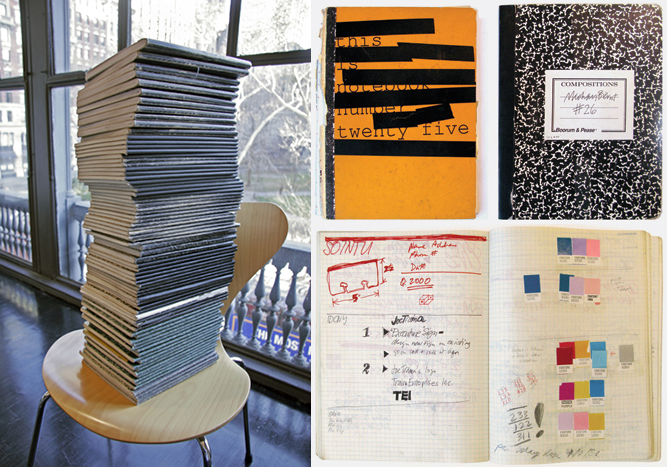
Michael Bierut shares notebooks he has kept from 1982 until 2008.
“There always seems to be a lot of interest in designers’ sketchbooks, but I call these notebooks for a reason. I’ve seen other designer’s sketchbooks and I’m always impressed by how much creativity is on display. Not in mine. Page after page contain nothing but records of phone conversations, notes from meetings, price estimates, specifications. I keep the random doodles to a minimum. Someone looking at those pages would think the book might belong to a lawyer or, more likely, a party planner. Every once in a while, though, there are some drawings that would suggest that the owner was a designer.” – Michael Bierut
I’ve always envied other designers who keep really interesting notebooks with amazing sketches and beautifully handwritten notes, worthy of exhibition (Jose Cabaco, Mathias Paeres, Patrick Rockwell..). I’ve tried to analyse my notebooks at one time, and out of laziness I drew the conclusion that my role and relationship with my work has reached a point where I don’t feel the need to meticulously draft it all out. But a more accurate analysis would be that my process is just different from those designers whose notebooks I envy. And this is ok. Thanks Mr. Bierut. 🙂
What if a print magazine used the same template for every article? It would be pretty boring, no?
The Death Of The Blog Post – Smashing Magazine1 (via fluffynotes)
NOTES:
1) Vitaly Friedman, Nov 19, 2009, “The Death Of The Blog Post,” Smashing Magazine, accessed April 29, 2026, https://www.smashingmagazine.com/2009/11/the-death-of-the-blog-post/
via DesignApplause
Good design is innovative
Good design makes a product useful
Good design is aesthetic
Good design helps us to understand a product
Good design is unobtrusive
Good design is honest
Good design is durable
Good design is consequent to the last detail
Good design is concerned with the environment
Good design is as little design as possibleDieter Rams (born May 20, 1932 in Wiesbaden) is a German industrial designer closely associated with the consumer products company Braun and the Functionalist school of industrial design.
In 1993 I asked Dieter to speak to the Architecture & Design Society at the Art Institute of Chicago. The society recently had a name change: “design” had been added. We joked ( ahem ) at the time that the real estate economy was so bad that the Architecture Society needed new members. We needed a credible and passionate design icon to speak to this group. Dieter became the first designer to speak under the society’s new name.
What I remember that night and again recently while watching the Objectified movie was Dieter’s 10 design principles. Honestly, I can’t tell you for sure that these are the same principles. Hoping Dieter will set the story straight.
I think I like the earlier stuff better. Maybe it was the materials or maybe it was so different than the pack at the time. The first Braun product I remember making a design connect to me was an electric razor. Much of Dieter’s work has long seemed more connected to brutalism than minimalism. Let’s say beautifully, brutally, minimal.
quality paper action book (via)
scumblr: (via ffffound)