Strange Throwback Thursday

Comic Stroll 2013


After nearly a six-year hiatus, I was excited to see a project that began with notes and sketches transform into a published comic strip. Even if it was a one-off. Even if I had to hand the responsibility of drawing each panel to someone else. It was done.

I had imagined that the creative non-fiction comic story I crafted would earn some interest. Maybe it would open a few doors to an audience. And allow me to write and illustrate. Even earn some money. Maybe I would quit my day job and provide for my household by doing something I loved. Telling stories. And drawing pictures.

That was five years ago.

A few weeks ago I found a box in the garage. It had several copies of a publication that printed my comic strip. I glanced over the pages and then placed them back into the box. I also found several books. Opened one book I remembered enjoying.

“What’s that?” asked one of the children.

“It’s a collection of comic strips.”

“Oh.”

I pulled a copy from the box and gave it to the child.

“There’s a story in there I wrote.” I said. “See if you can find it.”

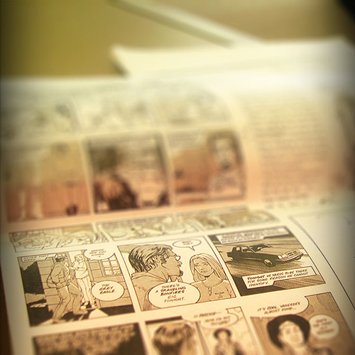
The child took the copy of Comic Stroll and headed off to the couch in the living room.

I flipped through the pages of the book I had found. Read a few highlights.

Yeah, I resemble that, I thought to myself after reading a few lines at the end of the book. The author referenced a friend of his who gave up an art gig for a corporate job in order to provide for his family.

Yeah. I know what that is like.

How many comic pages might I have written and illustrated if I had. . . Well, what-ifs and might-have-beens are dangerous paths to pursue. What you did, great or small, is what matters.

Watching my progeny spend an afternoon reading comic strips I had a hand in creating was a pleasure.

NOTES:
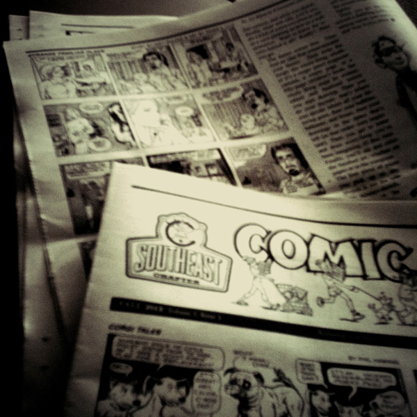
Comic Stroll, a publication of the Southeast chapter of the National Cartoonist Society, featured a collection of previously unpublished comic strips. You can read the whole journey of what started in November 2005 as a couple drawings and became a creative non-fiction comic strip:
[1] Comics and Narrative Non-Fiction
[2] Comics and Narrative Non-Fiction Continued
[3] Narrative Non-Fiction Comics: part 3
[4] Narrative Non-Fiction Comics: part 4
[5] Narrative Non-Fiction Comics: part 5
[6] Narrative Non-Fiction Comics: UPDATE
[7] Narrative Non-Fiction Comics: UPDATE
[8] Strange Familiar Place comic series
[9] Strange Familiar Place returns
[10] The return of Strange Familiar Place to print

This week in Asheville, 100 Thousand Poets for Change

100TPCAVL Web Poster
Just a few more days until the Asheville 100 Thousand Poets for Change event!

Join Caleb Beissert, Steve Brooks, Jeff Davis, Davon Dunbar, Barbara Gravelle, Shanita Jackson, Britt Kaufmann, Matthew Mulder, Jessica Newton and Brian Sneeden at Sly Grog Wine and Beer Lounge (The Downtown Market, 45 South French Broad Avenue, Asheville, North Carolina), Saturday, September 28, 2013, 7 PM – 9 PM.

Asheville Poets represent 100 Thousand Poets for Change

100TPC2013

Here is your official invitation to join a global event called: 100 Thousand Poets for Change.

The Asheville event will be held September 28, 2013, 7 PM – 9 PM at Sly Grog Wine and Beer Lounge (The Downtown Market, 45 South French Broad Avenue, Asheville, North Carolina). Featured poets include: Caleb Beissert, Steve Brooks, Jeff Davis, Davon Dunbar, Barbara Gravelle, Shanita Jackson, Britt Kaufmann,  Matthew Mulder, Jessica Newton and Brian Sneeden.

Use the hashtag #100tpcAVL when sharing details about Asheville’s 100 Thousand Poets for Change event.

For more information, or if you have questions, please leave a comment. Thanks!

UPDATE: Here’s a PDF file of the event poster for 100 Thousand Poets for Change Asheville event next week. Download here: 100TPC AVL Poster.

Strange Familiar Place returns

Stange Familiar Place - Comic Strip

After a very long hiatus, “Strange Familiar Place” will be back in print. Or at least it will be in a very limited capacity. More details on that later.

The creative non-fiction comic “Strange Familiar Place” first appeared in The Indie. Inspired by the works of Harvey Pekar, Jessica Abel, and Eddie Campbell, I wrote and illustrated “Strange Familiar Place.” Eventually I collaborated with illustrator and comic book artist James E. Lyle on six comic strips.

Comic Stroll, a publication of the local chapter of the National Cartoonist Society, will feature that collection of previously unpublished comic strips. Read the evolution of what started as a couple drawings and became a creative non-fiction comic:

  1. Comics and Narrative Non-Fiction
  2. Comics and Narrative Non-Fiction Continued
  3. Narrative Non-Fiction Comics: part 3
  4. Narrative Non-Fiction Comics: part 4
  5. Narrative Non-Fiction Comics: part 5
  6. Narrative Non-Fiction Comics: UPDATE
  7. Narrative Non-Fiction Comics: UPDATE
  8. Strange Familiar Place comic series

More details about Comic Stroll distribution will be made available later.

Anatomy of a children’s book

Updated - Anatomy of a Children's Book

Updated – Anatomy of a Children’s Book

UPDATE: A new image of the anatomy of a children’s book replaced the smartphone photo.

This crude sketch was quite popular at a recent meet-up of illustrators and comic book artists. Basically, the topic of children’s books came up and I got the impression that the idea of creating a children’s book was intimidating to artists. As well it should be. But it is not a path of labyrinthian impossibility. The big question is how to do it.

So, to encourage these artists, I showed them this dissection of a children’s book: 22 illustrations (five spreads), 18 pages of text (51 lines to be specific) an 32 pages (including title pages, front matter and back matter), intro story and character on page four, intro dilemma on page 14, how to solve problem (pages 15 to 23), problem solved on page 24 and resolution on page 28. It didn’t take long before a several artists were asking to take a photo of this anatomy of a children’s book with their smart phones.

Like all recipes, what you do with the ingredients (i.e. text, words and pages) is up to the artist and writer. And, like any good disclaimer, results do very.

Vanishing art

Anyone remember when you used to capture a photo and had to wait weeks to see how the negative film exposed to light translated by silver halide salts to a produce a positive image on paper?

June 2012 Poetrio reading series with Donna Lisle Burton, Alice Osborn, and Erica Wright

Sunday afternoon, June 3rd at 3 p.m., the Poetrio monthly reading series continues with Donna Lisle Burton, Alice Osborn, and Erica Wright. Details here [link].

From Malaprop’s community outreach director, Virginia McKinley:

Poet and visual artist Donna Lisle Burton. . . . has two previous collections of poems; is also an accomplished painter, portraitist, and photographer; and has four decades of experience as a special education teacher. Of Donna Lisle Burton’s third collection of poems, LETTING GO, award-winning Asheville poet Pat Riviere-Seel has written, “Do not be misled by the title: once you start reading, there will be no Letting Go [sic].”  North Carolina Poet Laureate Cathy Smith Bowers has offered this additional appreciation: “Reading the poems of Donna Lisle Burton is like happening upon a cache of tender and beautifully crafted love letters.  Among the objects of her most intimate affections are lovers both old and new — parents and siblings and children; students and friends; flowers and bridges and mills.  And, finally, her luckiest of lovers, whoever might open the pages of this exquisite book.”  The variations on letting go that are gathered in this collection are not entirely beautiful or easy, and not always for the reasons one might anticipate. . . .

Alice Osborn is another transplant to North Carolina. . . . AFTER THE STEAMING STOPS is her most recent collection of poetry; previous collections are Right Lane Ends, and Unfinished Projects.  The latter prompted these remarks from writer Homer Hickam: “I love Alice’s poetry.  She gives me thoughts I’ve never thought, and dreams I’ve never dreamed.  She uses words like a master potter — molding the clay of the mind into vessels that hold not things, but life, place, and time.”  AFTER THE STEAMING STOPS seems a book more of broken dreams than of new or unexpected ones.  There is no sentimentality in the face of death, departures, endings. . . Before the fierceness of nature and life, love becomes fierce — but after the fact, and nearly as helpless as the child who declared, “I’ll find my own way!” — and bicycled off as a tornado approached, “no clue dueling cyclones ate children / near the road he and Daddy drive on every day to school.”

Erica Wright. . . . serves as poetry editor for Guernica, a magazine of art and politics, and teaches creative writing at Marymount Manhattan College. . . . Of her 2011 book, INSTRUCTIONS FOR KILLING THE JACKAL, Christopher Crawford observed in a recent review for the literary magazine Neon, “Wright is not afraid to use the darkest of imagery combined with a violence of language. A great number of the poems here are in tercets and couplets and Wright makes good use of these forms[,] which allows her to move her short, sharp-edged anecdotes with disquieting ease from beginning to end. Wright’s poems often follow the tracks of her thoughts through various twists, turns and enjambments. The darkness that informs these images is always just below the surface, the music in the lines is subtle and tense . . . The poems give a sense of someone trying to find something while at the same time avoiding it, leaving the scene while simultaneously confronting it. . . .”  Erica Wright’s imagery, settings, and situations often recall the elements of tall tales — but tales whose paths soon wind toward mythical landscapes, the unsettling territory and characters of fables, a realm of constant metamorphosis and of faith mingled with superstition. . .

Hope to see you at this month’s Poetrio reading series.

How to capturing abstract ideas in a book cover design

How do you capture an abstract thought for a book cover design? That’s the question one person left in the comments section to Judging a book by its cover.

That is a challenge. A lot of abstract ideas — like love, grief, joy, freedom, etc. — have emotional and psychological weight. Photography is an easy tool to use in conveying physical responses to abstract thoughts. Photos illustrating love or grief become cliché. For example: how many books can you find at a local book seller on the topic of grief of a loved one that includes sun bursting through voluminous clouds? There are reasons for a majority of the bereavement books have similar titles — primarily marketing. Readers looking for books on how to cope with grief in a book store find themselves staring at a shelves of cloud cover books. So how does a graphic designer create a cover that competes with all the cloud-covered-grief-books?

Here are two other tools to consider: color and shape.

Color

Color psychology informs me what colors might work best to address a book on the topic of grief, freedom or spirituality. The challenge arises frequently — due to an enormous amount of books published every year — that most books on the topic of grief utilize the same color scheme or photographs of a path leading through a forest with a bright patch of light at the end or the ever-present sun breaking through the clouds. So I turn to color psychology as a tool to design a book cover dealing with the abstract concepts of grief, joy, love, etc. There has been a lot of research in this field to learn from. For example, blue (depending on the shade or tint) offers a feeling of peace, tranquility, confident, and as reliable as the sky and ocean. But blue can also be cold and corporate (again, depending on the shade or tint). Interestingly, brown can express reliable and authenticity.

Shapes

Recently, I’ve turned to the psychology of shapes and patterns as a way to define abstract ideas like endurance, peace or joy. According to research, there are three main categories of shapes: geometric, organic and abstract. Other distinctions remind me of primary school including: circles, squares, triangles, spirals, and more. Also, the orientation of the shape is essential — horizontal and vertical. Squares and rectangles are common but express peace, stability, conformity or other abstract concepts. For example, a horizontal rectangle expresses confidence in much the same manner as the color blue. Whereas a spiral shape my best represent grief as it expresses the idea of death, life and transformation.

As I share the psychology of color and shape with authors with whom I am designing their book covers, they often need to be educated on the visual vocabulary of these ideas. Most of the authors understand the premise of how color, shapes and patterns express the content of their book. Additionally, most of the authors prefer a photographic cover design. This is a bit off in my mind, because what is a photograph but a composition of colors and shapes? Is there a lack of visual literacy in our culture? Or is the graphic design community a cloistered cult of artists that do not share secrets with the outside world?

As I design book covers, these are the tools I fall back on consistently: color and shapes.

Judging a book by its cover

For me, every book cover I design begins with pencil sketches that eventually lead to ink drawings. Actually, I suppose it begins prior to that. The author receives a pre-publication questionnaire from me prior to the design process. The questionnaire asks the author what is his/her elevator pitch, what are the pillars of the book (i.e. what are three main concepts/ideas in the book?), and what is the book’s key audience? There are more questions that help me prepare for the design process, but reading through that document helps me form an idea of who the author is, what the book is about and how best to represent the book’s content with an attractive cover.

Then I receive the manuscript a few weeks later and begin reading the author’s work. This helps try to envision in my mind an iconic poster image. For me, a book cover is the equivalence of a film poster. At this stage, I produce some concept drawings (like the one’s pictured) and research color schemes and subject themes that I plan to use in the cover design. After a couple rounds of emails with the author, I proceed to the full-color design phase.

The full-color design is often photographic, as in the case of this sample, but can also feature illustrated work or typographic designs. An illustrated cover is sent to a freelance artist who spends a week or so producing the cover art. The final cover design pulls together all the elements (art, photo, type and copy) to present a cover that, in theory, sells a 1000 to 3000 copies on face value. I know what you’re thinking, but books really are judged by their covers. Just watch people at a bookstore. They’re scanning covers before they even pick up a book to read the back copy blurb or open a book to read the first few chapters. If a book has amateurish art or less than professional photography, the audience will move to the next book cover that has great photography or stunning artwork. Further, if a book has poor quality cover art, it will be represented in poor book sales. Let me say it again: if a book has crappy cover art, the book will have crappy sales. No reader wants a crappy book on their bookshelf or e-reader. Half the battle for a reader’s attention is getting him/her to pick the book from the shelf. The same applies to e-book stores. Readers are scanning covers from the Kindle or Nook e-stores and deciding, based on cover design and book blurb, what title to purchase.

From the time the final cover is approved until the product arrives is six to eight weeks depending on circumstances. That’s when the real test of a book’s cover design and interior content begin. And that’s about the time I begin the next round of cover designs.