 For me, every book cover I design begins with pencil sketches that eventually lead to ink drawings. Actually, I suppose it begins prior to that. The author receives a pre-publication questionnaire from me prior to the design process. The questionnaire asks the author what is his/her elevator pitch, what are the pillars of the book (i.e. what are three main concepts/ideas in the book?), and what is the book’s key audience? There are more questions that help me prepare for the design process, but reading through that document helps me form an idea of who the author is, what the book is about and how best to represent the book’s content with an attractive cover.
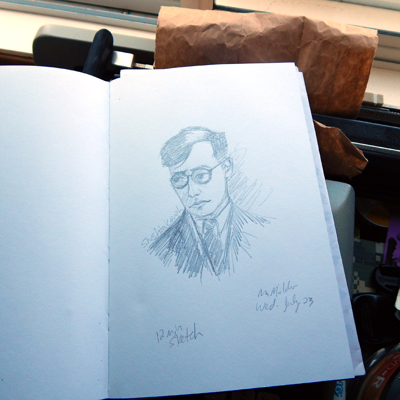
Then I receive the manuscript a few weeks later and begin reading the author’s work. This helps try to envision in my mind an iconic poster image. For me, a book cover is the equivalence of a film poster. At this stage, I produce some concept drawings (like the one’s pictured) and research color schemes and subject themes that I plan to use in the cover design. After a couple rounds of emails with the author, I proceed to the full-color design phase.
 The full-color design is often photographic, as in the case of this sample, but can also feature illustrated work or typographic designs. An illustrated cover is sent to a freelance artist who spends a week or so producing the cover art. The final cover design pulls together all the elements (art, photo, type and copy) to present a cover that, in theory, sells a 1000 to 3000 copies on face value. I know what you’re thinking, but books really are judged by their covers. Just watch people at a bookstore. They’re scanning covers before they even pick up a book to read the back copy blurb or open a book to read the first few chapters. If a book has amateurish art or less than professional photography, the audience will move to the next book cover that has great photography or stunning artwork. Further, if a book has poor quality cover art, it will be represented in poor book sales. Let me say it again: if a book has crappy cover art, the book will have crappy sales. No reader wants a crappy book on their bookshelf or e-reader. Half the battle for a reader’s attention is getting him/her to pick the book from the shelf. The same applies to e-book stores. Readers are scanning covers from the Kindle or Nook e-stores and deciding, based on cover design and book blurb, what title to purchase.
From the time the final cover is approved until the product arrives is six to eight weeks depending on circumstances. That’s when the real test of a book’s cover design and interior content begin. And that’s about the time I begin the next round of cover designs.
 This morning, kidlinger walks up to my desk while I work, looks at the laptop screen critically and asks: “What’s that?”