Category: graphic design
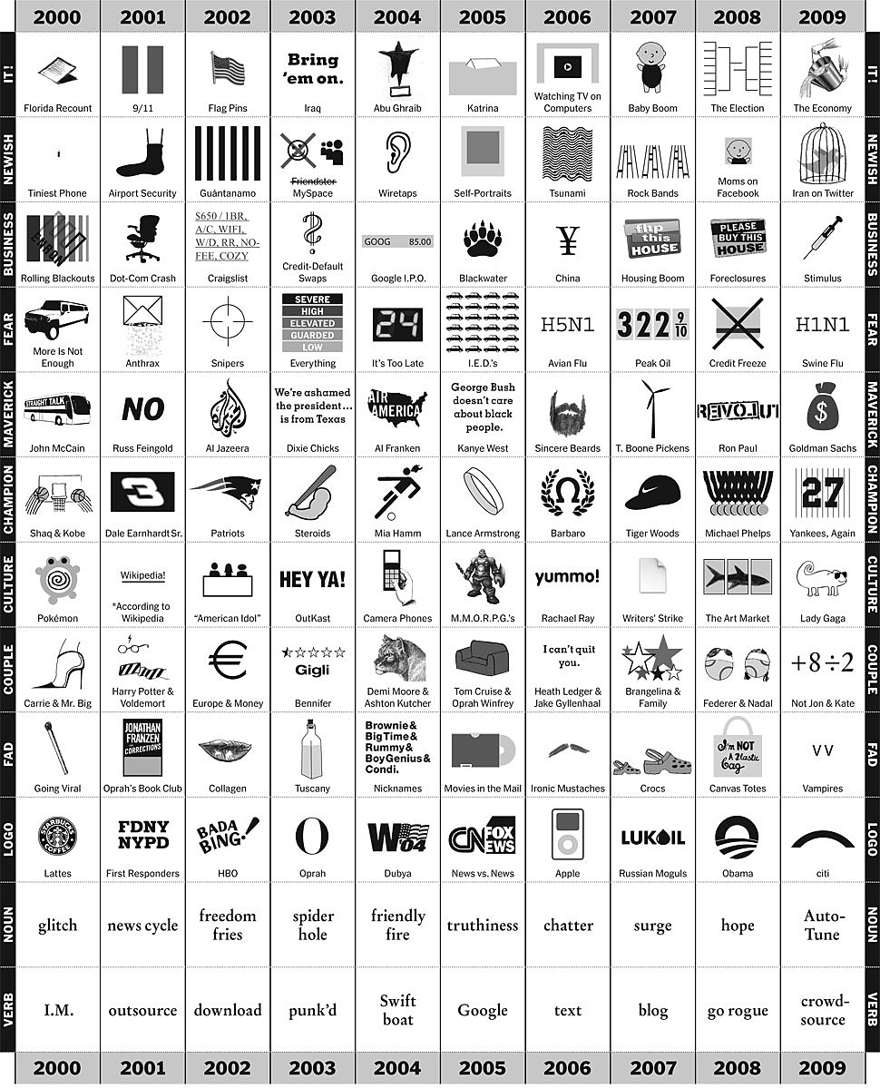
33 Ways to Stay Creative
Some inspiration to start your week with. I fully support everything on this list! Especially number 24. Anyone know who created it? (via hrrrthrrr)
People do judge a book by its cover
Have you ever considered who the people are who design book covers? I know most of us are more interested in the author and the story being told, but for me it is interesting to learn of the designers behind such iconic book covers. That’s why I enjoyed this short list of iconic book covers and the creatives who designed them. The list includes some of my favorites like The Great Gatsby (designed by a relatively unknown artist at the time, Francis Cugat), To Kill A Mockingbird (designed by Shirley Smith), Brace New World (designed by Leslie Holland), and Fahrenheit 451 (designed by Joe Pernaciaro). What are some of your iconic book covers?
Book cover design
Kidlingers like the latest book cover design… because the title has flaming letters & a firefighter.
How to create running headers and footers in InDesign
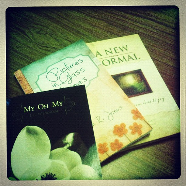
Just a few of the books I designed during the last few weeks.
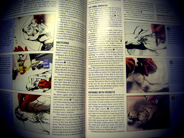
The purpose of sketching your ideas
“The purpose of sketching your ideas is to help you explore as many ideas as possible in order to trash the bad ones, leaving you with a couple of good ideas that could evolve in a solid design…”
Read the blog post for more details on productivity and creativity. Here’s some techniques offered:
- Brainstorming
- Idea writing/sketching
- Mind Mapping
- Gap filling
- Boxing gloves
I loved reading these kind of articles in Step-by-Step Graphics magazine.
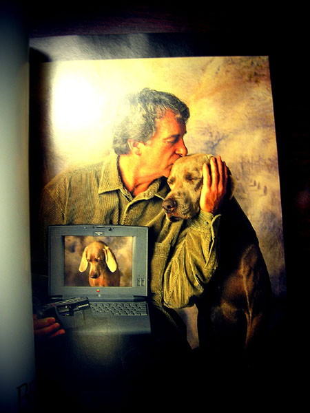
Old Apple Computer ad for the late 1990s.
An old MAC ad from the late 1990s
Anyone remember using these old Zip disks?
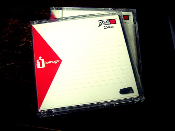
Better yet, does anyone have a Zip drive?
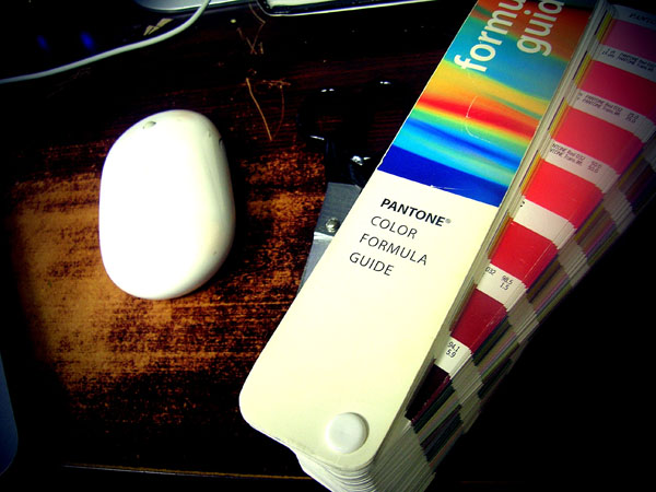
Does anyone still use these old Pantone color guides?
25 years of graphic design trends and history
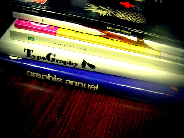
Cleaning out an old desk and discovered these books.
Five Ways to Fail at Design
- Refuse to change any other part of your business.
- Design outside of your innovation space.
- Try to design for everybody.
- Insist on replicating another company’s success.
- Compartmentalize design into isolated tasks.
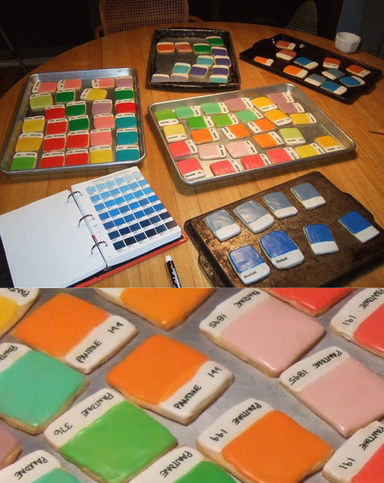
Pantone Color Chip Cookies
NOTES:
1) szymon, accessed April 21, 2011, http://inspire.2ia.pl/post/3216409498 (page no longer available, web site deactivated)
2) Laura Sweet, “Pantone Color Chip Cookies! Kim Neill Bakes Up Deliciously Divine Design.,” February 2011, If it’s Hip, It’s Here, accessed April 21, 2011, https://ifitshipitshere.blogspot.com/2011/02/pantone-color-chip-cookies-kim-neill.html?zx=9222f2c9e0dcd152
The symbol for recycling
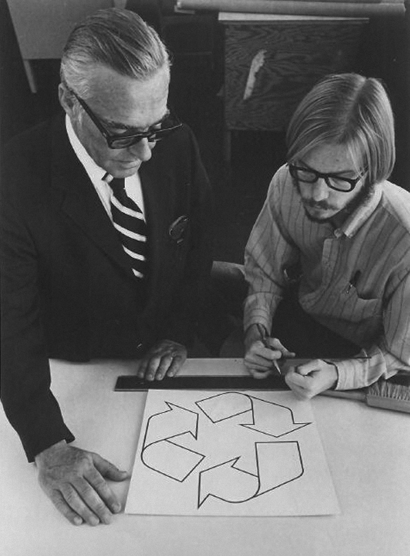
Gary Anderson (right), creator of the recycling symbol, 1970.
Anderson was a 23-year-old USC Architecture graduate when he entered the Container Corporation of America’s design contest to create what would become the universal symbol for recycling.
(via waxandmilk) 1
( via noonebelongsheremorethanyou) 2
(via brocatus) 3
NOTE:
1) Mark Malazarte, waxinandmilkin, accessed September 17, 2010, https://waxinandmilkin.com/post/963308730/gary-anderson-right-creator-of-the-recycling Tumblr account deactivated.
2) noonebelongsheremorethanyou, September 17, 2010, https://noonebelongsheremorethanyou.tumblr.com/post/964604837/anneyhall-gary-anderson-right-creator-of-the Tumblr account deactivated.
3) André Brocatus, André Brocatus was here…, September 17, 2010, https://brocatus.tumblr.com/post/964633674/noonebelongsheremorethanyou-gary-anderson
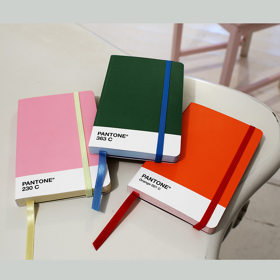
Pantone Universe A6 Notebook
Learn how to transfer files the old school way

This takes me back almost a decade. But this morning I had to scan an illustration. The only machine in the office with a scanner is an old beige Power Macintosh G3 minitower with Zip drive. Because the machine is an antique it doesn’t connect to the network. So I dug up an old 100 Mb Zip disc, scanned the illustration using Photoshop 6.0 (it took two scans because the image is larger than the 8″x10″ scanner bed), transferred the art files to Power Mac G4 minitower with Zip drive, stitched the two scans together using Photoshop CS, and emailed the art file to my MacBook Pro.
The question you may be asking right now is why all the trouble? Good question:
- The scanner is so old it doesn’t have a USB connection.
- The Zip drives do not have USB connection.
- It’s Monday.
T-shirt design: Why I am a designer

A couple years ago I stumbled upon this graphic on my Tumblr dashboard. Recently, I contacted the designer behind the art and asked if he planned to release the design as a poster or t-shirt. He replied he might if more people were interested in a t-shirt.
So, David Sherwin wants to know if anyone, beside myself, is interested in ordering this design as a t-shirt?
4 reasons why ad agencies are impotent at branding
Repeat after me: Branding is product, service and experience.* It’s not a wicked cool logo with drop shadow and PMS color key nor a catchy slogan. It’s simple and complicated and it’s why ad agencies typically don’t get it.
- Ad placement drives profits
- Advertising creatives are spoiled. And entitled. And enabled.
- The integrated agency is a fallacy
- Advertising is a knock-knock joke. Design is a dialogue
Design is dialogue sums it up for me. Know your audience, build community, and provide consistent, satisfactory customer experience.
*Watch this video for an excellent overview of what brand is (via AdPulp).
What are the top ten books you believe designers should read?
Earlier this week we did a post on a printed piece created by British design firm Spin that details the top 10 books from 50 major figures in graphic design.We sorted through the 500 listed books and found that there were 14 books that appeared in almost every list.
Here’s the list in no particular order:
01. A Designer’s Art Paul Rand
02. Typographie Emil Ruder
03. Mode en Module Wim Crouwel
04. A History of Graphic Design Phillip Meggs
05. Jan Tschichold: Typographer Ruari McLean
06. Design as Art Bruno Mari
07. 8vo: On the Outside Mark Holt
08. Tibor Kalman: Perverse Optimist Peter Hall
09. Weingart: My Way to Typography Wolfgang Weingart
10. Designed Peter Saville
11. How to be a graphic designer with…Adrian Shaughnessy
12. The Tipping Point Malcolm Gladwell
13. Modern Typography: An Essay in Critical… Robin Kinross
14. Envisioning Information Edward Tufte
NOTES:
1) Liz, “Follow up: Spin asks: What are the top ten books you believe designers should read?” accessed January 27, 2010, https://liz.tumblr.com/post/352754770/follow-up-spin-asks-what-are-the-top-ten-books
2) Plaid-Creative, accessed January 27, 2010, http://blog.plaid-creative.com/post/346685665/follow-up-spin-asks-what-are-the-top-ten-books-you (page no longer available, Tumblr account deactivated)
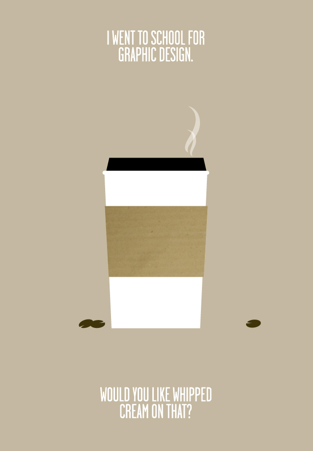
i went to school for graphic design, and did not spend my nights getting drunk. instead, i worked my ass off, spent most of my outside-class time learning/trying/doing as much as possible, and then got an awesome job after graduating.
protip: if you’re lucky enough (and i mean it when i say lucky) to be in college, you should be spending all available time learning, trying, making things, messing things up, experimenting and READING. (seriously. they make sketchbooks with words in them already. they are just called books.)
i didn’t waste a single day. and neither should you. build your momentum and go with it.
for the but-i’m-an-artist’s: you want money? learn a technical skill related to your field and get good at it. then get better at it. jonathan harris built wefeelfine on the weekends while working a full time job. just sayin’.
final note: i had a BLAST in college, and miss it like crazy. working hard does not mean no-fun-allowed, it means relax harder 🙂
orginal image via synecdoche
The 7 Components Of Design
(via vanseodesign)