Interlibrary loan system

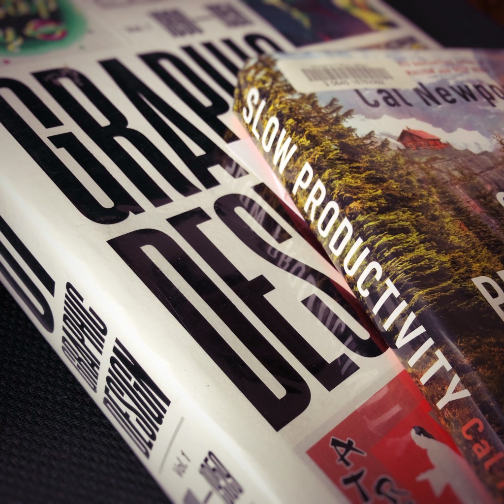
The interlibrary loan system provides access to books. Books that are not available at the local rural public library. Books requested using the library system’s web site arrive as they are available. Sometimes the combinations of titles display a curious serendipity. Slow Productivity. And History of Graphic Design Volume 1 1890 – 1959.

The principles featured in Slow Productivity appear to contrast with the other book. At least at first glance.

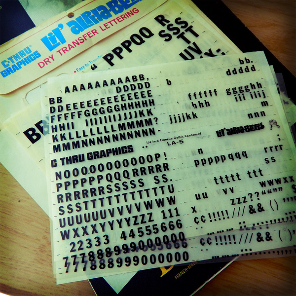
Graphic design projects and tasks were once defined by art and drafting skills. Tactile skills of cutting an oval with an X-Acto knife for a Rubylith overlay sheet. Or drafting skills of using a T-square ruler and triangle to layout the ad copy for an advertisement. Or the skill of painting a headline with gouache paints or pigment inks. Or the photographic skills of loading, shooting, processing, and printing 35mm film. Graphic design work prior to the 1990s required more physical activity. Often, a design shop featured multiple creative talents. A photographer. An illustrator. A copywriter. A director and assistant. A typographer and designer. A videographer and film and audio editors. That is a team of ten creatives. Now graphic design projects and tasks encompass project management and problem solving. And a single designer needs to do the work of ten creatives.

Can graphic designers do their projects and tasks without burnout? That is the question. And, maybe, that is where the interlibrary loan library books compliment each other. Can the past inform the present? And future? And, more uregently, can I read these books before they are due back to the library?

Dry transfer lettering and the human touch

Dry transfer type

From the graphic design history archive… Anyone remember doing advertising or editorial mockups using dry transfer lettering? Or the fact that mockups were expected to take several days. Not hours.

At the university where I received education in the art of design, I spent a lot of money purchasing packets of dry transfer lettering and Pantone triple nib markers. And I spent a lot of hours in the design studio developing the skill of paste ups and thumbnail layouts.

As I designed a multi-page layout project recently I could not escape the fact at how fast I was able to pull it together. The hand drawn layout thumbnails and non-repo blue line paste ups were not part of the process. Nor were there long days of sketches, dummied text, paste ups, Photostat machine, rubber cement, T-squares, proportional scale wheels and other essential pre-digital design tools.

Fortunately for me, I entered the world of advertising and marketing during the digital revolution in design. The design process for the multi-page layout project was exclusively digital — from concept to completion.

Instead of paging through thick, expensive design journals and other trade publications for color palette and typography and font inspiration, I visited a couple websites like Design Seeds[3] or Font Squirrel.[4] The color palette choice and font and photo selections were quick. That is the nature of the fast-paced environment of production work for a graphic designer.

Yet, last Thursday when the printed product arrived and I reviewed the freshly-inked pages, I was disappointed. The final printed product lacked the essence of human touch. At no point did my hand every touch the page. Everything was created by digital proxy. I can see the difference. Most designers see the difference. A careful observer may also see the difference.

NOTES:


[1] Image originally posted: August 8, 2014. https://coffeehousejunkie.net/2014/08/08/dry-transfer-lettering/
[2] It is a challenge to purchase the old style triple nib markers. Here is one source: AOE Artworld.

[3] Design Seeds: https://www.design-seeds.com/

[4] Font Squirrel: https://www.fontsquirrel.com/