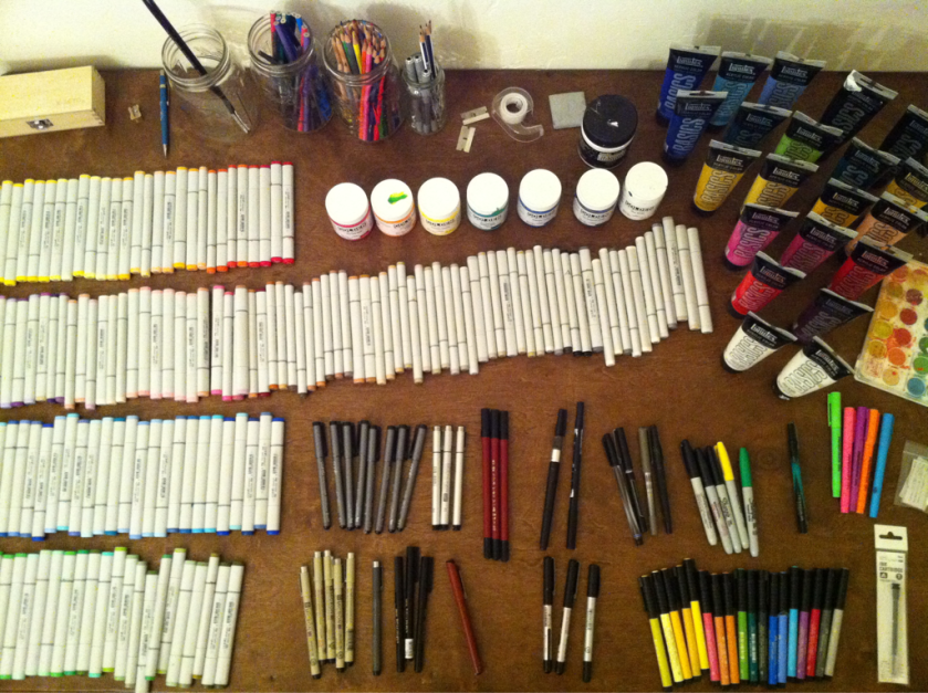
You can never have too many markers.
My marker habit is getting heavy. (via dallasclayton)
New art show @izzyscoffee
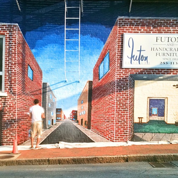
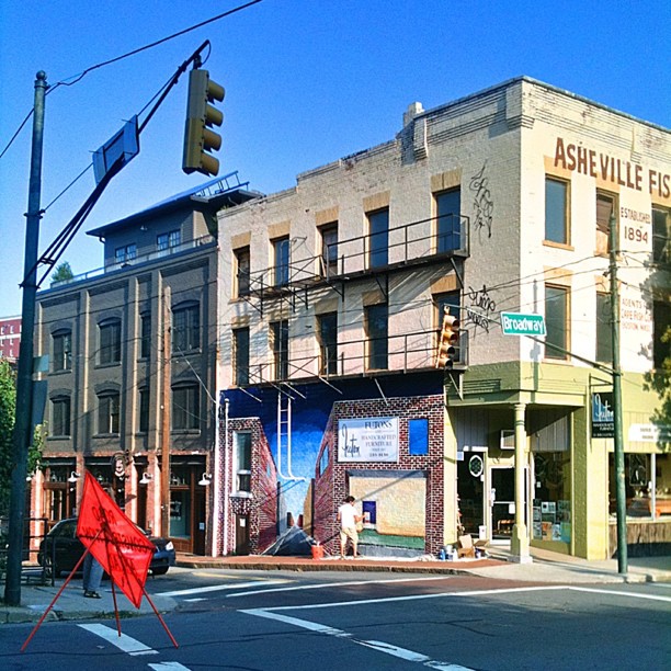
Artist Jason Brown adding details to downtown #AVL mural.
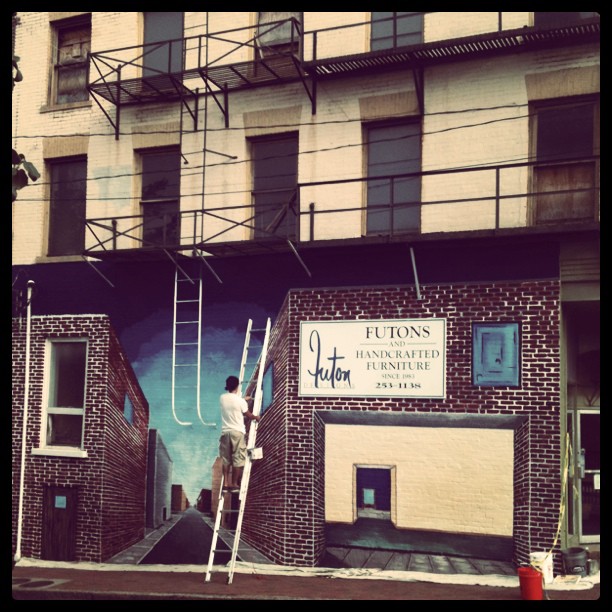
Painter at work on an #avl mural.
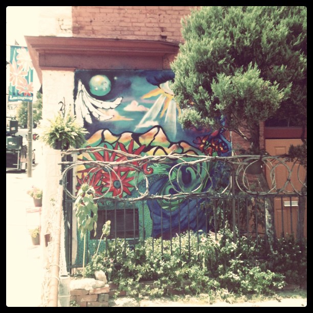
Another #avl mural. Remember what was there before the new mural?
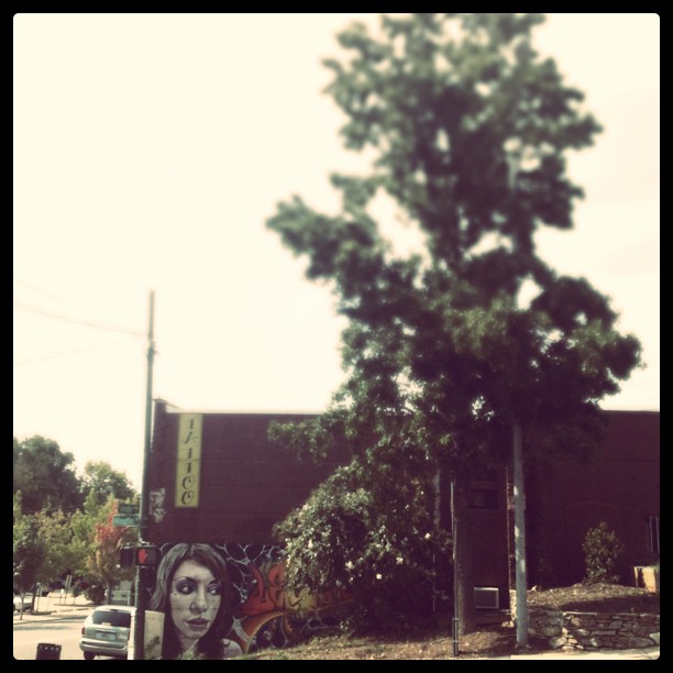
An #AVL mural on Lexington.
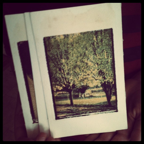
Just discovered some old Polaroid transfers I did back in the day before Instagram.
#avlnews Artist at work on a downtown mural.
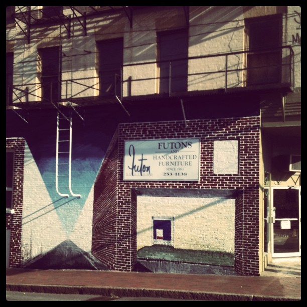
New downtown mural in progress.
Last night I picked up some art supplies downtown. The staff at True Blue is not only helpful, but offered me a cup of water after I coughed a couple of times. For some reason the pollen this year is especially irritating to my throat. It’s not often that staff voluntarily offer a cup of water to store customers, and that kind of service is why I plan to return often.
Being downtown, I couldn’t resist dropping by Malaprop’s for a visit to one of my favorite booksellers. Wandering through the book aisles I came across two book titles that caught my attention. The first book is by Thomas Merton, New Seeds of Contemplation. I haven’t read much of Merton’s writings. But as I was flipping through pages of New Seeds my eyes fell upon the following passage:
If I am supposed to hoe a garden or make a table, then I will be obeying God if I am true to the task I am performing. To do the work carefully and well, with love and respect for the nature of my task and with due attention to its purpose, is to unite myself to God’s will in my work. In this way I become His instrument.
The work ethics idea in this passage seems so foreign in today’s culture that it caused me to stand, shifting my weight from one foot to the other, and ponder the question: am I true to the task I am performing? However menial the task, do I accomplish tasks with due attention to its purpose?
The other book that caught my attention while I walked through the book aisles at Malaprop’s is The Poetics of Space by Gaston Bachelard. Here’s a passage that arrested my attention:
And whereas philosophical reflection applied to scientific thinking elaborated over a long period of time requires any new idea to become integrated in a body of tested ideas, even though this body of ideas be subjected to profound change by the new idea (as is the case in all revolutions of contemporary science), the philosophy of poetry must acknowledge that the poetic act has no past, at least no recent past, in which its preparation an appearance could be followed.
This took me a couple of readings to unpack the idea in this passage, and I’m not sure if I agree with it or disagree with it. My initial thought is not to agree with it simply on the basis that there is nothing new under the sun. However, counterpoint to my initial thought is a recollection of Jane Hirshfield’s thoughts on creativity and originality in poetry.
I wish I could have purchased these books last night, but I spent my money at True Blue and will have to wait until new funds arrive to purchase these titles.
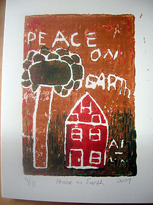
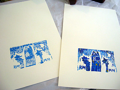
“peace on earth,” a limited edition woodblock print/greeting card
the three-color block print art is based on a drawing by an eight year old. it’s part is a limited printing of 15. each card is numbered. these limited editions are printed on paper good enough to frame.
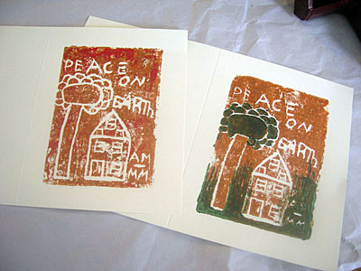
woodblock prints/greeting cards
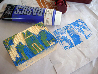
i transposed a drawing by an eight year old child into woodblock prints. typography designed by the child… all other mistakes are mine.
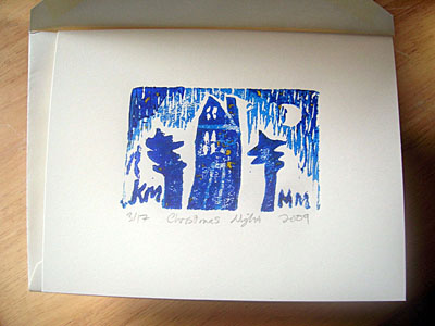
“christmas night,” a limited edition woodblock print/greeting card
the two-color block print art is based on a drawing of one of the kidlingers. it’s part is a limited printing of 17. each card is numbered. if you receive one of these limited editions it is printed on paper good enough to frame (if you so desired).
diy woodblock prints/greeting cards
i transposed a drawing by a four year old child into a two-color print.
this nice thing about using acrylic paint (instead of traditional ink) is that it drys quick.
woodblock printing on a budget… or diy woodblock printing.
i dug out some old art supplies & a few scraps of 2”x4” wood to create a limited printing holiday greeting card series.
the art for the print is my translation of a drawing by one of the kidlingers.
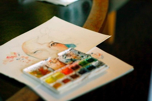
For years have pushed art making away from me. Partly due to lack of space and consolidating my paintings into small sketchbooks. Then I replaced paint for pen and ink, and drew smaller images into Moleskines until my drawings disappeared into lines of characters trying to form poems…
Now, I want to start painting again…
(Image source via creativeinspiration: 472239364: artpixie: love letters and skypaints: http://www.flickr.com/photos/tinycastles/3912498882/)
(via Room 116) Link
From 43 Folders:
[Chuck] Close talks about evolving his method of working to overcome his own personality.
“I’m a nervous wreck. I’m a slob. I have no patience. And I’m rather lazy. All those things would seem to guarantee that I would not make work like I make. But I didn’t want to just go with my nature.”
So instead of painting overwrought, expressive things when the mood struck, he committed to making his epic, close-up portraits by breaking the work into tiny pieces and hewing to a grid. Not only did the grid make technical sense, it forced a lifehack on Close that would help him deal with his own tendencies. It helped get the work done…
Link.
I’ve been dubious for years at the proliferation of iPod/MP3 music. I find this article, “The Death of High Fidelity,” delicious. Maybe it’s the former radio guy or just plain audiophile geek in me that screams, “Rawk on!.”
It’s not just new music that’s too loud. Many remastered recordings suffer the same problem as engineers apply compression to bring them into line with modern tastes…. MP3 and other digital-music formats are quickly replacing CDs as the most popular way to listen to music. That means more convenience but worse sound…. MP3s don’t reproduce reverb well, and the lack of high-end detail makes them sound brittle. Without enough low end… “you don’t get the punch anymore. It decreases the punch of the kick drum and how the speaker gets pushed when the guitarist plays a power chord.”
Link.
And further (this is great):
Still, “it’s like going to the Louvre and instead of the Mona Lisa there’s a 10-megapixel image of it… I wouldn’t look at a Kandinsky painting with sunglasses on.”
Now, I am not advocating abandoning iPods and other MP3 players.
It is just the fact that art, literature and music have been so diminished in the last couple decades that most people in our culture couldn’t tell quality art, literature or music if it was served them on a silver platter with a cue card reading “applause.”
For my generation, Gen-X, the touchstone song is Nirvana’s “Smells Like Teen Spirit.” Robert Levine, writer of the article, illustrates — with graphics — the difference in audio architecture of Nirvana’s anthem and Arctic Monkey’s hit “I Bet You Look Good on the Dancefloor.”
Suddenly I feel old.
It has been awhile since mentioning a comic strip I’ve written and illustrated. The Indie has published the series since December. It is called Strange Familiar Place and features a magazine A & E editor (at least in the first two strips) and the main character Hudson Stillwater, a graphic designer.
Strange Familiar Place also features Heather (Hudson’s wife) and presents a slice-of-life drama of living and working (and losing a job) in a cultural creative urban mountain city (or at least a city that looks a lot like Asheville).
 Published in The Indie, March 1, 2007
 Published in The Indie, March 16, 2007
Beginning in mid to late April, Strange Familiar Place will be illustrated by someone else. I’ll still be the principal writer, but I hired an illustrator that I am confident will present the visual narrative with a higher quality of art.
The Indie features part one of my creative non-fiction comic, Strange Familiar Place, this month. It has been a year of trying to find a place courageous enough to take the risk on a no-name amateur artist.
The Indie is available at: Malaprops, True Blue Arts, Pack Library, Woolworth Walk, Rosetta’s Kitchen, Mellow Mushroom, Hannah Flannagan’s, Fine Arts Theater, Early Girl Eatery, Port City Java, Burgermeisters, Lucky Otter, West End Bakery and many other locations.
Previous thoughts and intimations on creative non-fiction comics: [1] [2] [3] [4] [5] [6]
The publisher received the first installment of my creative non-fiction comic this week. It has been almost a year since a posted about a creative non-fiction comic I’ve been illustrating and writing. Previous posts on creative non-fiction comics: [1] [2] [3] [4] [5]
The irony is that Drawn, an illustration and cartooning blog, posted this on Monday:”Goodbye one-page diary comics; everyone’s blogging now.”
It appears the one the inspirations for my work now has a blog (which isn’t bad) but he posted this: “In the old days i’d have made a one-page … but today we squander our narratives in a blog.”
The first installment is due to hit the streets in December and the medium is horribly dated. Another source of inspiration has a blog as well but hasn’t updated since 2003. However, Vertigo released a five-issue miniseries by him that began in September.
Maybe it’s not as bad as Drawn considered.
A while back, I mentioned that the first installment of my creative non-fiction comic is complete and pending publication. The first installment is titled “Higgins: Inside the Box.” Last weekend I completed half of the second installment (four strips or roughly 12 panels) which is the conclusion to the story arch, “Higgins: Inside the Box.” Then I began scripting a 5-part comic strip for a third installment which features a story line about this event. There isn’t an official title to this one. However, “Higgins: Outside the Box” seems like a logical progression.
Last Tuesday was the SECNCS meeting and fellow artists encouraged me regarding my inking techniques and suggested some tips on lettering comic strips. One artist, who is regularly featured in the Rapid River magazine, recommended that dialogue text be all caps and narrative text be upper and lower case. The recommendation is already being implemented beginning with the second installment.
This endeavor of combining illustration and creative non-fiction, have inspired me to study the poet William Blake. The illuminated text is not a new media; many ancient manuscripts were illuminated. For example, The Book of Kells is famously known for its illuminated text. Years ago, I studied under a calligrapher who taught me the secret of the Celtic knot work and spirals represented in the Book of Kells. The discipline of the knot-work has served me well, though not in my recent illustrations.
But William Blake illuminated his own poems and printed his own collections with the help of his wife. It helped that he was trained as an engraver and went on to apply his trade for book and magazine publishers. Being an innovator in his own right, he applied his trade to illuminate and print his own literature. Like William Blake, I studied graphic design (the modern day digital engravers if you will) and know how to produce books and magazines for clients. I wonder what William Blake would think of creative non-fiction comics?
Previous posts on creative non-fiction comics: [1] [2] [3] [4]
