Illustration of roll up pen and brush case
Never waste money on purchasing a tube of black paint, I was told.
With three or four colors you can mix a pigment as dark as black. And a richer shade of pigment. Is black even a color?
These thoughts remind me of color theory and composition class at the university. My professor was a student of Josef Albers. At the time, that fact did not have a great impression on me. But I wonder about the lessons he must have learned. Not so much the academic rigor of craftsmanship and applied fine arts. That is important. But lessons of integrity and legacy. Was it Albers who taught him that quip about black paint? Or did that come from Willem de Kooning?
A couple days later, the middle child looks at this project. “What’s this about?”
I do not answer. It is an exercise. It is practice.
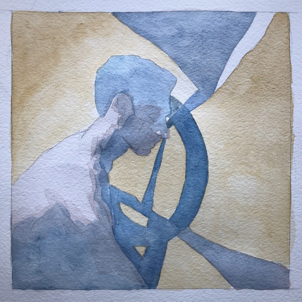
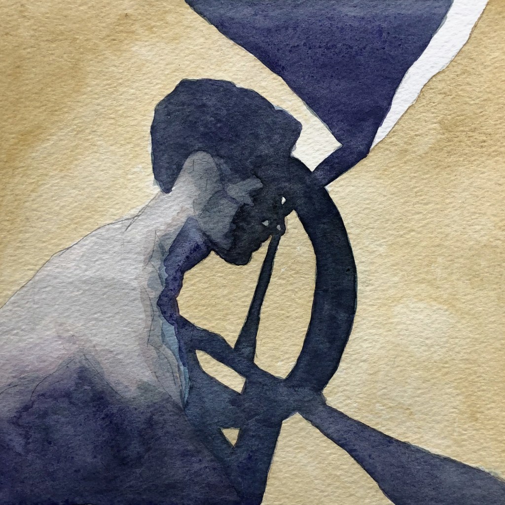
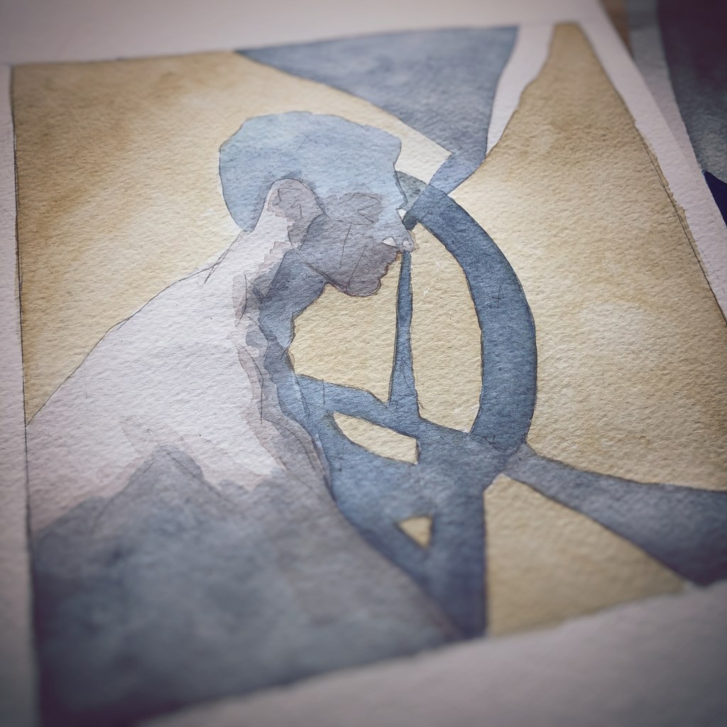
This is practice. An exercise. Form and color.
Do you see a character? As in, a letter of the alphabet.
Or do you see a character in human form?
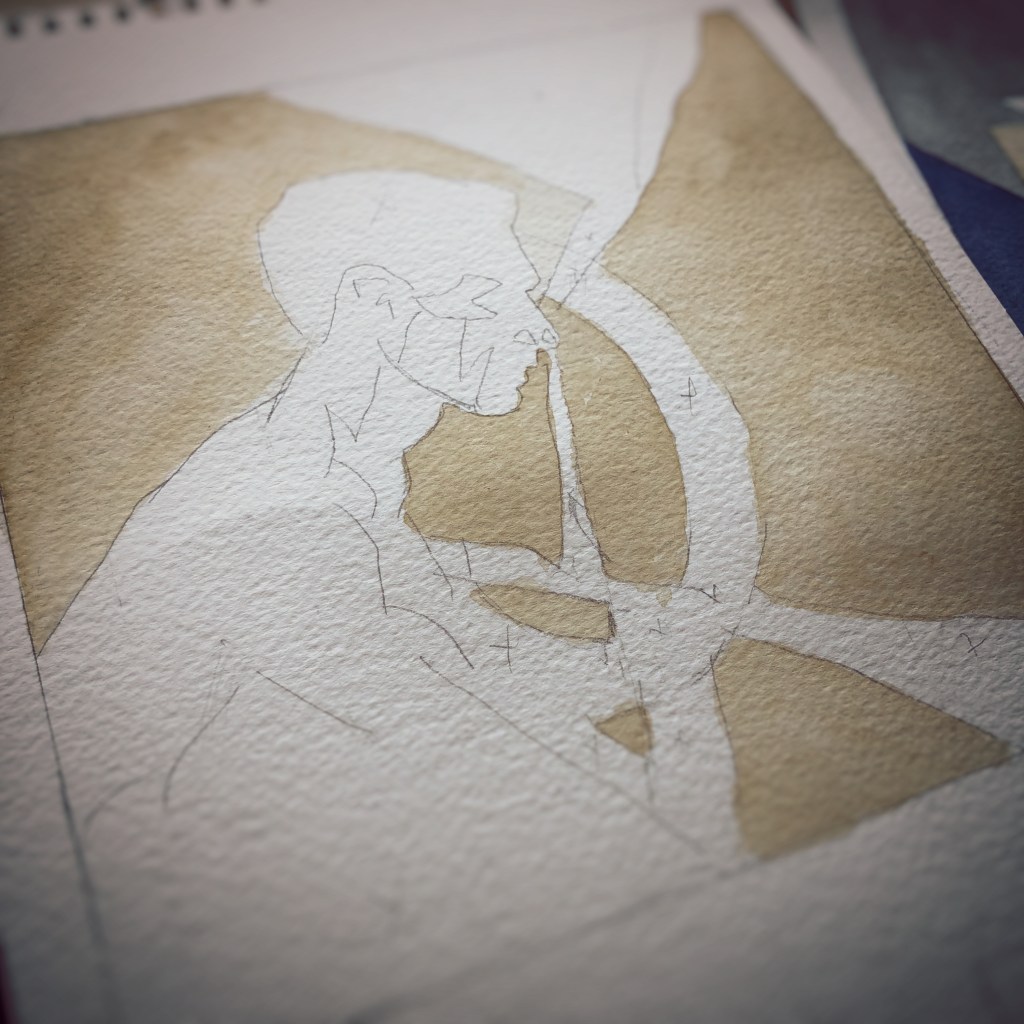
The daylight quickly fades for this January afternoon. I chose a larger brush to apply pigment. At the university, the art professor instructed, “If you can’t paint well, paint big.”
It was not criticism, but rather a modernist declaration. He provided an atmosphere that allowed guidance rather than dogma.
I load the larger brush with the muddy water from the tray and a touch of pigment found between two watercolor cakes. The transparent layer is applied to the dry paint. A technique called glazing.
This is not an art lesson. It is a conjuring up of an image.
This is an exercise. Form and color. Loading the brush with pigment and applying it to the paper. Quick strokes. Vision in motion.
Painting by the light of the apartment’s living room window. The sun light is best in the morning. But I have continued this project well past the noon hour.
“Why do you keep painting,” asks my child.
“It’s underpainting,” I say as I clean the brushes and prepare for an afternoon walk. “The lighter tones provide the base. When the paint dries I add more color layers.”
It is January. It is Winter. The outdoor temperature is above the freezing point. We walk to the library and return books. We continue to talk.
Trying something new. Or, rather, returning to something old.
Here is a first draft for consideration.
Will provide details as updates are available. Let’s see how this turns out.

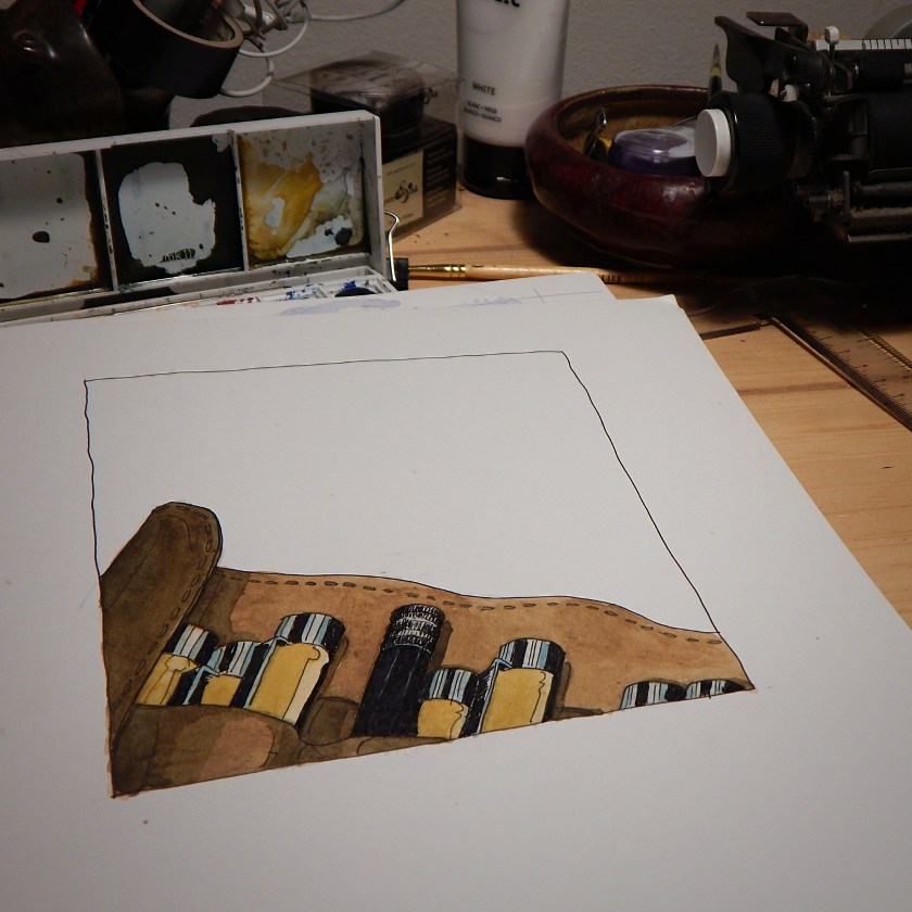
One of the challenges of an artist and designer is the amount of unfinished sketches or mock-ups (a working sample of an illustration or design) that collect over the years.
Found a unfinished illustration from over five years ago. Decided to finish the ink drawing. Added watercolor as a painting exercise.
Never too late to complete an unfinished illustration.
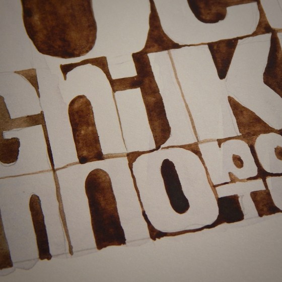
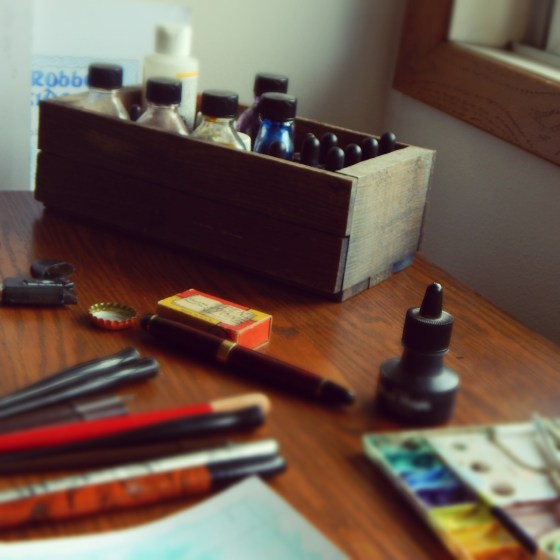
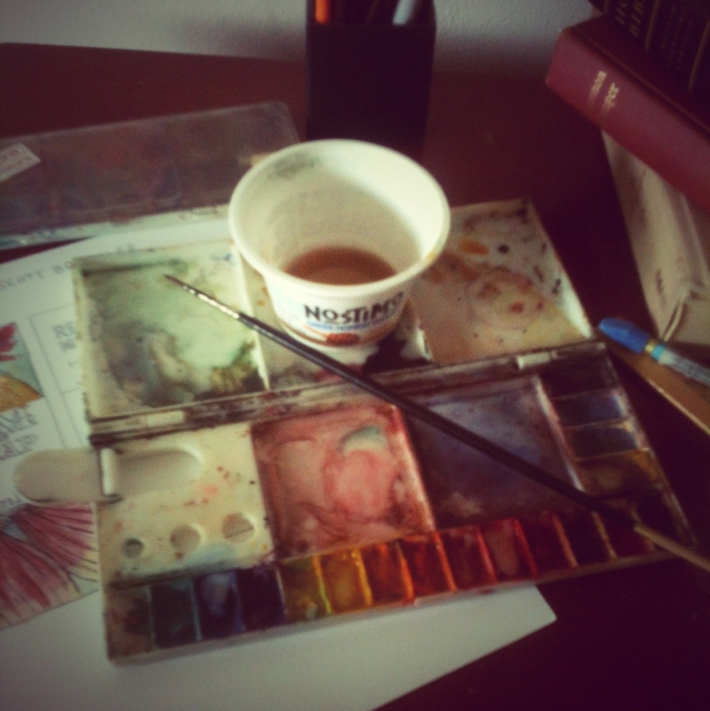
Tested a couple old brushes using a dozen watercolor half pans on illustration paper. Purchased the art supplies for a book cover illustration project a few years ago. Have not had the occasion to use them since then. Apart from recreational sketches and practice.
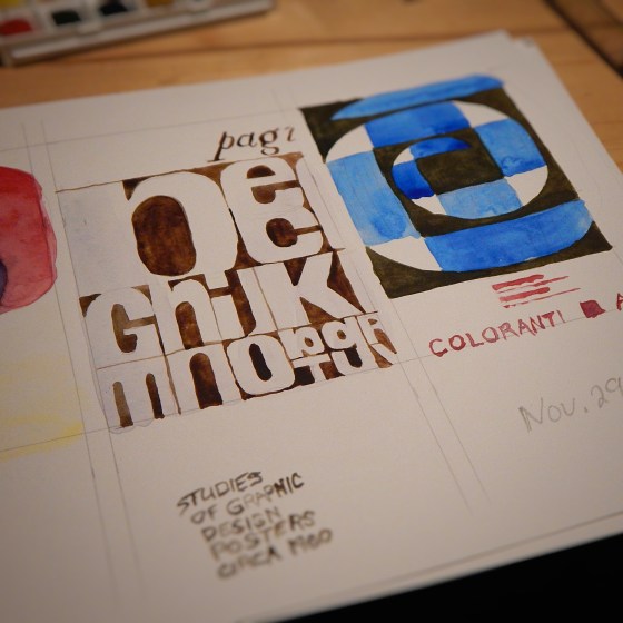
Painted some studies of graphic design advertisement posters from the 1960s. Muscle memory atrophied more than expected. How does the aphorism go? Either control the watercolors or they will control the painting. Some clumsy mistakes. A good test of skills. Not ready to paint a book cover illustration. But the exercise warmed up the muscles and mind to consider more opportunities.
Fear motivates. The paralyzing fear that if I mess up the coloring of this book cover art, I will have to start the whole process over again. And the completion date is fast approaching. But the task needs to be done. So, onward.
![DSCN3428[sqr-tilt-dallas]](https://coffeehousejunkie.net/wp-content/uploads/2015/06/dscn3428sqr-tilt-dallas.jpg?w=560)
Watercolor washes begin the color process for the book cover illustration.
![DSCN3427[sqr-tilt-dallas]](https://coffeehousejunkie.net/wp-content/uploads/2015/06/dscn3427sqr-tilt-dallas.jpg?w=560)
Paint to the edges and then let the colors bleed. The basic color palette had already been determined weeks prior to the final execution of the cover art. But once the water and pigment are activated on the surface of the paper, the color palette organically builds to its own organized spontaneity.
![DSCN3434[sqr-tilt-dallas]](https://coffeehousejunkie.net/wp-content/uploads/2015/06/dscn3434sqr-tilt-dallas.jpg?w=560)
Details. There are always small details that many casual observers may not detect at first glance. For example, the color for the shotgun shell includes multiple wash layers of different pigments — each layer pulling or pushing color from previous layer.
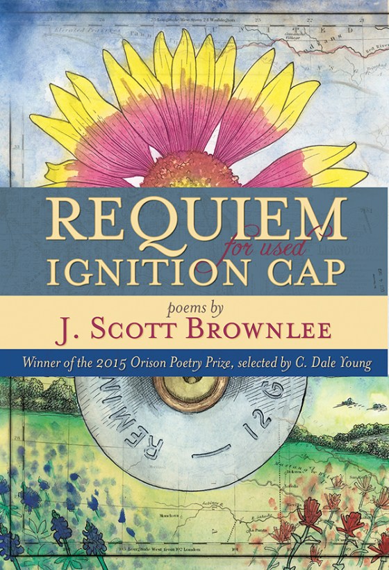
Once the final art is approved, I finished the design with title bar and a map overlay to texture the collage art.
The purpose of thumbnail sketches is to advance the concept of artist, art director and editor to a final product. It seems like a lot of busy work, but three elements are essential: brainstorming, mind-mapping and closing the gap. The following images illustrate the process of thumbnail sketches as it relates to a book cover illustration. ![DSCN3558[sqr-tilt]](https://coffeehousejunkie.net/wp-content/uploads/2015/07/dscn3558sqr-tilt.jpg?w=560) Three thumbnail cover comps presented to the publisher a couple months back.
Three thumbnail cover comps presented to the publisher a couple months back. ![DSCN3560[sqr-tilt]](https://coffeehousejunkie.net/wp-content/uploads/2015/07/dscn3560sqr-tilt.jpg?w=560) Full-size book cover sketch to gauge color temperature and composition of elements.
Full-size book cover sketch to gauge color temperature and composition of elements.
Listening to “It takes a lot of time to live in the moment” by Joseph Arthur while working on an illustration comp for a book cover.
