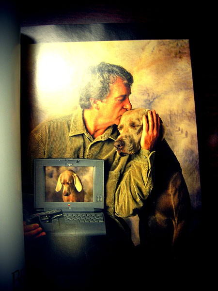
An old MAC ad from the late 1990s
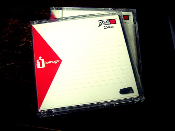
Better yet, does anyone have a Zip drive?
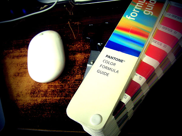
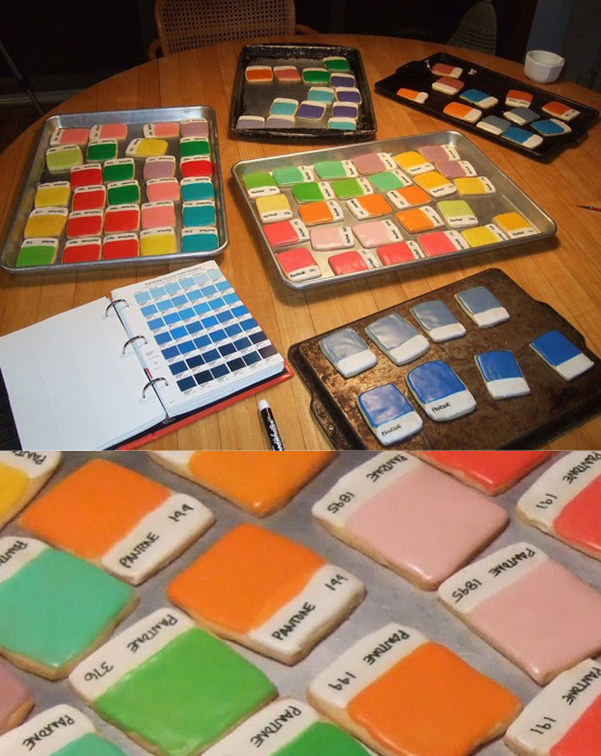
Does anyone still use these old Pantone color guides?
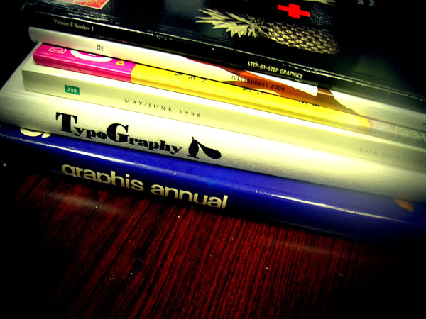
Cleaning out an old desk and discovered these books.
NOTES:
1) szymon, accessed April 21, 2011, http://inspire.2ia.pl/post/3216409498 (page no longer available, web site deactivated)
2) Laura Sweet, “Pantone Color Chip Cookies! Kim Neill Bakes Up Deliciously Divine Design.,” February 2011, If it’s Hip, It’s Here, accessed April 21, 2011, https://ifitshipitshere.blogspot.com/2011/02/pantone-color-chip-cookies-kim-neill.html?zx=9222f2c9e0dcd152
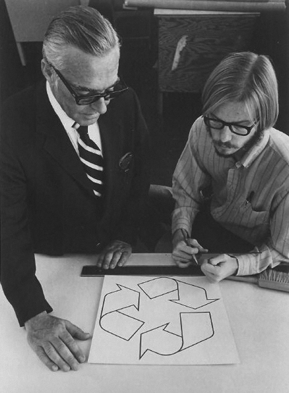
Gary Anderson (right), creator of the recycling symbol, 1970.
Anderson was a 23-year-old USC Architecture graduate when he entered the Container Corporation of America’s design contest to create what would become the universal symbol for recycling.
(via waxandmilk) 1
( via noonebelongsheremorethanyou) 2
(via brocatus) 3
NOTE:
1) Mark Malazarte, waxinandmilkin, accessed September 17, 2010, https://waxinandmilkin.com/post/963308730/gary-anderson-right-creator-of-the-recycling Tumblr account deactivated.
2) noonebelongsheremorethanyou, September 17, 2010, https://noonebelongsheremorethanyou.tumblr.com/post/964604837/anneyhall-gary-anderson-right-creator-of-the Tumblr account deactivated.
3) André Brocatus, André Brocatus was here…, September 17, 2010, https://brocatus.tumblr.com/post/964633674/noonebelongsheremorethanyou-gary-anderson

This takes me back almost a decade. But this morning I had to scan an illustration. The only machine in the office with a scanner is an old beige Power Macintosh G3 minitower with Zip drive. Because the machine is an antique it doesn’t connect to the network. So I dug up an old 100 Mb Zip disc, scanned the illustration using Photoshop 6.0 (it took two scans because the image is larger than the 8″x10″ scanner bed), transferred the art files to Power Mac G4 minitower with Zip drive, stitched the two scans together using Photoshop CS, and emailed the art file to my MacBook Pro.
The question you may be asking right now is why all the trouble? Good question:

A couple years ago I stumbled upon this graphic on my Tumblr dashboard. Recently, I contacted the designer behind the art and asked if he planned to release the design as a poster or t-shirt. He replied he might if more people were interested in a t-shirt.
So, David Sherwin wants to know if anyone, beside myself, is interested in ordering this design as a t-shirt?
Repeat after me: Branding is product, service and experience.* It’s not a wicked cool logo with drop shadow and PMS color key nor a catchy slogan. It’s simple and complicated and it’s why ad agencies typically don’t get it.
- Ad placement drives profits
- Advertising creatives are spoiled. And entitled. And enabled.
- The integrated agency is a fallacy
- Advertising is a knock-knock joke. Design is a dialogue
Design is dialogue sums it up for me. Know your audience, build community, and provide consistent, satisfactory customer experience.
*Watch this video for an excellent overview of what brand is (via AdPulp).
Earlier this week we did a post on a printed piece created by British design firm Spin that details the top 10 books from 50 major figures in graphic design.We sorted through the 500 listed books and found that there were 14 books that appeared in almost every list.
Here’s the list in no particular order:
01. A Designer’s Art Paul Rand
02. Typographie Emil Ruder
03. Mode en Module Wim Crouwel
04. A History of Graphic Design Phillip Meggs
05. Jan Tschichold: Typographer Ruari McLean
06. Design as Art Bruno Mari
07. 8vo: On the Outside Mark Holt
08. Tibor Kalman: Perverse Optimist Peter Hall
09. Weingart: My Way to Typography Wolfgang Weingart
10. Designed Peter Saville
11. How to be a graphic designer with…Adrian Shaughnessy
12. The Tipping Point Malcolm Gladwell
13. Modern Typography: An Essay in Critical… Robin Kinross
14. Envisioning Information Edward Tufte
NOTES:
1) Liz, “Follow up: Spin asks: What are the top ten books you believe designers should read?” accessed January 27, 2010, https://liz.tumblr.com/post/352754770/follow-up-spin-asks-what-are-the-top-ten-books
2) Plaid-Creative, accessed January 27, 2010, http://blog.plaid-creative.com/post/346685665/follow-up-spin-asks-what-are-the-top-ten-books-you (page no longer available, Tumblr account deactivated)
i went to school for graphic design, and did not spend my nights getting drunk. instead, i worked my ass off, spent most of my outside-class time learning/trying/doing as much as possible, and then got an awesome job after graduating.
protip: if you’re lucky enough (and i mean it when i say lucky) to be in college, you should be spending all available time learning, trying, making things, messing things up, experimenting and READING. (seriously. they make sketchbooks with words in them already. they are just called books.)
i didn’t waste a single day. and neither should you. build your momentum and go with it.
for the but-i’m-an-artist’s: you want money? learn a technical skill related to your field and get good at it. then get better at it. jonathan harris built wefeelfine on the weekends while working a full time job. just sayin’.
final note: i had a BLAST in college, and miss it like crazy. working hard does not mean no-fun-allowed, it means relax harder 🙂
orginal image via synecdoche
via DesignApplause
Good design is innovative
Good design makes a product useful
Good design is aesthetic
Good design helps us to understand a product
Good design is unobtrusive
Good design is honest
Good design is durable
Good design is consequent to the last detail
Good design is concerned with the environment
Good design is as little design as possibleDieter Rams (born May 20, 1932 in Wiesbaden) is a German industrial designer closely associated with the consumer products company Braun and the Functionalist school of industrial design.
In 1993 I asked Dieter to speak to the Architecture & Design Society at the Art Institute of Chicago. The society recently had a name change: “design” had been added. We joked ( ahem ) at the time that the real estate economy was so bad that the Architecture Society needed new members. We needed a credible and passionate design icon to speak to this group. Dieter became the first designer to speak under the society’s new name.
What I remember that night and again recently while watching the Objectified movie was Dieter’s 10 design principles. Honestly, I can’t tell you for sure that these are the same principles. Hoping Dieter will set the story straight.
I think I like the earlier stuff better. Maybe it was the materials or maybe it was so different than the pack at the time. The first Braun product I remember making a design connect to me was an electric razor. Much of Dieter’s work has long seemed more connected to brutalism than minimalism. Let’s say beautifully, brutally, minimal.
A poem is not poetry. A designed artifact is not design.
The Obama camp chose Gotham. Conceptually this chose could be a bad move (i.e. think of a future dystopian America or simply think of the south side of Chicago). Gotham is a fairly new typeface designed my Tobias Frere-Jones who was inspired by mid 20th-century architectural signage. This could swing two ways; 1) Obama could be considered as too trendy, new, inexperienced and 2) Obama could be considered as recycled material from the 1950s rather than a truly progressive. Gotham is classified as a geometric due to its lineal monoline circles and rectangles providing a modern feel. This could be a challenge for Obama if he’s trying to secure the parties base which started voting in the 1950’s.
The McCain camp chose Optima. Conceptually this chose could be a good move (i.e. think optimistic or Optimus Prime). Interestingly, Optima was designed by Hermann Zapf as one of the first digital typefaces for desktop publishing in the 1950s. This could date McCain as a dinosaur or cast him as a futurist. Further, Optima is classified as a humanist typeface due to its calligraphic elements. This could be a bad thing for McCain if he’s trying to secure the Christian vote.
(Other font thoughts from Steven Heller here).
When describing what you want in a design, make sure to use terms that don’t really mean anything. Terms like “jazz it up a bit” or “can you make it more webbish?”. “I would like the design to be beautiful” or “I prefer nice graphics, graphics that, you know, when you look at them you go: Those are nice graphics.” are other options. Don’t feel bad about it,you’ve got the right. In fact, it’s your duty because we all know thaton fullmoons, graphic designers shapeshift into werewolves.
Ways to drive a Graphic Designer mad. #5. (via yyoyoma)
My new favourite is ‘I’d like it look more designed”.
(via misssnowwhite)1
NOTE:
1) Account deactivated December 2013.
1) “the equal footing on which everything lends itself to art”
2) “the surface of conversion where words, forms, and things exchange roles”
3) “the surface of equivalence” between “the purity of art” and “forms of life.”
Gary Sullivan on poetry book cover designs:
“Stephen Paul Miller’s Skinny Eighth Avenue… has enough design problems to send me quickly in the other direction…. screams not just DESKTOP PUBLISHING but PRINT ON DEMAND.
“In the 60s and 70s, amateurish often meant a simple type on a white cover with a hand-drawn black & white image. These items often have a kind of funky charm, and sometimes even elegance, to them…. With the rise of desktop publishing in the 80s, things began heading south. Link
Avoid scaring off potential readers with “desktop publishing/print on demand” covers and hire me a professional graphic designer.
From Brand Autopsy:
“Borders recently tested a front-facing display strategy where more books were stocked with their covers, not spines, facing customers. Sales increased by 9.0%. The strategy was so successful, all Borders bookstores will be switching to the front-facing strategy in the next couple of weeks.” Link
From Rands in Repose:
“Anyone who has ever been in a bookstore knows that you’re not browsing books; you’re browsing covers.” (via Brocatus Link) Link
Silly me. I thought people bought books because of the words contained inside the covers.
Hugh Graham writes that “design is too often about the transitive and the temporary.” (Transitive—the word comes from the Latin and means “passing over”) Consider how quickly designers have to change and adapt to generational demographics.
Brand Noise offers this:
“According to Princeton sociologist Robert Wuthnow in a new book titled After the Baby Boomers the key differences between Gen Y and Baby Boomers include that the younger generation is ‘spending more time in school, remaining financially independent… and changing jobs more often.’” Link
Now consider the Baby Boomers (again from Brand Noise):
“They comprise nearly 24% of the population, have a buying power of $3 trillion, and include many of the country’s current business and political leaders. But marketers misunderstand—and inefficiently target—this country’s 78 million baby boomers.” Link
Designers, by the nature of their craft, are communication experts and should be able to articulate ideas, brands, and identity to various changing demographics successfully providing they are supplied with reliable research. Hugh Graham agrees that change is the new norm, but pushes beyond that and proposes that “there’s a new form of change on the horizon; we’re heading into a constrained environment where the designer’s artistry and craft will have to encourage what lasts, what matters, what sustains.” Link
Can design be both transitive and sustainable? Only time will tell.

Copies finally arrived. Actually, they arrived more than a week ago, but I’ve been rather busy and I am just getting around to posting about its arrival.
The Hunger CD design was completed months ago. The design process was completed via teleconference (Vanessa Boyd living in New York City) and digital transfer (i.e. emailing art/corrections/finals via high-speed internet). It’s nice to see the final manufactured product. Click on the image to see the inside and back of the package design on my Flickr photostream.
They arrived yesterday–thousands of them. Last night I received copies of the debut issue of D’licious Magazine. There’s something special–magical–about holding months of hard work, long hours and gallons of coffee in the final form of the printed product. Join me Saturday night for the d’licious magazine release party!
Here’s the details:
Saturday, August 5, 2006 from 7:00pm– until
Contact: D’licious Magazine at info@dliciousmag.com
D’licious Magazine will debut its premier issue. Come experience a taste of Asheville’s cuisine, entertainment, breweries and wineries at the Haywood Park Ballroom (1 Battery Park Ave., Asheville, NC 28801) underneath the Haywood Park Hotel in the heart of downtown Asheville.
Food and beverages provided by: Belly of Buddha Catering, the Flying Frog Cafe, the Frog Bar and Deli, Biltmore Estate Stable Café, Thai Basil, Hannah Flannigans, Skully’s Signature Dine & Drink, Digable Pizza, Greenlife Grocery, Sweet Monkey Bakery & Catering, Clingman Ave. Coffee and Catering, Zuma Too: Chef Oso’s Culinary Passport, Haywood Road Market, Sclafani Distributors, the Biltmore Estate Winery, Hanover Park Winery, the French Broad Brewing Company, Highlands Brewery and the Pisgah Brewery.
Additional sponsors: The Westville Pub, Kabloom, 96.5 WOXL, and the Art of Microbrewing by Stephen Patrick Boland and Kevin Marino.
Entertainment by: David Stevenson, Cabo Verde, Free Planet Radio and Jen and the Juice.
Purchase tickets today: The Haywood Park Hotel, The French Broad Brewery, Greenlife, Hannah Flannigans, Clingman Ave. Coffee and Catering, Skully’s Signature Dine & Drink, The Haywood Road Market, Orbit DVD and Diggin Art.
Tickets are $25 in advance and $35 at the door.
