Sharing this post[1] with you from nikography — plus my own story afterwards. Because graphic design is hard work.
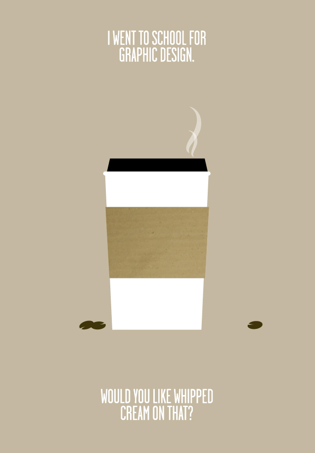
i went to school for graphic design, and did not spend my nights getting drunk. instead, i worked my ass off, spent most of my outside-class time learning/trying/doing as much as possible, and then got an awesome job after graduating.
protip: if you’re lucky enough . . . to be in college, you should be spending all available time learning, trying, making things, messing things up, experimenting and READING. . . .
i didn’t waste a single day. and neither should you. build your momentum and go with it.
for the but-i’m-an-artist’s: you want money? learn a technical skill related to your field and get good at it. then get better at it. . . . just sayin’.
final note: i had a BLAST in college, and miss it like crazy. working hard does not mean no-fun-allowed, it means relax harder 🙂 [2][3]
—nikography
I had the unique opportunity to enter a graphic design career during the transitional years of the digital revolution in design (somewhere between the Upper Peasealithic and Macolithic periods). The university offered computer graphics classes during the final year of the academic program called commercial arts. The degree was catalogued as a bachelors in science (as opposed to a bachelors in arts).
All other graphic design classes were hands-on, analog, technical application of composition, typography, illustration, photography, color theory, and so on. And for that fact, I am grateful.
One afternoon, during critique of students’ work a professor called two of my classmates out of the room. Most of the students knew why. One of the two owned a personal computer (yes, this is back in the paleolithic days before wifi, laptops, and mobile phones). They did their copy layout (design jargon for arranging blocks of advertising text — usually Lorem Ipsum — on a page) using a personal computer and printer. Then they inked over the print outs and submitted their work. Or so the rumors went.
No one else in the class owned a personal computer and had to lay out the text for a three-panel brochure by hand using rulers, graphite and non-photo blue pencils and rubylith film for color overlays.
The professor had caught them cheating. They denied using a computer to do the text layout. Hushed conversation relayed that they were nearly suspended for the act.
The recollection of that afternoon seems so arcane and archaic. The level of craftsmanship and skill required to accomplish print layout work was demanding. Each design student spent hours a day in the studio working on each project.
It used to take weeks of hand-lettering and composing mock-up pages before submitting the design samples for ad director and client reviews. Now it takes me a morning to generate three design layout drafts of a two- to four-page project.
The digital revolution allowed for faster turnaround of design projects, but graphic design is still hard work. It is something I try to impart to interns and young designers.
If graphic design is not good, hard, rewarding work, than you’re doing it wrong.
NOTES:
[1] The original post was shared from Tumblr, January 20, 2010. https://coffeehousejunkie.net/2010/01/20/nikography-i-went-to-school-for-graphic-design/
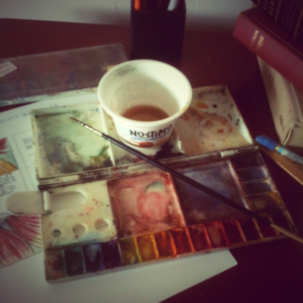
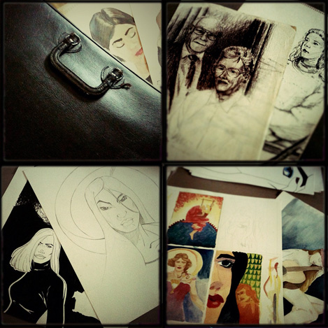
[2] orginal image via synecdoche
![DSCN3428[sqr-tilt-dallas]](https://coffeehousejunkie.net/wp-content/uploads/2015/06/dscn3428sqr-tilt-dallas.jpg?w=560)
![DSCN3427[sqr-tilt-dallas]](https://coffeehousejunkie.net/wp-content/uploads/2015/06/dscn3427sqr-tilt-dallas.jpg?w=560)
![DSCN3434[sqr-tilt-dallas]](https://coffeehousejunkie.net/wp-content/uploads/2015/06/dscn3434sqr-tilt-dallas.jpg?w=560)

![DSCN3386[sqr-tilt-dallas]](https://coffeehousejunkie.net/wp-content/uploads/2015/06/dscn3386sqr-tilt-dallas.jpg?w=560)
![DSCN3396[sqr-tilt-dallas]](https://coffeehousejunkie.net/wp-content/uploads/2015/06/dscn3396sqr-tilt-dallas.jpg?w=560)
![DSCN3400[sqr--dallas]](https://coffeehousejunkie.net/wp-content/uploads/2015/06/dscn3400sqr-dallas.jpg?w=560)
![DSCN3395[sqr-tilt-dallas]](https://coffeehousejunkie.net/wp-content/uploads/2015/06/dscn3395sqr-tilt-dallas.jpg?w=560)
![DSCN3390[sqr--dallas]](https://coffeehousejunkie.net/wp-content/uploads/2015/06/dscn3390sqr-dallas.jpg?w=560)
![DSCN3558[sqr-tilt]](https://coffeehousejunkie.net/wp-content/uploads/2015/07/dscn3558sqr-tilt.jpg?w=560) Three thumbnail cover comps presented to the publisher a couple months back.
Three thumbnail cover comps presented to the publisher a couple months back. ![DSCN3560[sqr-tilt]](https://coffeehousejunkie.net/wp-content/uploads/2015/07/dscn3560sqr-tilt.jpg?w=560) Full-size book cover sketch to gauge color temperature and composition of elements.
Full-size book cover sketch to gauge color temperature and composition of elements.
 For me, every book cover I design begins with pencil sketches that eventually lead to ink drawings. Actually, I suppose it begins prior to that. The author receives a pre-publication questionnaire from me prior to the design process. The questionnaire asks the author what is his/her elevator pitch, what are the pillars of the book (i.e. what are three main concepts/ideas in the book?), and what is the book’s key audience? There are more questions that help me prepare for the design process, but reading through that document helps me form an idea of who the author is, what the book is about and how best to represent the book’s content with an attractive cover.
 The full-color design is often photographic, as in the case of this sample, but can also feature illustrated work or typographic designs. An illustrated cover is sent to a freelance artist who spends a week or so producing the cover art. The final cover design pulls together all the elements (art, photo, type and copy) to present a cover that, in theory, sells a 1000 to 3000 copies on face value. I know what you’re thinking, but books really are judged by their covers. Just watch people at a bookstore. They’re scanning covers before they even pick up a book to read the back copy blurb or open a book to read the first few chapters. If a book has amateurish art or less than professional photography, the audience will move to the next book cover that has great photography or stunning artwork. Further, if a book has poor quality cover art, it will be represented in poor book sales. Let me say it again: if a book has crappy cover art, the book will have crappy sales. No reader wants a crappy book on their bookshelf or e-reader. Half the battle for a reader’s attention is getting him/her to pick the book from the shelf. The same applies to e-book stores. Readers are scanning covers from the Kindle or Nook e-stores and deciding, based on cover design and book blurb, what title to purchase.
 Bitter Black Coffee, Issue 6, Summer 2005


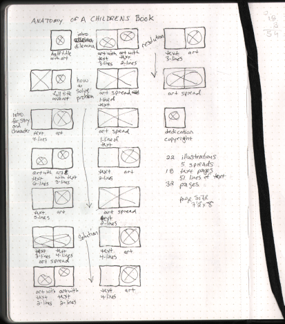
 pencil layout
 comic page layout
 inked comic page
