
Since the publisher posted the following on Facebook last night, I guess it is alright to unveil a new book I designed:
Jordan Rice’s debut poetry collection, CONSTELLARIUM, a finalist for the 2015 Orison Poetry Prize, is now available for pre-order at a discounted price! Order now and be among the first to receive the book when it’s released in April.
“Constellarium is a bold announcement of a new poetic voice to be reckoned with. These poems make us stare down shame and celebrate transition, celebrate the body inside. Jordan Rice does not flinch from what society would have us try to look away from, instead she carefully constructs a book in which we are forced to reckon, layer by layer, with her being. Let us be thankful that such a voice exists, that it is brilliant and shattering, and here to take us all on her journey.” –Fatimah Asghar
The process of cover design is exciting. Especially when the title of the project is constellarium.
There are so many stories behind the cover design that would be fun to share. Like, for example, how the kidlingers enjoyed the image of cetus — how cetus does not look like any image of a whale they have ever seen in a picture book. And how the eldest kidlinger is writing a report about rhinos.
And how a species of rhino has been reported extinct. And we wonder if these old drawings are accurate. And that maybe the cetus represented in the book cover art is correct. But maybe that species of ceti (is that the correct nominative plural of cetus, Latin students?) is now extinct.
Maybe these behind-the-scenes stories are more interesting to me than you.
See if you can find cetus in the cover art by pre-ordering Jordan Rice’s Constellarium!

 Grabbing a sheet of paper from the recycled bin, I feed the sheet into an old manual typewriter and began composing a manuscript on the spot. The kidlingers watched at a distance and then approached to watch the keys striking the paper. Their amusement fueled the writing and from time to time I would ask them for a color or word choice.
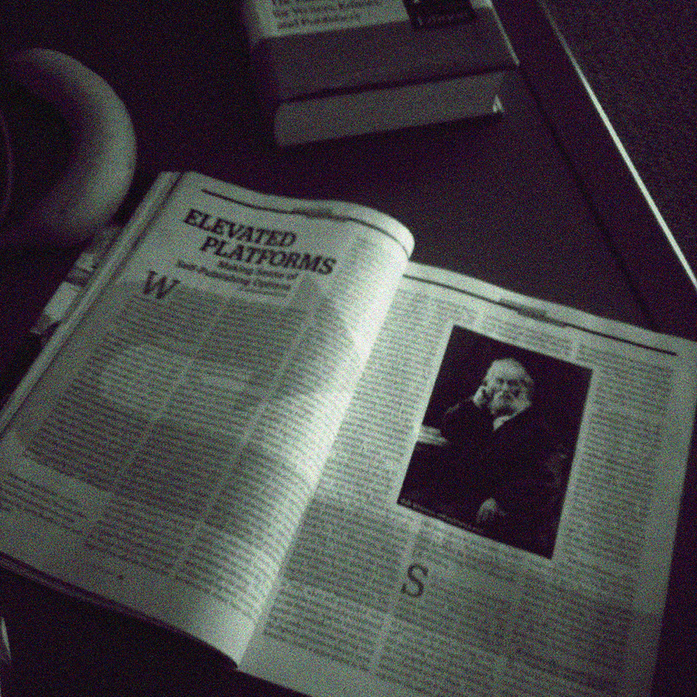


 For me, every book cover I design begins with pencil sketches that eventually lead to ink drawings. Actually, I suppose it begins prior to that. The author receives a pre-publication questionnaire from me prior to the design process. The questionnaire asks the author what is his/her elevator pitch, what are the pillars of the book (i.e. what are three main concepts/ideas in the book?), and what is the book’s key audience? There are more questions that help me prepare for the design process, but reading through that document helps me form an idea of who the author is, what the book is about and how best to represent the book’s content with an attractive cover.
 The full-color design is often photographic, as in the case of this sample, but can also feature illustrated work or typographic designs. An illustrated cover is sent to a freelance artist who spends a week or so producing the cover art. The final cover design pulls together all the elements (art, photo, type and copy) to present a cover that, in theory, sells a 1000 to 3000 copies on face value. I know what you’re thinking, but books really are judged by their covers. Just watch people at a bookstore. They’re scanning covers before they even pick up a book to read the back copy blurb or open a book to read the first few chapters. If a book has amateurish art or less than professional photography, the audience will move to the next book cover that has great photography or stunning artwork. Further, if a book has poor quality cover art, it will be represented in poor book sales. Let me say it again: if a book has crappy cover art, the book will have crappy sales. No reader wants a crappy book on their bookshelf or e-reader. Half the battle for a reader’s attention is getting him/her to pick the book from the shelf. The same applies to e-book stores. Readers are scanning covers from the Kindle or Nook e-stores and deciding, based on cover design and book blurb, what title to purchase.