It’s less than two hours before the event and I find myself pacing the house with loose leaf pages of poems wondering if I’ve chosen the correct poems for tonight. I’ve been preparing for tonight’s reading all week. Reading poems I’ve written (and avoiding making additional edits). Selecting the poems I plan to bring to tonight’s reading at The Altamont Theater. I’ll read at the Asheville Wordfest event Voices of the City alongside Katherine Soniat, DeWayne Barton, Ronald Reginald King, Ekua Adisa and Roberto Hess. But I can’t help wonder, what do these fine poets do before a poetry reading? What rituals do they observe the day before an event like tonight?
Tag: literature
Asheville Wordfest 2012 – poems that open conversations
 It’s true. There is only one article I read from the pages of O: The Oprah Magazine. It is the interview between Maria Shriver and the poet Mary Oliver. [1] “I consider myself kind of a reporter. . .” Mary Oliver says. I think that’s the same sentiment Wordfest director Laura Hope-Gill expresses in this week’s Mountain Xpress article where she describes poetry as “citizens’ journalism.” [2]
“Poetry is a short line between different cultures,” says Laura Hope-Gill. “It can heal the cultural divides that still plague our city. It opens conversations that we need to have.”
The invitation to read my poems at this year’s poetry festival is something I don’t take lightly. I spent the last few nights reviewing poems I’ve written during the last year as well as poems composed during the last decade. The PR/marketing side of me wants to chose poems to read that promote a certain manuscript I’m developing or maybe only read published poems. It’s a promotional game poets play when they read their work publicly. They casually mention that “the next poem I’m going to read was published in the Atlantic Monthly…” or the American Poetry Review or some other notable journal as away to promote their ascendancy of poet extraordinaire.
But my thoughts returned to the idea Laura mentioned in the Mountain Xpress article. I looked through pages of my poems last night searching for material that addresses the idea of healing cultural divides or opening conversations. Selecting poems that fit the general theme presented a bit of a challenge, but there are subtle threads of those ideas in several of the poems I’ve written during the last few years.
Tonight, however, I’ll put aside the task of poem selection and venture to the Vanuatu Kava Bar for Poem-ing the 28801 [3] featuring Barbie Angell, Ten Cent Poetry, Jonathan Santos and Jadwiga McKay.
NOTES: [1] Dear Oprah, you stole my idea, but I’m not filing charges [2] A short line between different cultures [3] Wordfest 2012: Poem-ing the 28801
It’s here… Asheville Wordfest 2012 begins tomorrow
“It’s a good time to come together at the table of poetry,” says Laura Hope-Gill, the director of Asheville Wordfest, in a recent article in the Asheville Citizen-Times.[1] I’m very excited to be part of the local Asheville poets who will be reading during the festival. I’m also excited to listen to the guest poets attending this year’s poetry festival. Some of the guests include Arthur Sze [2] (author of The Ginkgo Light, Archipelago and other books) and Matthew Shenoda (author of Somewhere Else and Seasons of Lotus, Seasons of Bone of which A. Van Jordan writes, the poet “uses a quiet language to bring some of the most striking lyrical intensity.”).[3]
This year’s Wordfest includes a memorial reading for poet Carol Novack. On a rainy evening last summer at the Battery Park Book Exchange and Champagne Bar was the last time I saw her. She was with friends and admirers reading selections from Giraffes in Hiding.
This morning I received an email from the director of Asheville Wordfest with the official schedule for the Asheville Wordfest 2012. It is listed below for those who have not received the schedule:
Wednesday
• 9-11 p.m.
Open mic hosted by Caleb Beissert. Vanuatu Kava Bar, 15 Eagle St.
Thursday
• 7 p.m. “Poem-ing the 28801,”
with Barbie Angell, Ten Cent Poetry, Jonathan Santos and Jadwiga McKay at Vanuatu Kava Bar.
Friday
• Noon, informational luncheon with Lenoir Rhyne University graduate studies program director Paul Knott, who will talk about the Masters in Writing program. Chamber of Commerce building, 2nd floor, 36 Montford Ave. RSVP required to Sara Landry at 258-6136 or Sara.Landry@lr.edu.
• 5-7 p.m., MadHat Reception honoring Carol Novack. Refreshments.
• 7 p.m. “Voices of the City,”
Katherine Soniat, DeWayne Barton, Ronald Reginald King, Matt Mulder, Ekua Adisa and Roberto Hess.
• 9 p.m. “An Evening of Translation,”
with Erik Bendix, Caleb Beissert, Thomas Rain Crowe, Nan Watkins and Luke Hankins.
Saturday
• 11 a.m.-12:30 p.m., “The Poets of Press 53,”
with Terri Kirby Erickson, Joseph Mills and Kathryn Kirkpatrick.
• 1-2 p.m. The Carol Novack Memorial Reading,
with Terese Svoboda, Marc Vincenz and Jeff Davis, Asheville Wordfest co-founder and host of Wordplay.
• 3 p.m. “Fixing to Tell About Jack,”
a celebration and benefit for Ray and Rosa Hicks Fund, featuring storytellers Sheila Kay Adams, Gwenda Ledbetter, Vixi Jil Glen, David Novak, Connie Regan-Blake and Ted Hicks. $12; additional donations welcomed.
• 5:30-6:30 p.m.The Poets of the Asheville-Buncombe County Schools Poetry Slam.
• 7-9 p.m. “Our Honored Guests,”
with Sara Day Evans, LeAnne Howe, Allison Adelle Hedge Coke, Arthur Sze and Matthew Shenoda
• 10 p.m. until late. “Late Night Open Mic.”
Sunday
• 10:30-11:30 p.m. “Children’s Poetry and Children’s Poems,” hosted by Barbie Angell..
• Noon-1 p.m. “Morning of Spirit,” with Tracey Schmidt and James Davis of Logosophia Books, Michael Ivey on guitar and Matthew Cox from Shantavaani on tablas and hand drums. An open mic will invite people to share their own spiritual poems.
• 1:30-2:30 p.m. “Voices of the City,” with April Fox, Eric Steineger, Lisa Sarasohn and Meta Commerce.
• 3 p.m., “Poetrio,” with Maureen Sherbody, Mark DeFoe and Jessie Carty. Malaprops Bookstore/Café, 55 Haywood St.
• 5 p.m. until whenever, “Poetic Wine-Down,” Battery Park Book Exchange and Champagne Bar, Grove Arcade.[4]
NOTES: [1] “Asheville Wordfest celebrates poetry of all stripes, May 2-6” [2] The Poetry Foundations bio of Arthur Sze [3] Matthew Shenoda’s web site [4] Asheville Wordfest 2012
Three ways for authors to promote their new book
This is obvious, but essential. Connecting with a local bookseller is vital to promoting your book. Most booksellers see your book title listed in their wholesale catalogs. All you need to do is remind them it’s there and then see if they’ll host an event. Be sure to contact the bookstore’s event coordinator, not the store’s book buyer. The PR & Events Coordinator schedules store events like readings and book signings and is the best point of contact for a newly published author.
Consider non-bookstore venues. Schools, public libraries, or other venues may have suitable audiences for your book title. Don’t just assume that your audience only buys books at Barnes & Noble. Libraries are great places to read. I’ve read in various locations including a tavern, café, ballroom, art studio, church and several other places. One author I know had a reading at a chocolate shop. Be creative with your events.
Social media sites like Twitter, Facebook, etc. are great tools to promote your book. If you don’t have an account, you’re already behind. Be authentic and approachable on these sites. If you sound like you’re a pushy salesperson, you’ll lose your audience. Share with your social media audience the same way you approach your book reading audience. Make converts from social media followers to book buyers.
Upcoming reading at Asheville Wordfest 2012
Next week I’ve been invited to read some of my poems at one of the Asheville Wordfest 2012 events. The schedule is still fluid. So, you’ll have to check the official Wordfest website for the schedule details. Suffice it to say, I am extremely humbled and honored to read with great local and global poets.
Life is lived as a messy first draft
How do you explain a poem without revealing its mystery? I thought about that question this weekend after a private poetry reading session. A few poets gathered under a full moon to read new work….
[read more]
UPDATE: This blog post is available as part of an audio podcast.
Listen now:
Or listen on:
PodOmatic: coffeehousejunkie.podomatic.com
SoundCloud: soundcloud.com/coffeehousejunkie
E-book: This blog post will be featured in a forthcoming e-book. More details coming soon.
Write 30 poems in 30 days: a challenge
During the summer of 2010, I took up the challenge to write 30 poems in 30 days with two goals in mind:
- generate new material and
- unclutter my mind.
Yesterday I began a new cycle of poems with the goal of writing 30 poems and 30 days during National Poetry Month (if your following National Poetry Month on twitter, the hashtag is #NPM12).
April Poetrio at Malaprop’s Bookstore/Cafe

National Poetry Month begins at Malaprop’s Bookstore/Cafe with Poetrio this Sunday at 3:00 p.m. This month’s featured poets include Ed Madden, Ray McManus and Anne Harding Woodworth.
Here’s an abridged version of the poets bios from the Malaprop’s Bookstore/Café news release:
Anne Harding Woodworth is a member of the Poetry Board at the Folger Shakespeare Library in Washington, D.C. She is a part-time resident of both Washington, D.C. and the Western North Carolina mountains. On April 1 this year, she will read from her fourth book, THE ARTEMIS SONNETS, ETC.
Ray McManus teaches creative writing, Irish literature, rhetoric, and composition at the University of South Carolina, Sumter. We are very pleased to welcome him back with his second poetry collection, RED DIRT JESUS, for which he won the Marick Press Poetry Prize.
At the November 2009 Poetrio event here at Malaprop’s, Ed Madden read from Signals, the 2008 poetry collection for which he won the South Carolina Poetry Book Prize. His most recent collection of poetry is PRODIGAL: VARIATIONS.
Learn more about the April 2012 Poetrio at Malaprop’s Bookstore/Cafe at their web site.
Three ways self-published authors fail
“Only idiots and the self-deluded think that being able to self-publish qualifies them to write,” concludes one person commenting on Two reasons why not to self-publish your book. It’s true. Not every self-published author writes well. For that matter, not every best-selling author writes well. I do agree in part with that comment–the logical part, not the jaded part. Like I said before, I am an advocate of self-publishing, but my views are changing.
Regarding self-publishing, I wrote a multi-part series titled The Economics of Writing. The basic premise of the series is this question: Why should a poet/writer spend his/her money on literary contests when they might self-publish his/her own work? You can read the whole series by following the links. What prompted the series was:
- I’ve been in publishing for a while and know how much it costs to produce and distribute print products and
- I read a story about a writer that spent more than $14,000 in a seven-year period on contest entry/reading fees, related postage, sample journals, literary memberships and writing conferences/workshops and won a $500 cash prize during that period.
I’ll avoid the analysis of literary contests [read about them in the second part of the series], and move to notable poets and writers who have self-published their work: Margaret Atwood, T.S. Eliot, Robert Service, Nikki Giovanni and Viggo Mortensen [read more details in the third part of the series].
When you consider the amount of time and energy–not to mention money–it takes to publish a book, self-publishing is an option to consider if you don’t want to wait for a publishing house to release your product. A poet and/or writer may spend years working with an agent to secure a book deal with a traditional publishing house. Whereas, self-publishing a book can make its way to the market in a matter of days or weeks.
Most self-published authors fail with their book releases in the following three areas:
- Cover design. And in general, book design. Just because you cleverly wrote your major literary work in MS Word does not mean you can print it in MS Word. Let a professional graphic designer package your literary endeavor. Further, just because you have Adobe products loaded on your fancy schmancy MAC machine, doesn’t qualify you as a designer either. Book design is not the same as designing a web site (that you really borrowed from WordPress or some other blog platform and told your client you designed their web site *sigh*). A book cover is the movie poster for the book. It must invite, entice, and coax readers to pull the book from the retail shelf (or etail shelf), read the back blurbs and first chapter, and ultimately buy the book.
- Editing. First draft, best draft is not the best practice in selling books. Having your ever-loving mother to review your manuscript is not that same as getting your manuscript edited. Even a good writing group is not enough–but it is a very good start. Hire a good editor to work on your literary masterpiece. A good editor will make a huge difference in the final product. So much of self-published books are deficient in quality work. There are gruesome typos, grammatical crime scenes, and abominable stylistic failures. A good editor is like a good film producer–a poet/writer may have the vision, but the editor knows best how to articulate it to readers. A good editor is one of your best friends. The last thing you want to do is release a book product that you immediately have to print a second revised edition because you used “their” instead of “there.”
- Production efficiency and quality. The financial bar has been lowered in matters of producing a book. Print-on-demand options are more affordable now than ever before. But more affordable doesn’t always equate to quality book product. A lot of do-it-yourselfers enjoy the look of the Etsy-ish, handcrafted book products that clutters the indie poetry and zine scene. And that’s fine. Those products are souvenir. People who purchase those items understand that they are a souvenir, book art object. But that option is more expensive than one might suspect. Consider a book’s cover price of $12 per copy for a 64-page literary chapbook. Most traditional publishers have a production markup of no less that 12 times. If, for example, the cover price is $12, than the book’s production cost–printing cost, cover art, book design, etc.–on a 1000 copies print run is $1 per copy. Most self-publishers don’t consider this fact and usually spend $6 per copy on a print run at Kinkos for a run of 100 copies. At that rate, it’s a hobby not a business.
I’ve been on both sides of the argument. I’ve self-published books that failed and succeeded. I launched two book imprints within a media organization that sold over 30,000 books in a couple of years. And here’s where I’m changing my position on self-publishing versus traditional publishing: idealism versus reality. Poet and blogger extraordinaire, Ron Silliman, offers these thoughts on idealism versus reality when he suggests that it would be ideal:
…if all bookstores carried every book of poetry that is in print… and if all poets had equal access to book publication.… But until then, it’s the real world I’m going to engage with…
So, where does that leave authors who don’t have a literary agent and don’t want to wait years and years to get their work published? Co-publishing. There are several reputable publishing houses that offer co-publishing services. A poet/writer still pays for the production of the book product, but the publishing house offers editors, publishers with decades of experience, a professional art department, a public relation staff, a warehouse facility, events coordination, distribution and other services. Consider the question that sparked the multi-part series I wrote. As a writer, would you rather spend seven years and $14,000 trying to win a literary contest and/or land a book deal? Or spend $14,000 and seven years selling your book, earning new readers and working on your upcoming books?
Poetry at the Altamont

Tonight from 7:00 p.m. until 8:30 p.m., Poetry at the Altamont continues with this month’s featured poet, Laura Hope-Gill.
It’s been awhile since I visited the The Altamont Theatre. I believe it was during last year’s Wordfest. It’s a gorgeous setting to hear poets read their work. I’m looking forward to tonight’s event.
Here’s more details about the event Poetry at the Altamont from their Facebook invite page:
Poetry at the Altamont is a reading series for poets and poetry lovers commencing on the third Monday of each month at seven o’clock in the evening at The Altamont Theatre in downtown Asheville. The event consists of a reading by the feature poet followed by an open microphone, for which readers may sign up and recite one or two short pieces. During the open portion of the event, we encourage new voices and accomplished poets alike to share what they have been working on, a space where writers have the opportunity to try out new works in front of an audience on a regular basis. Please join us for consistent, fine poetry in a setting that is equally fine.
Hosted by Jeff Davis and Laura Hope-Gill
Produced by Caleb Beissert and Aaron Price$5 at door
Beer and wine served(link)
Two reasons why not to self-publish your book
Confession: I am an advocate of self-publishing. I have been for years. But my views are changing on the matter due to the glut of poorly written self-published books being released each year. Serendipitously, I found this article in the London Evening Standard that offers two reasons why not to self-publish: 1) publishers and 2) editors.
Authors need publishers more than ever when there are so many voices out there competing for our attention. As Horowitz rightly says, the main raison d’être of a publisher is to provide the author with a skilful editor who can turn a sow’s ear into a silk purse.
Editors are the midwives of great literature. T S Eliot’s The Wasteland wouldn’t have been the masterpiece it is if it hadn’t been edited by Ezra Pound and his wife, Vivien.
The death of publishing is greatly exaggerated. We will still need publishers as long as we read books, just as we still need critics to review those books. It is part of the great filtering process of literature and culture. (link: Self-publishing makes us think we can write)
Any questions?
Judging a book by its cover
 For me, every book cover I design begins with pencil sketches that eventually lead to ink drawings. Actually, I suppose it begins prior to that. The author receives a pre-publication questionnaire from me prior to the design process. The questionnaire asks the author what is his/her elevator pitch, what are the pillars of the book (i.e. what are three main concepts/ideas in the book?), and what is the book’s key audience? There are more questions that help me prepare for the design process, but reading through that document helps me form an idea of who the author is, what the book is about and how best to represent the book’s content with an attractive cover.
Then I receive the manuscript a few weeks later and begin reading the author’s work. This helps try to envision in my mind an iconic poster image. For me, a book cover is the equivalence of a film poster. At this stage, I produce some concept drawings (like the one’s pictured) and research color schemes and subject themes that I plan to use in the cover design. After a couple rounds of emails with the author, I proceed to the full-color design phase.
 The full-color design is often photographic, as in the case of this sample, but can also feature illustrated work or typographic designs. An illustrated cover is sent to a freelance artist who spends a week or so producing the cover art. The final cover design pulls together all the elements (art, photo, type and copy) to present a cover that, in theory, sells a 1000 to 3000 copies on face value. I know what you’re thinking, but books really are judged by their covers. Just watch people at a bookstore. They’re scanning covers before they even pick up a book to read the back copy blurb or open a book to read the first few chapters. If a book has amateurish art or less than professional photography, the audience will move to the next book cover that has great photography or stunning artwork. Further, if a book has poor quality cover art, it will be represented in poor book sales. Let me say it again: if a book has crappy cover art, the book will have crappy sales. No reader wants a crappy book on their bookshelf or e-reader. Half the battle for a reader’s attention is getting him/her to pick the book from the shelf. The same applies to e-book stores. Readers are scanning covers from the Kindle or Nook e-stores and deciding, based on cover design and book blurb, what title to purchase.
From the time the final cover is approved until the product arrives is six to eight weeks depending on circumstances. That’s when the real test of a book’s cover design and interior content begin. And that’s about the time I begin the next round of cover designs.
Literary reading series continues at Posana Cafe this weekend
Saturday night, March 17, 6:00 p.m. at Posana Cafe in downtown Asheville, NC. The literary reading features writer Elizabeth Lutyens and poet Tina Barr.
From a press release:
Elizabeth Lutyens teaches the Prose Master Class in the Great Smokies Writing Program of UNC Asheville and is Editor of The Great Smokies Review, its online literary journal. A former journalist, she got her MFA in Creative Writing from Warren Wilson College, and since has been at work on a novel set in the mid-19th century in Boston and the Port Royal Islands of South Carolina.
Tina Barr has received Fellowships from the National Endowment for the Arts, the Tennessee Arts Commission and the Pennsylvania Council on the Arts. Her awards include the Editor’s Prize for book publication from Tupelo Press. Her poems are published in anthologies and journals like The Harvard Review, The Southern Review and The Paris Review.
Literature takes a habit of mind that has disappeared. It requires silence, some form of isolation, and sustained concentration in the presence of an enigmatic thing.
Philip Roth (via libraryland)
The Origin of Titles
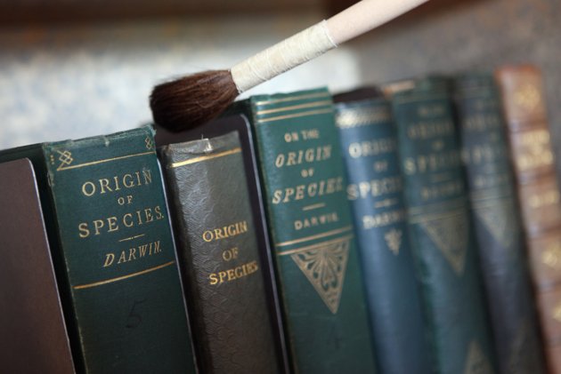
It is amusing that modern readers have been spared the lengthy title of the 1859 first edition:
ON THE ORIGIN OF SPECIES.
OR THE PRESERVATION OF FAVOURED RACES IN THE STRUGGLE FOR LIFE.
hm?
British scientists have found scores of fossils the great evolutionary theorist Charles Darwin and his peers collected but that had been lost for more than 150 years (via libraryland)
Representing nations through poetry
Today, I followed a link to a web site that I rather enjoy — the United Nations of Poetry. Serendipitously I found the link and learned that it presents a catalog of international poets. I noticed, however, that some nations are missing from the list. For example, Germany is not represented. Consider including German language poets Durs Grünbein, Michael Hofmann and Sarah Kirsch. Also notably missing are Polish and Russian poets. Vera Pavlova makes a good addition to the United Nations of Poetry representing Russia. For Poland, Eugeniusz Tkaczszyn-Dycki might make a good contribution. And last, but not least, add Greek poet Dimitris Varos to the list of poetry dignitaries. One thing that is unique to the United Nations of Poetry is the inclusion of poets from America representing the indigenous peoples.
Why is this important? I think C. S. Lewis wrote that literature “irrigates the deserts that our lives.” Along that line of thinking, to know and understand the inner life of a nation or culture is to explore the fertile literature of their poets and writers. Film tends to present caricatures and stereotypes of Germans, Russians and Americans, but literature plumbs the depth of cultural nuances. For example, you might miss the significance of the shamrock and the lily in a film about two brothers in North Ireland. In a novel, the weight of those two images will elucidate the drama between the two siblings, and a reader will come to realize that the tensions between two brothers are often the same between nations.
Literature adds to reality, it does not simply describe it. It enriches the necessary competencies that daily life requires and provides; and in this respect, it irrigates the deserts that our lives have already become.
C. S. Lewis (via ermarty)
Big night in Asheville for poetry readings

Last night Asheville hosted two great poetry readings.
Loretta’s Cafe featured the Flood Reading Series with poets DeWayne Barton, Gyorgyi Voros, and Landon Godfrey.
Malaprop’s featured readings by Evie Shockley and Luke Hankins.
Unfortunately, I missed both readings because I was on the road and didn’t return to my adopted hometown until after the readings. Anyone have a report to how the readings went? Please feel free to offer a review of the readings in the comments.
“[Khalil] Gibran’s ‘masterpiece’… turns not so much upon poetry as upon the genre of wisdom literature and its subgenre, the aphorism, which holds a particularly valued place in Arab culture. Like all good aphorists, he uses language that is both plain and metaphorical; it invites understanding yet in a way that brushes against the mysteries of being alive. There’s no doubt that the style occasionally ascends into comical elevations, and that its high tone seems lost in the ironies and specificities of American life. But that sort of spiritual homelessness pretty much describes a large swath of immigrant life.” (via poetry & popular culture)
It is a good rule after reading a new book, never to allow yourself another new one till you have read an old one in between.
C.S. Lewis
// weird. fell asleep reading an ezra pound bio and woke up thinking i’m late for class.
// i didn’t know ezra pound had wisconsin connections… chippewa falls connections at that.
//decisions, decisions… eat lunch at my desk while editing audio recordings? or eat in the breakroom and read barzun’s house of intellect?
I’m embarrassed to say that since college… I’ve been so busy speechwriting for Kerry and then Barack that I haven’t been reading all the good literary stuff I used to read…
~Jon Favreau
NOTES:
1) Mark Warren, “What Obama’s 27-Year-Old Speechwriter Learned From George W. Bush,” Esquire, accessed December 20, 2008, https://www.esquire.com/news-politics/a5339/barack-obamas-speech-writer-1208/
